At the Tagaytay studio of designer Wataru Sakuma, origami folds, cutouts of undulating patterns, folded squares and triangles are tacked on the board.
The three-dimensional studies have become inspirations for lamps designed for export companies. Sheets of painted grids in intricate patterns of paper pulp are scattered on the floor.
There are layers of stenciled pulp, colored in muted tones of old rose, taupe, blue-gray and blue-violet. These are his newest reductive representations of the city map.
Sakuma makes the public aware of the allure of paper pulp as a medium because of its tactile quality. He produces paper pulp for the export market and for local designers who use them for wall décor.
Last year, he brought his craft to the level of art by creating maps of Metro Manila made of newspaper pulp. Beyond cartography, the works capitalized on the intricacies of roadways, intersections and networks.
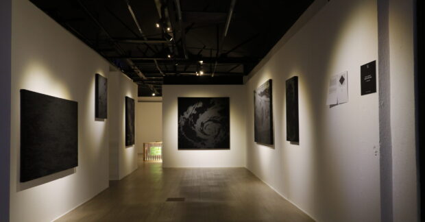
On July 25, at Art Informal, he will show his continuing fascination with maps, only this time they have color.

Medium for drawing
Sakuma was born in Japan, raised in Dubai and India, and studied arts in the United States.
He came to the Philippines nine years ago when he saw an advertisement for a designer for for Masa Ecological Development Inc. (Masaeco), a Japanese pulp- and forest-products company in Tagaytay. Masaeco produces paper using salago, pineapple and saging na saba, abaca, cogon, rice straw and sawdust.
“Anything can be made into pulp. Some fibers are stronger than others. I mix strong fibers with weaker ones. We started with pineapple and saba which were strewn after the harvest. These wastes are gathered and processed to make the papers. For the designs, I sketch the patterns and draw with pulp. You can even write letterings. Then they are dried,” he explains.
For his map art, he utilizes newspaper because it contains information just like the map. He puts the newspapers in a blender with water. Once they are beaten to a pulp, they become the medium for drawing. The pulp is placed inside a ketchup dispenser to illustrate the roads and arteries. The map is then painted in acrylic.
Woven cities
“I use the pulp as the ink of a pen to draw the lines,” explains the artist.
He scanned the maps from atlas, made the patterns for the map, and let his assistants write the street names.
It takes at least three layers to make the maps—one for the main-road networks, another for the secondary roads, and the third for the arteries and side roads. The strata invariably show the interconnections and the overlapping streets.

“The maps look like woven cities,” he says.
There is a feeling of transparency as the viewer can see through the intersections.
He also compares them with the human body with its network of facial tissues, veins and arteries.
“I see the country like a human body. The streets are the veins and the people would be the blood of the nation. If there are no people, there would be no activity. Hence the city suffers,” he says. “People add culture to the city. The color represents culture and traditions.”
Depth and richness
Sakuma likens the painted maps to painting where layering is necessary for depth and richness. The initial layer establishes the concept of image while the subsequent layers create the quality of the finished product.
The new maps will also be framed in formats as large as 4 ft x 8 ft. They depict various districts—from Ortigas to Libis, Ermita, Mandaluyong, the bayside, etc.

Although they are abstractions, the maps still resemble conventional notions of what a map should be. A closer look reveals that the layers of streets challenges our viewpoint of the city and provides a commentary on it as well. The maps record not just what is but what will no longer be there. Depending on how you look at the map—near or far, our perspective changes all the time.
Sakuma has been fascinated with maps because of their importance to human survival. He says they reflect the growth of our understanding of the world around us. They record the course of a nation and show the lay of fields, districts, streets and plaza.
As an abstractionist, he can relate to maps because of their power to condense reality into an accurate and intelligible image.
Dramatic change
Although he has been living in Cavite, he regularly comes to Manila to meet with clients for Center for International Trade Expositions and Missions.
He is amazed at the dramatic change of the skyline and the new satellite centers that have emerged. He uses the map to mirror the complexity of living in the metropolis.
At the end of day, he prefers to go home to Tagaytay.
“I love it here because I could focus on my work. In Metro Manila, I can’t live with the traffic and the heat. I was lucky to be in a workplace where I can do whatever I want.”
Art Informal is at 277 Connecticut St., Greenhills East, Mandaluyong City; tel. 632-7258518, 0918-8992698.