Every young couple dreams of having a big house with a driveway that gives one a sense of arrival and a backyard where kids can romp. But given the urban congestion and rising prices of real estate, narrow homes on narrow lot sizes have become the norm.
Building her home, a former graphic artist believes that warm interiors and well-placed windows can compensate for the small space.
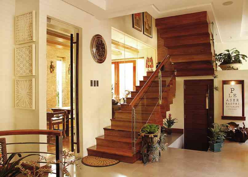
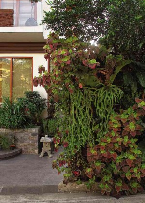
The three-level, 450-sq m house stands on a 200-sq m lot. Since it can’t accommodate a front yard, the architecture is supported by vertical gardens.
Visitors are in awe upon entering the house. It’s neither trendy nor flashy.
How does the house have such an effect on visitors, even if everything about it is familiar, from the traditional materials to the Oriental artworks and tropical plants?
Natural flow
The small space on the ground is visually enlarged with the use of split-level space and of little corners by the windows. A split-level space adds drama to a small space.
The different levels make the house seem built on uneven ground. The result is a natural flow of space.
In a hidden corner, an Asian-theme foyer with a huge Korean cabinet, Oriental masks and a banquette which discreetly hides shoes, is called the “valet corner.”
When the children arrive, they put their shoes inside the rack. They take a few steps down to the sunken living room which is adjacent to the open kitchen. It was designed to be a conversation pit, paired with long sofas for lounging, lots of pillows and a fun accent piece—a bicycle glass table.
Friends advised the couple not to have the TV set so that guests could enjoy quality conversations. Instead, an abstraction by Roel Obemio becomes the focal point. People can stand back and appreciate its forms and colors.
With cooking and dining as main activities, the kitchen becomes the focus. The owner wanted concrete flooring to create a modern edge, but the material cracks easily. For easy maintenance, the floor has porcelain tiles that mimic the look of cement.
The sleek kitchen has graphicote walls in cool avocado green, a sophisticated black granite counter, and a maple laminate cabinet with frosted glass. A dropped narra ceiling adds warmth while a skylight creates atmosphere in the kitchen.
The family prefers the informality of eating in the kitchen peninsula, not in a formal dining room.
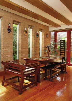
Since the narrow space can’t accommodate a large picture window, the wall is built with long, vertical windows that filter the sun into pins of light. Laminated beams of faux timber add panache to the ceiling. To match the cozy walls, the room is decked with furniture pieces made of exotic woods.
Mix of old and new
The 200-year-old dining table, a family heirloom, is surrounded by a variety of wooden chairs in teakwood, kamagong (Philippine ebony), ipil-ipil (Philippine lead tree) and tanguile (local mahogany).
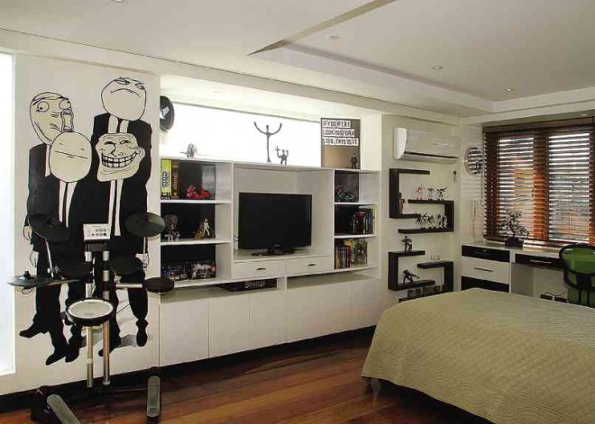
The children turn their rooms into forms of self-expression—they chose the colors and graphic designs on their walls. The teenage boy chose images of Laugh Out Loud, Poker Face, Troll Face and Challenge Accepted instead of a painting to “capture the zeitgeist.” A voracious reader, he is provided with lots of bookshelves.
The preteen girl loves slime, so she asked for green. The mother kept it to a brighter and livable shade. Although a mural of cartoon character Finn dominates the room, she will outgrow that character in a matter of time.
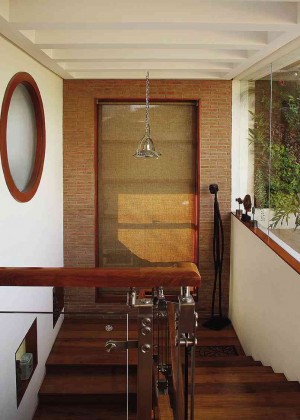
The stairwell, though narrow, feels light and airy with window openings and little niches to display the couples’ Orientalia.
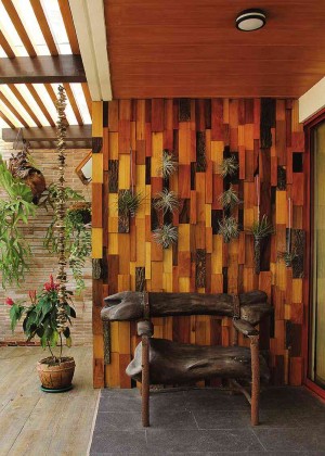
The garden roof deck which overlooks the city skyline is still a work in progress. For visual interest, pieces of scrap wood were assembled to make an accent focal wall.
All these attention-getting details express the uniqueness of the inhabitants.

