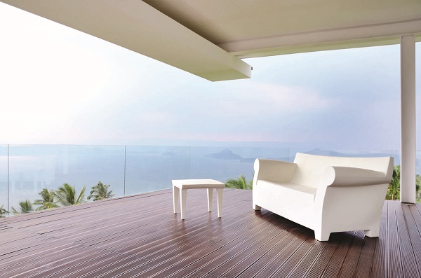
Architect Ed Calma has become synonymous with minimalism. His design revolves around geometry, nature, void spaces and materials.
One of his talked-about designs is in Lipa, Batangas. The house was owned by actor Aga Muhlach’s mother and is now owned by an oncologist. On a hilly, one-hectare property facing Taal Volcano and the lake, the house used to be a four-level, Mediterranean-style structure with a pagoda-like gazebo on the roof deck. The oncologist tapped Calma, his former schoolmate at Ateneo high school, to transform the house into a getaway and a gallery for his artworks.
This project conveys the spirit of minimalism. It has not only the line, form and non-color palette, but also the spatial relationships and lighting. Calma creates a dialogue between the space and the environment. Natural light reveals clean spaces. At night, the lighting design sculpts the space.
“Getting down to the fundamental elements is very specific to my work. The fundamentals are clear. We had to deal with the existing structure, strip it down to its bare essentials—the columns, beams, and the space. This used to be compartmentalized, with its three rooms. From the rooms, you couldn’t see the view. There were just small windows,” Calma recalls the design of the previous house.
“I had to knock down all the walls facing the view and install glass instead. The design is all about the view,” says Calma.
His design has an open-plan living room, dining room and master bedroom, all of which are oriented towards the west and the panoramic view. The balconies are enclosed by a glass expanse so as not to obstruct the view. The two lower floors, which have no scenery, are used for utilities.
The design elements serve visual and functional purposes.
“We focused on the glass. There are not too many interior finishes,” he says. Epoxy resin is used as floor application and whitewashed walls serve as clean background for the owner’s sculptures and paintings.
Although the artworks have become part of the interior design, the focal point really is the peaceful scenery of Taal Volcano and the lake. The canopies not only provide shade but also frame the view.
A double-volume vestibule is utilized as an art gallery space. Likewise the sculptural staircase with long steel bar railings complements the artworks. Calma says the rails aren’t just guards or barriers but also, their pattern—the repetition of lines—becomes a design element. Even the large, pivot door with long steel tube handles comes across as an art installation.
“The doors are not just openings. They are large so that a painting can be displayed on it,” says Calma.
There are only two narrow vertical windows to restrict the flow of light so as not to tarnish the artworks. “We don’t put lighting on the high ceiling. It would be difficult to maintain,” says Calma. Instead, uplighters are installed on the ground to create ambiance.
The ground floor design has an open plan. The kitchen has a concrete counter which doubles as entertaining and service space. The room adjacent to the living room is enclosed by sliding doors. “You can make this into another living room, free up the space so that you can make anything out of it,” says Calma.
The bathroom is also minimalist. “I wanted it sparse. The sink uses ceramic tiles. We made the drains invisible by putting them underneath the tiles, with a slot to empty the drain. I hate looking at drains. They don’t look good. The slot looks better. The fixtures are rectilinear to match the rectilinear quality of the house,” he explains.
While the interior design is simple yet elegant, the exterior makes a bold statement. “There are two ways to make the house—blending it with the environment or making it stick out as a piece of art. We chose the latter. The façade is a combination of a rectangular empty wall with a horizontal canopy, and a window slot. That’s it.”
Calma clarifies his trademark minimalism—“It’s not really minimalism. Every architect looks for an expression. He searches for a form that is appropriate to the site. That form has to be clear. I don’t want to add anything to the form that will detract from the main idea. Some houses have too many ideas that you can’t see the main idea. In this house, it’s all about the views. The house itself potentially becomes a wall for art or an art piece in itself. The form of the house is like a sculpture. You can use exterior walls to accommodate art.” The owner tastefully decorated his getaway with Italian furniture and reproductions of mid-century pieces and works by contemporary artists.
“The owner is a jolly fellow. He acquired his love of art from his parents. This place serves as an escape from his work which deals with cancer patients who talk about death. Art keeps him sane and the place revitalizes him,” says Calma.
He didn’t want to charge his friend for his design services, so the oncologist gifted the architect with a 1,000-sq m lot also in Lipa. Calma saw it as a potential site for his weekend home.
Cocoon magazine is available in leading bookstores and newsstands nationwide. For inquiries, please call 8978808 loc 604. Facebook.com/cocoonmagazineph