The punk subculture is characterized by “antiestablishment views and the promotion of individual freedom.” The punk lifestyle is, first of all, a philosophy, a politics—diverse ideologies and forms of expression that invaded youth culture in the 1970s, in music, fashion, literature, film, dance and the visual arts.
Punk art is minimalistic and imbued with underground sensibilities and the impulse to outrage. It is often illustrative, with straightforward messages about political issues like social injustice and economic disparity. It is usually seen in album covers, fanzines, concert flyers, and sometimes in art galleries.
In his essay “A Visual Survey of Early Punk-Rock Album Covers,” artist Mark Vallen explicates: “Punk had a unique and complex aesthetic. It was steeped in shock value and revered what was considered ugly. The whole look of punk was designed to disturb and disrupt the happy complacency of the wider society.”
England Hidalgo showcases the essence of this anti-art in “I Don’t Wanna Grow Up,” 27 pieces in ink on paper, until tomorrow in The Drawing Room (Metrostar Building, 1007 Metropolitan Ave., Makati City).

The title references the Tom Waits song. Editorializing is at the core of many of these images, and in some cases the melding of text and visual segues into outright editorial cartooning.
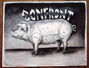
The clearest editorial of all, stamped with the iconoclastic and satirical punk sensibility, is “Primary Cuts and the Collateral Damages,” a simple illustration of a hog sectioned into pork cuts with the corresponding words Boston Butt, Jowl, Picnic Shoulder, Loin, Spare Rib, Side, Ham, Foot.
Straightforward enough, but above it runs the word Confront, almost as huge as the swine itself, with all letters in upper case—which substantially changes the image in the viewer’s eye, suddenly conjuring today’s headlines.
Common device
In “Life Needs More Green Lights,” showing a kiddie trike in a wasteland, no text is incorporated, but by its title this must be a forlorn call for a return to nonpollutant modes of transport, or to the Edenic state of Planet Earth.
Similar to it in desolate visual and mute editorializing is “What’s He Building in There?” Again, but for its title, the viewer wouldn’t have recognized this to be the old homestead now turned into a godforsaken place by—illegal logging? slash-and-burn agriculture?
Another straightforward illustration is “Whoever You Vote For, Government Wins,” depicting a sad-eyed, shaggy mutt on the foreground while behind looms a girl in a sexualized pose, in black bikini and loose white tee emblazoned with the word Vote.
In “Death and Taxes,” a series of abstraction, mostly patterns, lines and curves, circles and triangles, the viewer wouldn’t have suspected any editorializing at all but for the title and the integration into two pieces some text: Debt Comes Reapin’ and Bills.
“Reefer Madness” is a visual pun showing a vessel stranded on a reef mass with two talk balloons saying, “Did we hit something?!” and “I think you forgot to open the garage.”
“Conquest for Death” could be any book illustration of a galleon on tempestuous waters. On closer inspection, however, one sees skulls adorning the ship’s deck, and one is reminded of La Conquista, when conquistadors from the West invaded our native land.
A common device of the punk aesthetic is the use of images of suffering to shock and create feelings of empathy or a sense of revulsion in the viewer. These are provoked by the two marathoners fleeing from the conflagration in “Boston Bombing,” which mirrors an iconic image from the Vietnam War. Subliminally inscribed on the visual are Bwoston and Monday Apr 15.
Shock, contempt, revulsion and outrage—feelings dear to the punkista’s heart—are all provoked in the image of the vomiting dog in “Bone Machine.”
Prime example
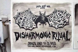
Punk artworks are usually in black-and-white as these are distributed and reproduced in posters, flyers, programs, fanzines. That conforms to Andy Warhol’s mass-production aesthetic.
A prime example is “Disharmonic Ritual,” which must be a gig poster for a punk concert. The pictorial plane is subdivided into four levels. On top runs Pojax Kult Elite Presents. On the third level is the piece’s title in upper-case lettering. The central image is of a bat with outspread wings, the performers’ names forming white webs or veins on the wings: Eyes of Fire, The Boxers, Sister Bastard, Monochrome, Surrogate Prey, TKNK, Kill Ratio, Blanix, Legarda Doo, Syrrup. At the bottom of the frame reads: Aug. 17, Year of No Lord, IDB Bar, Sucat Parañaque, P50.
In fact, Hidalgo played for the hardcore punk bands Eskapo and Delubyo in San Francisco, CA, to where he migrated in his teens. He had also created flyer and record artworks for the Bay Area punk community.
He was a member of the Bay Area artist collective Kwatro-Kantos. His art had been featured at the Mission Cultural Center for Latino Arts and in San Francisco Museum of Modern Art.
Now in his mid-30s and back in the country, he has exhibited at the Cultural Center of the Philippines and in Green Papaya Art Projects.
A footnote to this exhibit is a unique edition of the artist book installed on a white pedestal in one corner of the gallery. Titled “It Didn’t Look That Far on the Map,” it is a compilation of studies on form and perspective, of mechanical tools, a staircase, a gasoline hose, a man revving up on a motorcycle. It is not for sale.

