At the Philippine Furniture International Show (PFIS), exhibitors met the challenge to remain creative yet viable despite stiff competition from China and other markets.
Organized by the Cebu Furniture Industries Foundation, the Chamber of Furniture Industries of the Philippines, and the Pampanga Furniture Industries Foundation, the first PFIS focused on the entire furniture industry.
J. Antonio Mendoza, PFIS’ creative director and curator, gathered big names in design to give this trade show an energetic face.
“We’re trying to bring out the very best of the Philippines,” he said.
Many exhibitors reverted to traditional craftsmanship to produce forward-looking designs. Others updated their top sellers.
Many followed this year’s trend that highlights copper and brass and the return to luxury.
“The Asian Modern, which dominated the late 20th century to the early 21st century, is over. Everything now is gold, gold, gold. People are going back to old familiar forms with a contemporary take. They look at the past not to copy, but to learn from it and inspire new designs. Kenneth Cobonpue says, ‘The world doesn’t need another chair, but you still need to innovate,’” said Mendoza.

Designer’s pick
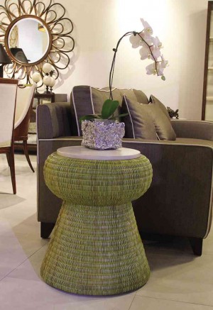
Cebuano company Pacific Traders presents what it does best—Filipino craftsmanship born out of years of research and development. It is subcontractor to international home brands. This green woven rattan drum table with faux parchment top is a fine example of combining traditional craft with modern design.
Lightbulb moment
The dramatic chandelier has tiers of inverted glass domes with classic filament glass bulbs. The lighting fixture, with copper-finished aluminum and cable supports, has that wow factor. Azcor designed it for the beach to withstand the elements.
Old is new again
It’s a wrap
Reimagining the classics
The sunburst mirror frame is given the distressed antique gold finish. Viewers are tricked into thinking that the wrought-iron chest with playful curlicues is made of wood. Tanseco’s works appeal to designers and buyers who are looking for conversation accent pieces.
Oodles of doodles
The outdoor chair, executed by Locsin International, is futuristic yet “baroque,” says designer Tony Gonzales. Made of aluminum frame, PVC and synthetic fiber, the Calligraphy chair resembles his doodles. “I wanted to break boundaries and buck the trends,” he says. The chair has been getting inquiries from buyers, as they’ve never seen anything like it.
Transitional
“The rectilinear geometry, the enhanced proportions and the chrome handles are modern but the material, solid mahogany, is traditional.”
The design marries the quiet Asian aesthetics with early American viewpoint, with the refined and narrow moldings. The walnut veneer framework encloses the composition as a picture frame would, says the architect. The drawer faces are made of a lighter material, parchment. All told, the striking contrast makes this piece an interesting focal point.
It’s hip to be geometric
Daniel Latorre Cruz dramatizes the pentagon by playing with proportions. For Designs Ligna, he hollowed out the geometric coffee table to display some accent pieces.
Anton Mendoza’s sofa shows how function follows form. The sofa is striking in its simplicity yet designed with the user in mind. It’s deep enough for back support and just the right size so the legs don’t dangle. The arm rests are generous and just the right height so you don’t hunch your shoulder. Elegantly streamlined, it can fit any narrow door or elevator, and blends with most interior design styles.
Raffia and rattan
Game of thrones
Milan-trained Cebuano designer Vito Selma was inspired by the iconic buri peacock chair. His company utilizes the ancient way of weaving buri, but with a modern design. The round back is reinterpreted into a hexagon and the proportion is blown up to seven feet in height. Covered in gold, this chair is fit for the beauty queen.
Rocking