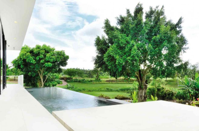
Build as a series of horizontal planes that appear to rise over glass walls, the weekend house of businessman Richard Upton is designed to assimilate the ambience of the surrounding golf course.
Understated
The style is understated, reflecting the aesthetic of its architect, Anna Sy.
The three-level house is constructed on a rolling terrain. From the street, it looks like a one-story bungalow.
As one enters the house, however, what unfolds is a series of views, capped by a rooftop 360-degree view of the surroundings.
“The façade looks like a very understated volume. Then the back side becomes a prominent two-story volume with a reflecting pool,” Sy explains.
Although the house seems to float with its whitewashed walls and large expanse of glass, planes of dark tiles run from the infinity pool to the basement that serves as visual anchor.
“It’s as if the house is sitting on a stone base,” she says.
To make his residence seem like part of the landscape, the owner favored tall grass as natural fence. “There’s no perimeter wall, which most people would never do. The grass serves as boundary” says Sy.
Layout
The flow of space was one of the initial steps in designing the house.
“How do we maximize the views for most of the rooms? That was how we came up with the layout. We spent a long time with the layout. Then the architecture comes together as a whole. Some are fixated on designing the exterior, then they will force their layout to work in that idea. We work the other way around. We start from the inside to the outside so that everything is integrated,” says Sy.
The sliding glass doors that open up to the outdoors obscure the difference between the indoors and outdoors, as if the entire floor was one continuous space.
“There is no formal living and dining area, no lanai. There are terraces above and below. Many traditional houses have a lanai after the living room. In this house, we made the living and dining areas so open that they could also serve as the lanai. When it is hot, you close the doors and turn on the air-conditioning.
“When you open the doors, you feel as if you’re eating in a lanai. The house is cool because of cross-ventilation. That goes with the informal lifestyle of the client. We thought of his day-to-day living. He plays pool so there is the pool table below,” Sy explains.
Simple
Sy adds that her client’s needs are simple. Upton wanted a vanishing edge pool that not only soothed the senses but also blended with the scenery. He also requested a dressing room with a center island to pack his luggage.
Since he collected Asian arts and crafts, Sy built an oak veneer shelf-wall that divided the space between the open plan area and the stairwell.
Sy favors a neutral palette, characteristic of modern architecture. The look reflects her personality and Harvard training.
“In school, they emphasize clarity in what you’re trying to do,” she says. “The simpler, the better. Culturally, it’s not us. Filipinos like things to be flamboyant. We visually like to see things happening everywhere. I prefer minimal elements similar to the Japanese and Swedish aesthetics. We like to do architecture that is straightforward and not overly embellished.”
Although the house uses quality materials such as Italian tiles and narra, there were concessions due to budget.
“We had to keep looking for alternatives,” says Sy. “It took a long time. It was a big consideration… to maintain the palette and the feel that we would like. For example, in the kitchen cabinetry, we would have preferred wood veneer.
“But it was expensive, so we used laminate. There were compromises… As long as the overall idea was kept, we could work with him on that.
Reprinted from Cocoon Magazine