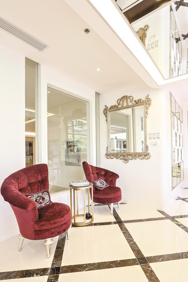
When the medical couple Z and Aivee Teo started work on their newest beauty clinic in Alabang several months ago, their main challenge was to come up with fresh-looking interiors that were still reminiscent of their two older clinics inspired by the French gilded age.
Compared to their old Alabang clinic at nearby Bellevue Hotel, their new address at Commerce Center has the luxury of space—300 sqm, with a spacious open-air veranda overlooking tree-lined Filinvest Avenue.
It was a “good” challenge, says Z, a native of Singapore where office spaces can be quite limited and expensive.
“This isn’t a medical clinic where sick patients go to,” says Z. “It’s an aesthetic clinic where healthy people go to so they could look and feel good. They come here to feel pampered and comfortable.”
They tapped the services of Singaporean interior designer Malcolm Chua of Avid Interiors, who also did the couple’s two older clinics.
Chua opted for “modern French.” He described it as the “modern interpretation of the French traditions and luxury with an emphasis on ‘less is more’, essentially a reductivist approach to exude glamour and maximize function.”
Compared to the Teos’ other clinics at Megamall and at the Fort, which are rather ornate, this one took advantage of the sweeping view of Alabang’s greenery by using big picture windows and achieving a streamlined effect.
Marble welcome
The clinic’s reception area, a white marble-top wooden counter, is wide enough to divide the clinic into two wings. Excluding the operating suite and Aivee’s consultation room, the clinic has six treatment rooms, including a couple’s room with two beds.
“We learned that people in the south like to come in big groups,” says Z. “Our couple’s room is proving to be popular not only with couples, but also with friends and mothers and daughters.”
Slabs of Italian off-white Volakas marble with variegated gray patterns make up areas behind the reception counter and one leading to a wing of treatment rooms. Inspired by an airport lounge, the latter serves as service-buffet area serving drinks and snacks.
“We ended up removing some slabs in favor of plain white marble and wood,” says Aivee.
The shiny white marble floor accented with crisscrossing diagonal stripes of black marble works well, and so does the ivory-striped wallpaper in the rooms.
“Since this is still a clinic, the dominant color should still be white,” says Aivee. “But plain white could look too boring and antiseptic. This striped off-white wall paper looks just right.”
Since the drop ceiling above the reception area is quite low to allow room for air-con ducts and pipes, Chua used as accent a series of mirrors and pin lights to give an illusion of height.
“It turned out to be a cool solution because everyone now wants to take his or her selfie here,” says Z with a chuckle.
“Since the area behind us is surrounded by trees, we all agreed on letting the outside in,” Aivee adds. “Because Alabang is known for its lush trees and clean air, we wanted to stay true to that feel.”
Chua used a lot of picture windows. To create a semblance of “continuity” from the outdoors to the indoors, the printed carpets in the treatment rooms echo the shapes and colors of the trees outside.
Like in their Megamall branch, most of the accent chairs and tufted furniture come in neutral colors. Bright colors are confined to carpets.
Cooler shades
In the Alabang clinic, however, Chua opted for carpets with cooler shades instead of bright tones.
Aivee chose the carpet in her consultation room—a combination of warm and neutral colors in huge abstract prints.
The room’s unique triangular space also allows her to see what’s happening in the other wing through a series of glass panels.
What the three branches have in common are the chandeliers, glass-lined double doors, sliding partitions and huge, framed mirrors.
To go with the Alabang clinic’s low ceiling, Chua chose smaller mirrors and chandeliers. Even the restroom has a chandelier.
He also worked around the low ceiling by carving out and building circular niches to highlight the chandeliers.
He reserved the best and most unusual chandelier— transparent, all-crystal—for Aivee’s consultation room.
“We’re not only being true to our older clinics’ DNA,” says Aivee, who drew inspiration from a charming hotel the couple stayed in two years ago along the French Riviera.
“Opening a new clinic isn’t just an exercise in continuity. It’s also an occasion to improve ourselves as we learn from our past experiences”
With her growing line of eponymous, doctor-prescribed skincare products such as moisturizers and sunscreens, Aivee has a testing counter in her new clinic.
Chua sourced the furnishings and decor from Singapore.
However, Aivee salvaged a few pieces from the old clinic, like a mirror-top round table with distressed finish, which she matched with two modernized batibot chairs with silver finish and upholstered seats she bought from Filipino furniture designer Ito Kish.
“The combination makes the place an interesting mix of traditional and new, imported and locally sourced elements,” she says.
Follow the author on Twitter and Instagram @alex_y_vergara