The spaces are planned to fit a modern lifestyle that has become more simplified with all the conveniences and technological essentials of a home in this century. The family who lives in this house exemplifies this new lifestyle, one that covers interests and values as wide and diverse as the digital age can offer.
Division of spaces
The design solution was site-specific. A collaboration with architect and design firm Budji+ Royal (Budji Layug and Royal Pineda) produced a seamless integration of exterior and interior spaces.
The lot is on an incline sloping downwards to the street from the back of the property line. With the neighbors overlooking the property, this logically posed a problem in terms of privacy for the owners. The architectural design had to address this particular challenge.
The result was a view of a wide expanse of landscaped greenery for both the owners and their neighbors, with the main volumes cleverly tucked in between the plants and trees.

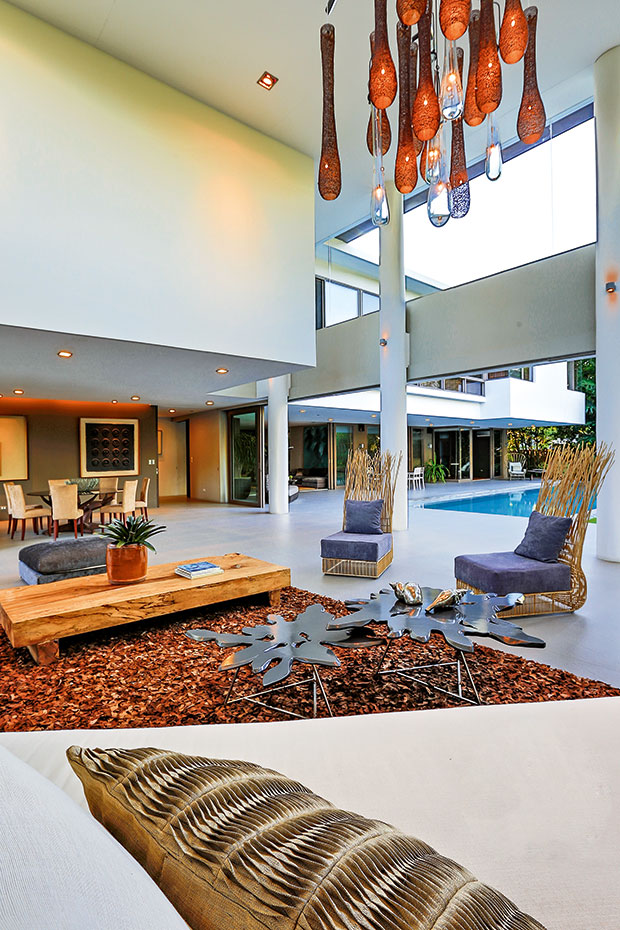
The designer furniture and accent pieces including the pendant blown glass lighting fixture were chosen specifically to go with the high cantilevered ceiling.
Photo by PJ Enriquez
The plan is arranged around two three-level concrete volumes that form a right angle. Each volume has a specific function: the basement for the service and utility areas; the ground floor for an open kitchen and the main living areas fronting the pool; and the upper floor for the private living areas and bedrooms.
The ground floor of this wing houses the traditional dining room, now a new social space that is more relaxed and inviting, where the open kitchen becomes an extension of the living room. The dining room leads to a private family room, these spaces run parallel to the pool and the garden.
The upper floor contains the bedrooms and spans both left and right wings. Light and external noise are deliberately more filtered in these areas and you sense that you have entered a private space, a cocoon with a collection of portrait sketches, family photographs and travel mementos. The vibe here is slower than the living spaces on the floor below. Pushed to the rear of the property, this volume is made up of “privacy cubes” that shield the neighbors’ line of sight. Tall bamboo poles planted along the boundary act as natural sound buffers, effectively deflecting external noise.
The entrance wing has a high cantilevered canopy ceiling projecting from the upper floor, held up by a vertical support of columns. The equivalent Philippine vernacular architectural feature of this would be the silong (shadow), a space below the main house where traditionally things would be stored. Like a modern silong, the grand lanai now has an updated function. Fully transparent, it is an open, spacious and airy hangout where the family can entertain friends and enjoy the surrounding landscape and pool. The double height of the ceiling and its openness allows you to see the clouds in the sky, trees, their branches and leaves casting shapes and shadows on the lanai’s floor. The transformative power of nature softens the architectural planes and is at full play here at different times of the day.
The orientation of spaces and the strategic placement of all openings not only provide cross ventilation but also fill the areas with natural light in the daytime. You can still enjoy the house and its setting even in the absence of power.
You get to see and experience the full width of the property when you stand at the center of the lot, from one end to the other with the clever use of openings, glass, cantilevers, invisible boundaries, and strategically placed walls.
Photo by PJ Enriquez
Any way you look at it, the house has all the most prominent features of modern architecture: open interior floor plans with fewer walls, sliding panels that open up to bring the outdoors in, straight and angled lines, and exterior building materials of glass, stone and high density homogeneous tiles. It is one of the best examples of a modern house that always incorporates the topography of the land it is built on, within the home’s design.
While creating a space to live is quite simple, it is the thinking framework and a philosophy that includes working with nature, that is complex. This is a house that says this best.

