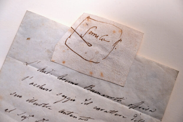
Times New Roman was dark chocolate and anxiety. Book Antiqua was pineapple juice and boredom. Impact and Avant-Garde—there was no distinction between these for him—were the aftertaste of vomit and a whiff of panic, but quickly settles to a nothingness he found bearable, thank God.
If Ramuel Villapando had any choice, the world of text—and the world indeed was swimming in it—would all be Helvetica or Palatino Linotype, which ranged from the whiff of vanilla or citrus paired with the most acceptable of emotional response: an edge of satisfaction you could mistake for happiness. Do not bring up Edwardian Script or Verdana, the sight of which prompts in Ram not just a peculiar taste or feel—but hives that suddenly appear, and depending on exposure, could range from the mildest of rashes to the most life-threatening of swellings, like the worst of allergies.
It occurred to Ram when he was eight that perhaps he was not at all an ordinary boy—that what he took for granted as something the rest of the world also saw and felt was actually quite singular in him.
Was there any sufficient explanation? Synesthesia. But growing up, he had never heard of the word, and all there had been was an ever so slight tickling under his skin every time he’d pass by a billboard, or when letters flashed on the TV screen, or when he’d open a picture book. He learned quickly to avert his eyes from anything bearing typefaces, serif or sans serif, and in the movies he’d concentrate on the popcorn in front of him when the titles flashed and was quickly out of the theatre before the closing credits rolled. He thought he just didn’t like words. Which was strange, because he had a natural affinity for them.
It wasn’t the handwritten word that ate at him, thank God. It was the printed kind. When he finally learned to read for real in the first grade—that experience in turns exhilarating and exhausting—that was when everything blossomed into something he could taste and feel, and sometimes smell and hear. Comic Sans was noxious fart. Perpetua Titling was nails scratching on chalkboard. Wingdings was the tip of feathers touching the bare skin of his soles.
He never told anyone—not through the gauntlet of college with its textbooks, most of which were mercifully printed in Galliard or Arial. He took up Fine Arts, naturally. His images spoke for him, and in his colors and strokes he could let his mind relax enough to express itself.
But there was finally the ad agency. And there was Miko, the graphic designer and copywriter he was teamed up with. Miko had the most beautiful brown eyes; it was easy to get lost in them.
“What do you think, Ram?” Miko held up an ad they were designing. “I thought the main copy should be in Avenir Black.” Cotton candy, the surrender in a sigh. “Looks good,” Ram said.
“Or Didot?” Bunny fur, the contentment in a cat’s purr. “Looks good.” “Or Century Gothic?” The fluff of clouds, the feeling of waking from a good dream.
“Looks very, very good.”
And Ram heaved a sigh of the deepest relief.


