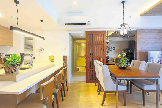
At first look, the 80-sq m pied-à-terre at One Shangri-La Place in Ortigas Center seems like a study in neutral colors and sleek lines.
It has a soothing ambience and a décor that’s safe without being boring, says Angelo Gabriel Siochi, chief architect and creative director of AGSiochi Architecture+Design.
“I wanted the design to feel like a hotel—relaxing,” he points out.
The color theme is inspired by the taupe, beige and gold elements of the condo lobby. These tones are echoed in the finishes, while the metallic touches are seen in the shiny pillowcases, the art installation and the legs of the dining table.
The condo’s charm also lies in its use of space. The kitchen is partially concealed from view from the main door. One’s eye is drawn to the living room and dining area.
The architect manages to put in a corner office near the kitchen, a multipurpose island for cooking and casual dining, and a statement table for the formal dining area.
There are no bulky kitchen appliances—the essentials are tucked inside cabinets. The drop ceiling of wood vinyl makes the living room feel cozier.
Room depth is achieved by the contrast of beige and textured wooden walls.
A Japanese-style slatted door separates the public spaces from the private areas—
“to hint at some mystery,” says Siochi.
The master’s bedroom can accommodate extra bed space on the built-in ledges. The cabinet becomes part of the headboard, and a niche was built to accommodate displays and a side table. “The wall becomes a storage facility,” adds Siochi.
Mood
The simple lighting design stimulates mood. The architect favors Steltz lighting because they emphasize desired elements.
Siochi collaborated with FinoPino, a furniture firm owned by designer John Vigilia. FinoPino’s sectional sofa was cut on a diagonal for flexible arrangement. Siochi likes to offset formal furniture with playful pieces like Triboa Bay’s stair lamps and Kenneth Cobonpue’s Chiquita stool.
For his architectural studies, Siochi attended Mapua Institute of Technology. After college, he needed to work in a design firm to help him with his board exams. He went to Budji Layug + Royal Pineda, where he cultivated a refined sensibility for space planning.
He was influenced by their “clean design,” says Siochi. “I learned to style as an architect from Budji.”
His young firm has already acquired many residential and corporate projects. “I have the passion for design and the sensibility of putting together what is good or right.” —CONTRIBUTED