When an infectious diseases specialist and his dermatologist wife acquired almost 300 sq m of property in a quiet subdivision, it was primarily because they wanted to be near her brother.
Otherwise, the bungalow wasn’t exactly what the couple would call their dream house.
Built with a 1980s aesthetic, it had a number of curious features—among them, a spiral staircase in the center of the room leading to an attic, a ceiling so low you could touch it with your fingertips if you raised your hand high enough, and a tree house in the backyard.
The smell of animal pee and poop was also prominent, as the previous owner had 10 dogs.
Potential
Yet the couple’s architect, Jason Buensalido, saw huge potential in the otherwise dark and dingy property. Guided by images of the couple’s idea of a dream home, as well as answers in a questionnaire he had them fill out while they were living and training in the United States, Buensalido set to work on a design that married his clients’ specific requirements with his vision of a home suitable for a Filipino family.
“As Filipinos, our idea of a single unit is a family,” he explains. “When you marry a person, you marry that person’s habits, traditions and even his family. I envisioned a huge open space for this family to choose to be in, rather than in their own bedrooms.”
Buensalido also went for clean, minimalist lines to allow the couple’s personality to show in their choices of furniture and accent pieces.
Though about 20 percent of the old house’s structure was salvaged for this renovation, its latest iteration looks entirely new.
The architect did away with the usual gate and instead installed a tiled driveway and shaded wood parquet.
“The previous house had a front gate but apparently the homeowner didn’t follow the village’s regulations,” explains the dermatologist. “We were hoping to retain the exact location of the gate in our design, but it was not approved.”
So, the couple did get their “gate,” but in the form of black sliding grills incorporated in the main entrance. Like a typical sliding door, the grills “disappear” into a pocket on the side. Slanting like a rhombus, the gate and main entrance glass door are instant icebreakers for new and returning guests.
“Everyone who walks into this door walks like this,” says the infectious diseases doctor with a chuckle as he mimics visitors’ right-leaning gait. “Everyone.”
Designed experience
“We believe in designing experiences,” Buensalido says. “With its shape, you’re more aware when you step into the door. You feel like the space is engaging you.”
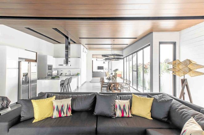
The original dark interiors have since been replaced by the refreshing sight of a bright, airy and generous open plan, an unimpeded flow of living area, dining area, kitchen and family area. High ceilings fitted with wood enhance the desired spaciousness, as do walls of exposed light gray concrete and clear glass.
Wood-based and Filipino-
designed furniture complement the thoroughly modern interiors, achieve Buensalido’s goal to bring family together.
The sofas from Omo by Milo Naval in the living and family areas are large enough to accommodate a huge brood, and then some. Family and friends can also interact in the open kitchen facing a 12-seater dining table from Dexterton.
Personal touch
Paintings by the couple give the home a cozy and personal touch. The dermatologist is responsible for the cheerful pieces in the living room, artworks that used to hang in the couple’s Michigan apartment.
Her husband’s painting is in the family area, a somber rendering of a tree fronting their US apartment at the height of a polar vortex.
The two bedrooms on the ground floor, and the master bedroom and room for their young son and daughter upstairs, are smaller than usual.
Rugs add pops of colors and prints, and quirky details such as a teepee and oversized Lego blocks give the kids’ room a playful vibe. Ditto with the powder room and restrooms, whose sepia-toned ceramic Spanish tiles never fail to elicit oohs and ahhs from guests.
Glass jalousies in the rooms provide natural ventilation and light, while deflecting rain and the sun’s rays.
True to Buensalido’s design, this house consistently brings family together. The dermatologist’s parents have stayed over in the guest room that now includes a luggage rack and a painting of a vinta, an homage to their province in Zamboanga.
The man of the house doesn’t have to go very far to relax and recharge after work. “When I’m here I don’t want to leave,” he says with a smile. “It’s like I’m in a vacation home.” –CONTRIBUTED