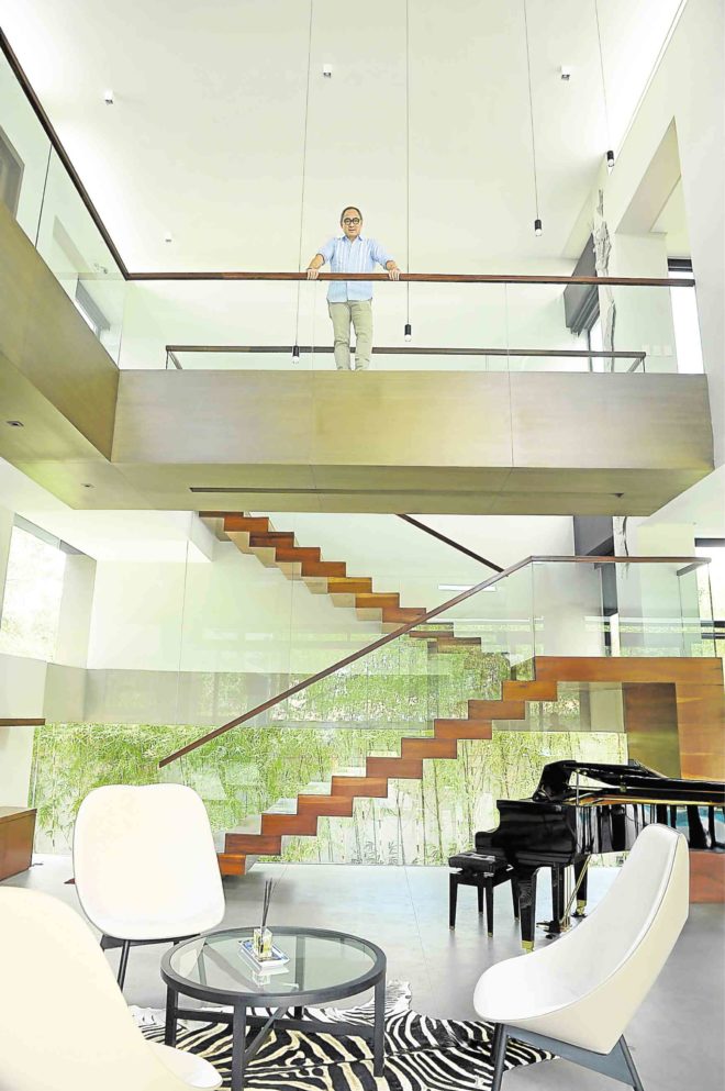
The name Eduardo “Ed” Calma has been synonymous with minimalism, an architectural style that conveys geometry and simplicity of form to highlight materials. Through the years, his contemporary style has evolved by adopting elements of Filipino architecture and influences from one of Italy’s greatest architects of the 20th century, Carlo Scarpa.
Scarpa is admired for stirring up subtle emotional experiences through the layering of spaces, the harmony of materials, the layout of design in relation to the outdoors, the combination of basic materials with precious stone, overlapping and intersecting lines and architectural details that become decorative elements.
Calma takes these elements and creates from them.
Christian Tinio is a contractor who also runs a real estate business in Luzon. Over time, he collected beautiful hardwoods. He and wife Tonet decided to send their sons to study in Metro Manila. In time, the couple acquired a 1,000-square-meter lot in a tree-lined subdivision near their sons’ school. Tinio was able to use the supawood and dungon, which he had accumulated over time.
The Tinio house designed by Calma stands out for its clean lines and lack of intimidating fence in a neighborhood of gated residences with embellished façades.
Courtyard drop-off
“I wanted to open the front of the house out onto the street by creating a courtyard drop-off. Most houses have gates that seem unwelcoming,” says Calma.
A long, rectangular portal serves as demarcation. “The portal frames the entry. It also creates a threshold between the outside and inside. It makes you stop before entering the semipublic zone,” he explains.
The gray tile pavers blend with the colors of the walls, establishing a sense of continuity. “It looks as if the walls emerge from the ground,” he says.
Calma points out that the house adopts bahay-na-bato features, such as the contrast of stone masonry with glass and translucent materials. Instead of traditional capiz windowpanes that diffuse the light, he favors an onyx wall that is backlit at night.
In the U-shaped house, the spa, the living room and the lanai frame the pool.
The design reiterates Calma’s trademark. Foremost is visual continuity. Tall doors intersect with the ceiling, creating the illusion that one is the extension of the other. The unified tiled flooring from the living room and formal dining room runs through the poolside, achieving a generous space for entertaining when the sliding doors are open. Bathroom counters and walls are of the same tile; headboards extend into working desks. A hidden shoe cabinet becomes part of a stair landing. Cabinets disappear into walls in the dressing room. Supawood wraps around the floor to the ceiling in the spa.
There are other recurring motifs. The swivel door features a slim vertical metal strip handle that intersects with the strip light on the eave. The main space is defined by the double-volume ceiling, which creates a kind of “Venturi effect” that forces the wind up when clerestory windows above are open, thus releasing warm air accumulated inside the house.
Drama
The clerestory windows also allow daylight, the better to appreciate the true colors of the materials and the artworks.
“These features should be typical of Asian houses,” he explains.
Over time, Calma has created drama through his sculptural staircases and layering of space. An homage to Scarpa is the uneven sizing of steps to produce a sculptural rhythm, in place of uniformly boring steps.
Inside, the main staircase is admired for its stark geometry. The steps look like hardwood planks that are stacked one on top of each other. From a distance, they become a succession of intersecting lines, framed by a clear glass baluster.
The stairway is placed against a window that offers a view of the bamboo fence and the sloping driveway. It lends the illusion of being part of the house and part of the driveway.
The house is furnished with Italian lighting and furniture and designs by Patricia Urquiola. Calma collaborated with sculptor Jinggoy Buensuceso for the artworks. A Mondrian-style gate doubles as a sculpture and a boundary. “Ink,” a metal series of inkblots, emphasizes a structural column in the staircase.
“Instead of the clients buying art and making me find the space to put them, we worked with artists to make the artwork part of the architecture,” he says.
The house is a fine example of how Calma continues to evolve despite the challenging conventional ideas of architecture. He shows how a walk through the house can be mesmerizing with the use of space and its interaction with the landscape, highlighted by raw materials and artistic details. —CONTRIBUTED
Reprinted from Cocoon Magazine Issue No. 10.1, available at selected bookstores and magazine stands nationwide.