Up until the last decade, the luxury condominium was defined by state-of-the-art techniques and imported materials such as Italian granite or Indian slate. But when developer Filigree launched Botanika Nature Residences in Muntinlupa, it took the organic path. It sought to situate itself in the tropical climate, using local materials.
Botanika has portrayed itself as an oasis—replete with birds and butterflies—in the urban jungle. And this is not hype.
The residential complex sits on 1.5 hectares of land, 70 percent of which is devoted to greenery and outdoor amenities.
It will consist of three midrise buildings, surrounded by landscape and nonreflective surfaces. The design is characterized by permeable walls following the breeze and air movements.
Leandro “Andy” Locsin Jr., head of Leandro V. Locsin Partners, the local architectural counterpart of the project, said that Filigree, was not compelled to fill every corner with sellable GFA (gross floor area).
“Luxury isn’t about expensive materials or over-the-top design. Ultimately, the space differentiates itself by how one feels about being there,” Locsin pointed out.
The most striking impression about Botanika is that unit owners will feel like they are outside, as they are constantly cooled by natural ventilation.
Wind tunnel
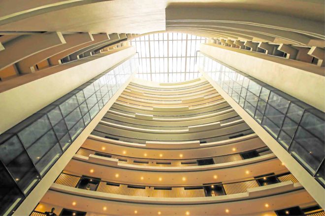
Locsin acknowledged William Higgins of foreign partner firm Architects International for collaborating in the leaf-shaped plan of Botanika. “The building looks like an elongated doughnut with an empty space in the middle,” he said.
Instead of a vertical box, the architecture is distinguished by a curved geometry that lends an organic feel. When the three towers are completed, unit owners will appreciate that the subtly curvilinear building inhibits unsightly views.
“When the building’s curve is directly in front of a building with the similar shape, you won’t be looking into your neighbor’s unit,” said Locsin. “The surface peels off on a different line. The layout provides the beneficial privacy.
“From an environment viewpoint, it acts like the surface of a wing,” he added. “The curvilinear structure has spaces with openings that are at an angle to one another. This encourages a laminar flow or straight, smooth paths of air. You get nice cross-ventilation, and an airy feeling.”
The building’s passive cooling applies the Venturi effect, a scientific principle in which the design and building’s position are oriented toward the dominant breeze direction to create air pressure zones, said Locsin.
Botanika is raised above the ground for the air to flow through and up the central atrium which creates a wind tunnel effect. The skylight is bordered with small openings for air circulation. When air flows, produced by hot air moving upward, it goes up the central atrium and out of the openings. People will feel the cool breeze as they walk along the corridors on any floor.
Locally sourced
Locsin pointed out that most of the materials were sourced locally to lessen carbon footprint. Local stone, engineered woods, araal (slates) were used in nontraditional ways. He added that Botanika was aiming for a three-star rating from Building for Ecologically Responsive Design Excellence (Berde) of the Philippine Green Building Council.
The first building has already been turned over. The 12-story Botanika Tower 1 consists of 101 units ranging from 123-square-meter two-bedroom units, priced at P28 million, to 214-sq-m three-bedroom affairs, pegged at P43 million.
Corner units have generous, wraparound balconies. Penthouses have been sold out.
Each unit comes with two kinds of kitchens. A maid’s room has a louvered wall for natural cooling and an amenities area. There are 10 units per floor and each level faces the cool central atrium.
The developer also understands how landscaping adds value to the property. Hence, it commissioned master urban planner Aecom to make the landscape a central feature.
Armando Casibang, Aecom Singapore’s director of design and planning, explained how the landscaping adopted patterns of movements that helped make Botanika emotionally engaging.
“At the main drop-off, there is an architectural wall covering the lush green forest,” said Casibang. “As you enter the lobby, there is water cascading in front of you.”
Breezeways are lined with ponds on the ground floor and central atrium. This is a treat for visitors.
Pocket spaces
The tiered swimming pool in the middle of the three buildings is the “jewel of the landscape,” said Casibang. Once the surrounding trees have grown, the pool will appear like it’s partially hidden in a lagoon.
“The site is undulating without having too many abrupt changes of levels,” said Casibang. “You look back and see slopes. The highest level in this property is the poolside. You get a sense of climbing uphill.”
The landscape is designed with zones catering to various demographics. The north side, dedicated to the children, has a tree house and a series of pods for interaction. At the end of the atrium walkway is a cabana, built on a platform, where families can gather. A greenhouse, which will allow residents to put their plants, can also be a setting for afternoon tea.
“The idea is to maximize opportunities for pocket spaces,” said Casibang. “You can either be out in the open or be all by yourself.”
To get the Berde rating, all the plants must be endemic species and drought-tolerant to reduce water consumption.
Ultimately, Botanika redefines the parameters of a high-end development.
“We did a retake on what people valued,” said Locsin. People from the premium market define luxury as living an “environmentally ethical life.”
“It is going back to the simple things—a beautiful garden, bumping into your friends, feeling part of community, feeling safe and breathing good air,” said Locsin. “Safety, nice people, good air. That is true luxury. People are discovering that.” —CONTRIBUTED