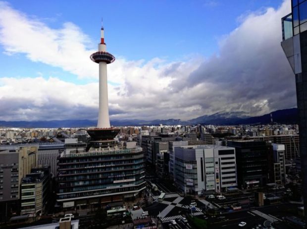
KYOTO — I’ve heard that foreign tourists feel disappointed as soon as they get off the train at Kyoto Station, particularly if they have immersed themselves in images from travel guides ahead of their first visit to Kyoto. Instead of the historical buildings, they anticipated after seeing so many in books and on the internet, they are confronted by the milky white 131-meter-tall Kyoto Tower, which is unarguably a modern building.
The tower was designed by an architect named Mamoru Yamada (1894-1966). Before World War II broke out in Europe, Yamada met with such modern architectural giants as Le Corbusier and Walter Gropius, and was greatly influenced by them.
Yamada’s signature style is the use of curved lines and curved surfaces. The Nippon Budokan Hall in Tokyo, another Yamada work, has a gently curved roof. Similarly, Kyoto Tower has a cylindrical shape with a curved surface that makes it thinner toward the top. It is said that Yamada drew the outline of the tower freehand without calculating the degree of the curve.
Yamada aimed for a cosmopolitan style before the start of the war. Yet don’t you think his Nippon Budokan and Kyoto Tower, both constructed in 1964, somehow have Japanese features?
The roof of the Nippon Budokan is modeled on the outline of Mt. Fuji, which is a familiar theme of ukiyo-e woodblock prints by Hokusai and Hiroshige. And there is more. When seen from above, it has an octagonal shape, which is very similar to Yumedono (Hall of Visions) at Horyuji temple in Nara Prefecture.
Kyoto Tower looks like an upside-down warosoku, a traditional Japanese candle. Warosoku, unlike cylindrical Western candles, becomes thicker toward the top. It seems that Kyotoites are amused by likening the Kyoto Tower to a huge warosoku candle that is offered to Higashi Honganji, a gigantic temple just north of the tower.
Yet before Kyoto Tower emerged — when it was still in the planning stages — its design was criticized by scholars and cultural leaders, who maintained the tower on completion could damage the scenic beauty of the ancient capital. Its height was the most significant problem, based on an unwritten rule that buildings higher than Toji temple’s five-story pagoda, which was built in 1644 and is 55 meters tall, are not supposed to be built in Kyoto.
Tested by time, however, both the tower and the pagoda have established their statuses as landmarks of Kyoto. Renowned religious scholar Tetsuo Yamaori, a resident of Kyoto himself, once said to me: “The black tower of Toji [which looks blackish as it is a wooden structure] in the south is seen across Kyoto Station from the white Kyoto Tower in the north. Their combined view is exquisite.”
Speaking of landscape destruction, the current Kyoto Station building created controversy, too, as the 60-meter-high structure is higher than the five-story pagoda.
Hiroshi Hara (1936-), who designed the station building, is classified as a postmodern architect. In the building, there is a large, valley-like atrium above the concourse, with flights of stairs sloping upward and outward on the eastern and western sides. Although Hara does not clearly say so, it is said that the space symbolizes the Kyoto Basin. That interpretation stems from his explanation that he incorporated the traditional jobo system, the grid-pattern city plan of the ancient capital Heiankyo (now Kyoto), into the building’s design.
Unlike old cities in Europe, where old streets lined with old buildings have been preserved intact, Kyoto has a mixture of old, modern and even postmodern buildings. I want to stress that if those buildings are truly excellent works of architecture, they must have some Japanese or Kyoto-esque elements deep within. I hope people will explore and find them. Yasuhiko Mori