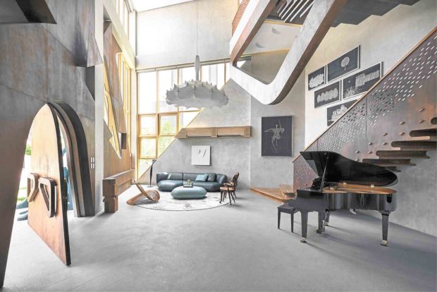
The design of contractor Pablito Calma’s house started from a playful sculptural model of his son, Carlo, an architect.
Calma’s son’s firm, Carlo Calma Consultancy Inc., literally thinks out of the box.
The façade of the house is not the conventional plain surface with windows and textured walls. Rather, it is a vibrant play of overlapping geometric shapes and layers of oversized, decorative architectural brackets and sweeping forms.
In one’s imagination, the geometric and organic elements look like three-dimension cut-outs mounted on a collage.
Calma likens it to “the skin peeling off to show the bones.”
The younger Calma’s design is characterized by asymmetry, flamboyance, dynamic shapes and references to nature.
He was partially influenced, he says, by Catalan architect Antoni Gaudi—who was famous for the world landmark, Sagrada Familia, in Barcelona, his surreal bent, his dramatic use of space and volume and experimentation with surface treatments.
At first glance, the revolving arched front door and the staircase look like they’re made of wood. But in fact, they’re made of steel, oxidized to achieve a rust color.
Carlo Calma explains: “My dad was inspired by Gaudi’s carved oak armchairs that were made from a single piece of wood. I was looking for that same organic feel, so we ended up with fluid aesthetics in this house.”
He also drew references from Brutalist Architecture, a style known for functional reinforced concrete and steel and for its imposing and geometric proportions.
“We use concrete in the whole house and in the portals on the facade—so there’s that Brutalist aspect. But I’m creating a new language that’s neither Gaudi nor Brutalist,” he says.
Planetarium
He describes the open-plan living and dining areas as landscapes on the ground-floor social area. These areas are defined by the varying heights of their ceiling.
The main living area has the cathedral ceiling and the voluminous space that lend it drama.
The rails of the main staircase also have the weathered, rusty look.
The architect widened the Indonesian teak risers so that they double as bookshelves.
in the dining room.
“The staircase looks like a monster because of the grand scale and the patterns of perforated half moons which people interpret as eyes,” he says.
The big windows are shaped like right triangles where one side is angled at 90 degrees.
Elements from nature abound in his design. The cathedral ceiling is embellished with crescent-shaped lights that resemble a flock of migrating birds—while retaining the function of ambient lighting.
The ceiling, he says, could be seen as a planetarium with abstract heavenly bodies.
The living room is a visual metaphor of a forest. The designer sofas and the seaters are shaped like rocks, trees and foliage set atop a carpet of feathers.
“It looks like a deconstructed forest,” he says.
In the dining and kitchen areas, the ceiling height drops—to create a feeling of intimacy.
Although the kitchen is designed by Bulthaup, with cabinetry made of wood laminate oak treatment, there is a marble island that is Calma’s design signature.
The enlarged crescent-shaped cove ceiling in the kitchen continues the crescent light patterns of the living room.
A lighting fixture by Dutch company Moooi, which resembles origami birds, echoes the movement theme of the architecture.
The 18-seat dining table is for big groups. To complement the mood, a rectangular abstraction of the Last Supper by sculptor Daniel de la Cruz suggests activity in the dining area.
Three stories
In another conversation corner, the ceiling doubles in height to define a different space.
The informal sala has an L-shaped sofa with iBeam legs by Patricia Urquiola, a Moooi carpet with tree branches, artworks by Indonesian artist Yunisar and by Joey Yupangco.
Huge windows open to the views of talisay trees outside. When the trees grow, they can form a canopy over that corner.
The house has three stories, 10 meters in height.
On the second floor is the older Calma’s minimalist bedroom, the oak headboard integrated in the Poltrona Frau leather bed. Sculptural shelves, Indonesian teak flooring and spare decor create quiet luxury and warmth.
Two rooms are for the gym and linen storage which can be used as bedrooms since they have bathrooms.
The balconies bear playful, ornamental touches such as curved ramps to create the feeling of fluidity, if not extravagance.
“In the future, the ramp will serve as seating area and plant box. The balcony can turn into an outdoor lounge,” says Carlo Calma.
His room on the third floor continues the look of fluidity. An S-shaped structural support curves from the bathroom ceiling and flows into a headboard (which doubles as a partition for the bathroom), and gracefully bends into a bed platform.
Since there is no demarcation between the bed and bath, the bedroom is made of tile that mimics wood.
“People say that my room is overexposed from the outside. It juts out from the architecture. I have that extra balcony that will serve as garden for my plants,” says Calma. “Even if my room is open, I will have privacy because of some architectural details.
“The bathroom doesn’t have to be classified as a bathroom per se. It’s my kind of lifestyle where there are no borders. I want curvilinear shapes that define the spaces.”
Asked to sum up his design, Calma says: “It’s an architecture of exuberance. It comes with playful elements, blurring (the line) between art and architecture and drawing from nature forms. The house is like a living, kinetic sculpture. It’s a new kind of storytelling.”—CONTRIBUTED