This entrepreneurial couple are empty nesters. They’ve been slowly making a transition from a 320-sq m house to a 230-sq m condominium. For design firm Atelier Almario, the downsizing entails a plan to maximize the space.
Interior designer Victoria “Ivy” Almario has to understand the clients’ needs and activities to create their condo living. The couple’s penthouse loft in a mixed-use development is a pied-à-terre for entertaining. Since the couple are frequent travelers, they also require ample storage for their suitcases.
The lady of the house is an art collector who needs shelves to display artworks and pottery. Moreover, there are space provisions should the couple finally decide to make the penthouse their permanent residence.
The clients also want a condo that’s like a luxury hotel suite.
Challenges
The design challenges included the adjustment of the floor plan from a three-
bedroom loft to a single master bedroom and a public space, and working around existing plumbing.
In the original floor plan, the first floor had provisions for living room, kitchen, dining room and a bedroom. The second floor predictably had the master bedroom with a grand deck and a guest room.
Almario explains that the couple wanted to maximize the deck for entertaining al fresco. “We flipped the developer’s plan,” she says.
The owner told the developer to keep the spaces open and just provide the materials for the walls and flooring. The layout would be designed based on the owners’ needs.
The first floor was turned into the foyer, hidden storage area and master bedroom.
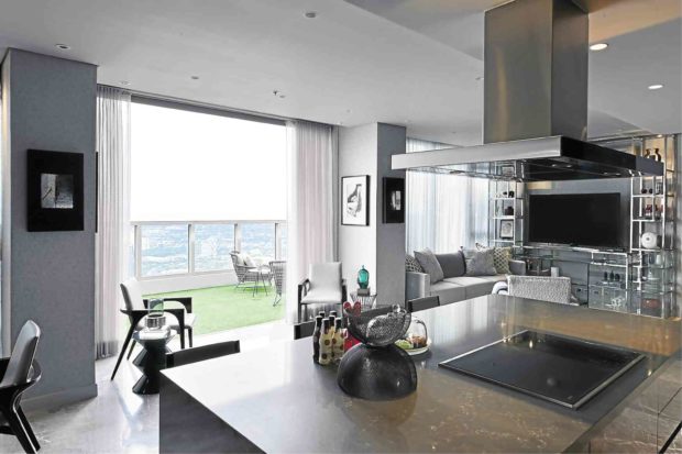
The second floor was transformed into an entertaining area. Since the wife loves to cook, the kitchen—flanked by the living and dining areas—is the focal point and faces the balcony that gives a sweeping picturesque view of the city and beyond, far into the horizon.
“We had to be mindful of the main utility lines which can’t be moved since they are part of the entire condo. Relocating the plumbing was like piecing
together a jigsaw puzzle,” says Almario.
Nonetheless, Atelier Almario felt fortunate to work with a bare unit that served as a blank canvas. The owners specified to the developer that they didn’t want partitions. They wanted the space customized to their needs. Hence, there were no thick walls, cabinetry and fixtures to knock down. The open space gave the design firm more options to explore the space potential.
Neutral palette
The home is welcoming. The foyer reveals the condo’s neutral color palette and with its display of artworks, the owners’ passion for art collecting.
The surface treatments reflect the signature polished style of Atelier Almario—textured wallpaper, antique gray marble stairs and a glass baluster leading to the second floor.
Hall closet doors made of wooden slats not only disguise the generous storage for luggage, golf bags and shoes, but also make an artistic statement. The sculptures by Bullet Demetera and Ramon Orlina create a powerful impact.
The master bedroom is glammed up with an upholstered tufted leather headboard. Its bed is flanked by two palisander blue marble side tables. A deep tufted sofa in front of the bed also doubles as a day bed.
The room is surrounded by customized metal shelves which display works by BenCab and Arturo Luz. There’s a sculpture of a human by Juan Sajid Imao with the signature sarimanok comb by his father Abdulmari Imao.
Like in a hotel room, it has a hidden mini refrigerator.
On the second floor, the plumbing lines in the original plan are maintained.
The kitchen is located on what was meant to be the bedroom, bathroom and toilet. The bathroom sink is now the kitchen sink. The range hood was also taken into consideration. The kitchen’s focal point is the Caesarstone quartz island, surrounded by lacquered cabinetry.
Illusions
The compact space was designed to give the illusion of bigger space.
The open balcony makes the condominium look bigger. For spatial impact, the windows were converted into large sliding doors.
Opening up this wall captures the view of the deck and blurs the boundaries between the interior and exterior. It also makes a seamless transition from the kitchen, living and dining rooms into the balcony.
Full-length silver gray curtains emphasize the ceiling height and make the space seem taller. The pale silver shade also brings in more light to make the room seem bigger.
Another way to visually enlarge the compact condominium is through the continuity of unifying colors and materials. The antique gray flooring in the main area continues toward the staircase.
The gray scheme is used throughout the penthouse. This allows the eye to travel smoothly across various open spaces. Its neutral tone is both soothing and dramatic.
In Atelier Almario style, a healthy dose of shine is created by reflective surfaces and the layering of high-gloss lacquer, stainless steel and mirrors—all of which make the condo more glamorous.
Metal shelves are built on both floors not only for visual continuity, but also to serve as design solution for lack of wall space to display art.
The furniture is a mix of premium brands and customized pieces chosen in proportion to the space. The pieces allow the hosts to arrange the furniture for intimate conversations or for entertaining more guests.
The balcony is luxuriously paved with faux turf and decked with a customized stainless-steel bar, a dining area and outdoor furniture by Kenneth Cobonpue.
At parties, the owners share their passion for wine collecting with friends while savoring the views of the Sierra Madre and Laguna de Bay.—CONTRIBUTED