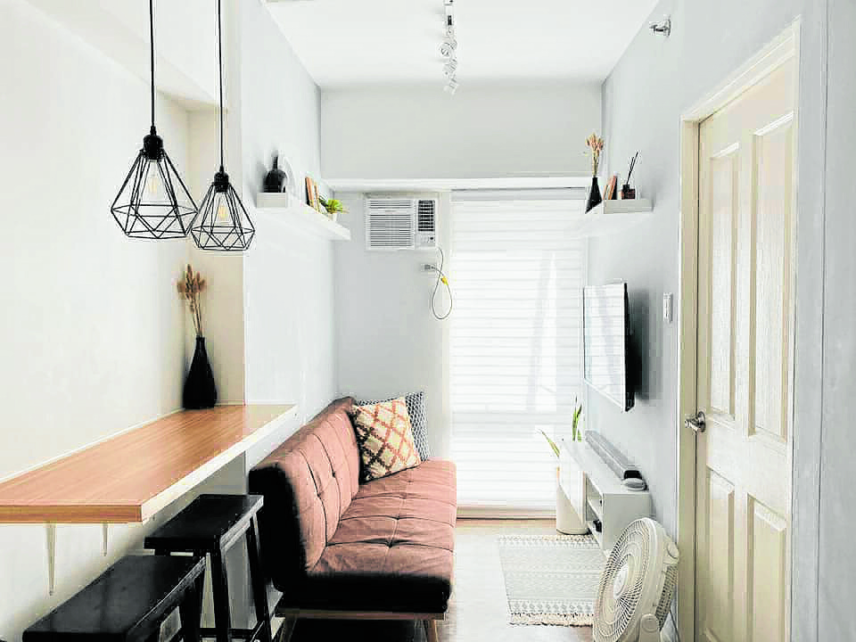
Small spaces present an opportunity to be creative. Our virtual neighbors from the Facebook page Home Buddies share tips on how they made use of the limited space they have.
Angel Cundangan credits the Home Buddies page for the design ideas used in her 30-sq m home. Taking cue from the popularity of white shades and wood, she went for a Scandinavian theme for her nooks and bedroom.
A multifunctional area was the route Lei Roscom took when she designed her coffee and breakfast nook. The cabinet was also used to organize her kids’ snacks and spices and condiments.
“If there’s anything that I’ve learned living in a small space over the years, it’s investing in quality functional pieces and having a dedicated and organized space for everything,” Roscom writes in Home Buddies.
Everything is functional in Charles Duante’s 31-sq m bachelor’s pad. The graphic artist’s well-thought-out space includes a bench by the entrance that doubles as storage for mail and house slippers. Across it is a full-height closet.
He chose pretty containers for his open shelves to store essentials such as creamer and sugar. The industrial drop lights, black hardware and accessories add masculinity to the space.
Duante said that he planned for his space for more than a month and regularly consulted his ideas with his architect supervisor. He initially wanted a dark-theme home, but eventually decided against it because darker shades would make his space look even smaller.
“My priority was to have plenty of storage while keeping it looking spacious and functional. Even when the space is small, it looks bigger,” he said. (You can get more design ideas from his YouTube channel, @Charles Duante.)
Repurpose items
Sheryl Evangelista-Baculinao inspired many virtual neighbors when she posted photos of her laundry room. From the quirky signs to the ingenious storage for detergent, her space has since become the design peg of other members.
“When our helper of almost 10 years left, we decided that our three children were old enough to do things on their own and to help out around the house,” she said. The maid’s room became a storage area but when it became an eyesore, Evangelista-Baculinao decided that it was time let go of a lot of stuff.
Finding ways to repurpose items kept this mom busy during the lockdown. She also thought of turning the room into a gym, but she decided that a laundry room took greater importance.
She got design ideas from Pinterest. Most of the items have been repurposed by hand.
“This laundry room is very dear to me because I would exchange ideas with my brother,” she said. “He was also excited to see the outcome of this project. But sadly, he passed on a few months before it came to fruition. I hope he is pleased and is smiling down on me; he was always so generous with his affirmations.”
Evangelista-Baculinao said that seeing other people getting inspired by her space brings her joy. But she said that people need to think about what will work best for them.
“Categorize your items,” she said. “Other homes’ categories may not apply to yours, so ponder on how your home functions and what things are in it. Imagine how you go about your daily routines and think about what things you need easy access to. All of these must be considered when organizing your rooms. Think pretty with purpose, and remember that form follows function.”
Light and monochromatic
Shiella Marie Atienza of Konstruktura Atienza, an architect, shares tips on how to design small spaces.
“Keep it light, calm and monochromatic. Use soft tones of accent color to highlight features if necessary,” Atienza writes in Home Buddies. She added that good lighting and allowing natural light to come in make a space feel open and airy.
The use of drop ceilings should be minimized, Atienza said. But painting the ceiling white or a very light shade can make a ceiling look larger. A dark ceiling, meanwhile, creates depths.
Doing a linear layout on furniture and cabinetry is also key to avoid clutter.
“But this kind of space planning will need technical people to transfer some TV and cable outlets,” Atienza said. The use of mirrors on walls will make a space appear larger.
She added that less decor and hanging frames will achieve a lighter-looking area. Bulky frames and paintings are a big no.
Some items should serve at least two purposes, like a sofa being converted into a bed, Atienza said. An interior designer or architect can assist you in making the most of a small space.