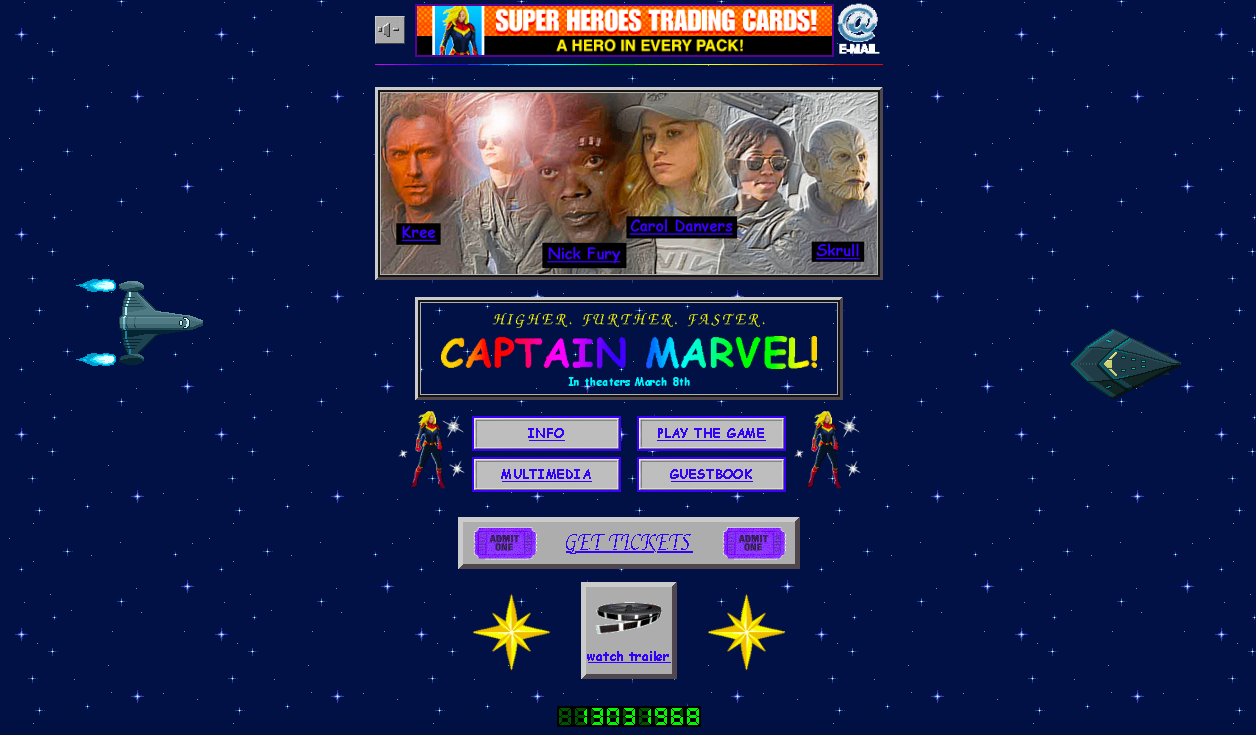
Today is the day that Marvel’s marketing team gets praise from me, a nerdy nobody. We all know that Captain Marvel’s coming out soon to dominate the blockbuster (as Marvel films usually do). So in order to hype its fans and audiences, they came up with a website for the movie. But it just so happens that their web designer used ‘90s HTML codes to create it.
Captain Marvel is an upcoming film from Marvel Studios set in the ‘90s. It is the cinematic universe’s first female stand-alone film after years of success in the box office. And so far, they are not disappointing any of us.

The website is done in a way that our fourth-grade class back in the day could have done it. Captain Marvel’s site is bedazzled with a starry sky background. There are comic sans in a rainbow gradient, a website banner that I may or may not have done in MS Paint, and of course, a LED visitor counter down below the page.
It is so dumb—I love it.
Check out the site right now. Expect a lot of Word Art gifs in comic sans, images of humanoid aliens that weren’t feathered in Photoshop properly, and clipart backgrounds galore. My eyes are hurting because of the clashing gradients. But you know what? At least, my need for nostalgia is satisfied.
Go to the website here.
Photo from Captain Marvel’s website