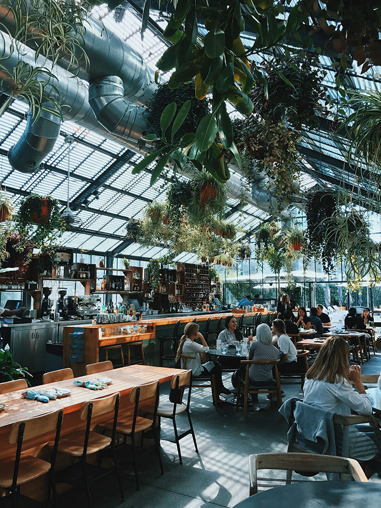
In a generation fueled by social media and populated by visual consumers, having beautifully presented dishes just isn’t enough anymore. Restaurant design also has to impress and be worthy of a mobile click, especially since this is the very first thing customers devour. Hipster murals on the red brick wall just won’t cut it. If you want some millennial love, talk to them in the language they know best—make it picture perfect.
Initial impact
Branding your restaurant concept is a big deal. Successful branding will hit the target market where it counts and elicit a lasting impression, making you the instant and obvious choice for whatever goods or services you are offering. With flawed branding, you’ll be deemed tepid and, like many, easily forgotten.
The chance to create a mind stamp goes beyond interior design. Brand marketing extends to your logo, menu, business cards, furniture, utensils, and choice of art. It can even involve the kind of service training you give your service staff. All these contribute to a restaurant’s distinctive character. Color alone can trigger the memory of a brand. Yellow and red remind us of McDonald’s, while orange immediately suggests Jollibee.
Restaurant design has to impress and be worthy of a mobile click, especially since this is the very first thing customers devour. Hipster murals on the red brick wall just won’t cut it. If you want some millennial love, talk to them in the language they know best—make it picture perfect.
Logos, your staff’s uniform, and company ideals are only a few of the elements that work into a cohesive brand strategy. And they all should be considered part and parcel of the design of your restaurant. Extending your brand into your dining space helps the customers understand a little about who you are and what makes you unique.
In early 2016, Manam Comfort Filipino opened its flagship store in Bonifacio Global City. The store features high vaulted ceilings, mirrored wall panels, and a cozy private room. As you enter, you’ll be greeted by a distinctly Filipino solihiya-inspired floor and a banquet that represents the brand’s Pinoy fare. You will also notice the refreshing light blue color dominating the logo; the color extends to the unassuming and casual layout of the menu and uniform. Manam’s choice of materials, utensils, and even the signage by the bar that says “#masmalinamnam” lend in conveying the brand’s DNA, which is Filipino, casual, comfort food.
Shoot, click, share
Food porn may eat up most of your mobile’s photo album and storage space, but not far behind are snaps of Le Petit Soufflé’s hanging plants, Hey Handsome’s tile work, and Señor Pollo’s mural. People have turned to immortalizing not just food but also Instagrammable zones in the restaurants they can share with their network of friends. It’s a lure to lounge in a pretty space. And since it’s posted by the customers, it’s real and credible marketing. Best of all, it’s free.
Just about every inch of the dining space can act as a target for a mobile photo shoot. Single Origin in Rockwell uses furniture that complements its interior’s industrial and rustic look. Its Short Ribs Benedict looks even more mouthwatering when photographed against its dark hardwood tables.
As attention-grabbing as Bruce Ricketts’s inspired dishes at Mecha Uma are, the sculptural ceiling draped with a rusty steel installation leaves a lasting impression. Fast food restaurants have also caught up to design trends with Greenwich Pizza & Pasta plastering its walls with posters written with witty lines like, “Don’t ask for extra rice, ask for extra slice.” Open kitchens also feature design-style and entertainment as well as add to the whole dining experience. Made Nice Supper Club and Hey Handsome restaurants are proof of this.

Intelligent interiors
It’s not enough to design a pretty space; it should be functional and smart, too. To make the most of every inch in your rented room, proper planning and layout are needed. The general rule of thumb for space allocation is that the dining area should make up most of the total space (about 60 percent), while the kitchen, storage, and preparation areas should share the remaining area. These dimensions will have to be adjusted if you plan on having a waiting area or a bar.
When considering the environmental design of your restaurant, even small decisions require much thought, as they deliver a big difference. The use of secondhand items can be beneficial. It has become common in trendy or “hipster-type” establishments to have non-matching cutlery and dinnerware. Using refurbished wood or recycled plastics as decor can also be a good sustainable business practice. And do not forget the energy-efficient lightbulbs. Single Origin in BGC and Rockwell makes good use of refurbished wood for its interiors.
There certainly is as much beauty and story in the kitchen and dishes as there are in the restaurant’s walls and furniture. If the chefs are becoming more thoughtful and wary about what they’re cooking, the restaurateurs and builders are not far behind as they are following suit with more conscious and intelligent designs.

