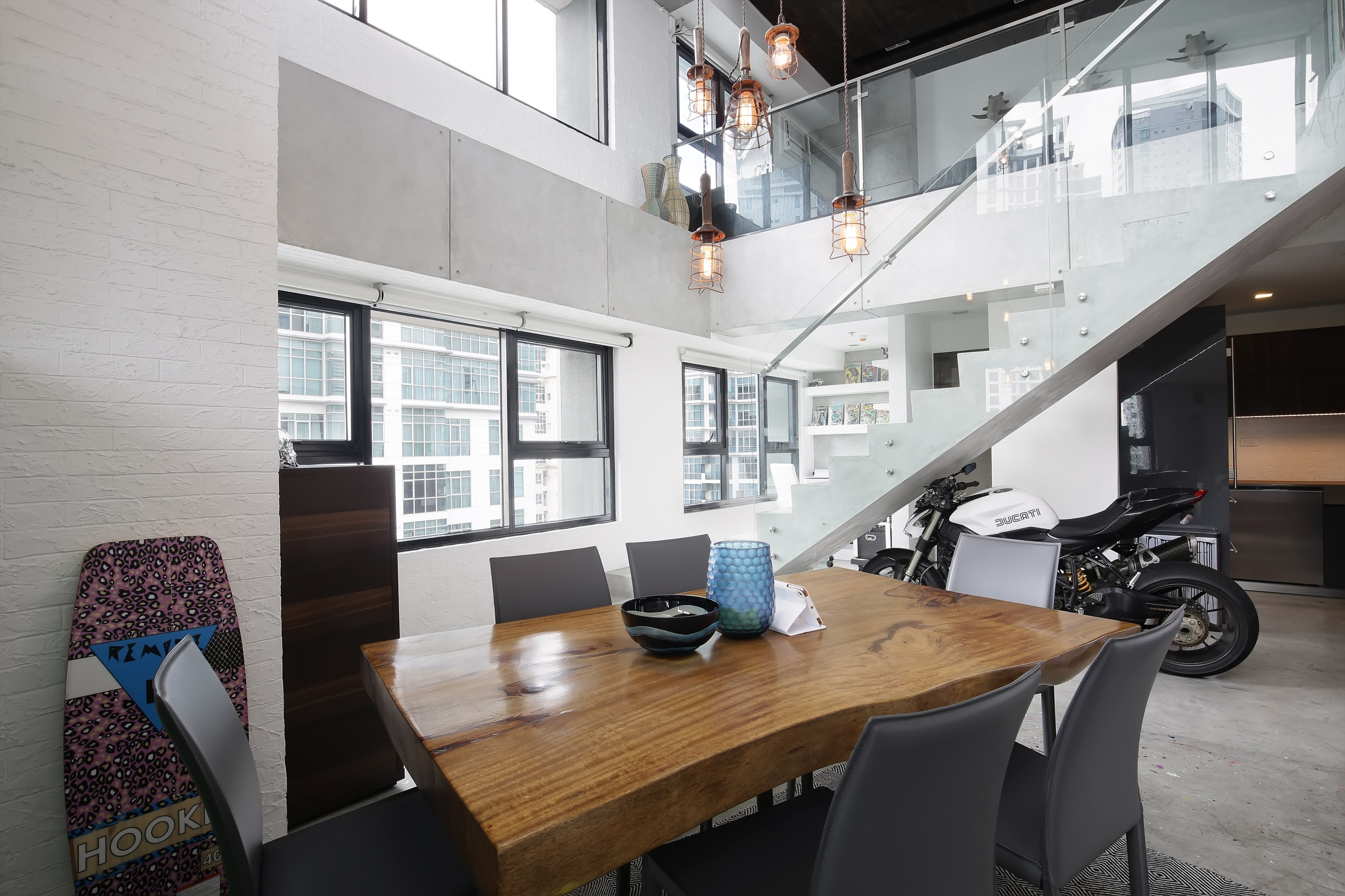
It’s that time of the year again when we open the doors of our home to a number of visitors, even to some we don’t expect. Schedules are packed with dinners and get-togethers. Relatives all over the world are visiting to be updated on what they missed for the past year. Best friends come over for intimate gatherings, maybe even in just pajamas like the old times. With all these traditions, it’s no surprise that most prefer to redesign their homes to be ready for hosting any occasion.
Yet with all the food and gifts you need to prepare, redecorating can be quite a job. How can it not be? You’re planning to buy a new set of furniture—all in the shade of living coral to celebrate the 2019 “Color of the Year.” You want your curtains, carpet, and even placemats to match it.
But here’s one thing you should know: It doesn’t have to be all “matchy-matchy.”

Forcing yourself to buy and pair furniture to make your home look cohesive is unnecessary, not to mention stressful. Interior design consultants have told us that staying stiff to only one color, pattern, or theme doesn’t only take much of your time, it also takes the intimacy out of the occasion. There are a lot of things you can do to make your home look cozy and elegant without the fuss.
Design consultants from Ethan Allen Philippines shared to Nolisoli.ph a few tips on how we can mix furniture and maximize our house spaces to make it look welcoming, like this loft apartment in Bonifacio Global City, Taguig.
Contrast your style
If you’re opting to refresh the look of your rooms, find your design antithesis.
This means if you’ve been buying gray pillows, white bed covers, black tables, and everything else in neutrals, you need to add something that’s exactly the opposite of it. And as much as possible, the contrasting furniture should be the main furniture. Take a look at the bedroom above, for example. In a layout of neutrals, a bright blue headboard stands out—providing the visitor a visual interest as the room is not too dark despite the dominant gray tone and not too washed out despite the surrounding white walls.
Match textures instead of colors
The thing about using textures is that it adds depth to what the eye perceives. Common definitions of texture would state that it’s something you can feel when you touch a surface of a certain material. However, texture is not just limited to that.
If you’ll observe the living room layout above, you’ll notice that although the two chairs don’t match, they still look like a pair. The pairing of an upholstered olive green sofa and a tufted beige accent chair blends well, primarily because both have the same finish—suede. According to the designers, if you want your room to generate a sleek feeling, don’t look at the colors. Look at the textures, which are the key to adding weight to the overall finish of the room.
Take advantage of patterns
The key to combining different patterns without overdoing it is to know how you will take advantage of each print. Don’t just choose prints that appeal to you individually. Find a common ground among them.
This room, for example, carries a total of five patterns: chevron for the wall, dry brush for the pillow covers, vertical stripes for the comforter, trellis for the bench, and quatrefoil carpet. But you won’t notice these immediately, except for the striking gradient of blue and white of the wallpaper. This is because each pattern is within the same theme, all in the motion of going down or up.
Also, notice that the undertone of each print is in the similar shade of beige.
Even your tableware doesn’t have to match
There’s no reason for you to buy new sets of tableware to make sure that all your guests will have matching utensils and plates. Remember that there’s more to the occasion than those silver, gold, and crystal items.
According to Patricia Pastelero-Tañedo of Spruce Floral Designs, you don’t really have to stick with one theme or material for the entire table. “That will only make it look stiff and cold.”
If you’re preparing a table for the family, it’s best that you keep it casual and just mix and match the utensils you already have. “Mixing and matching is a nice way to not stress yourself out and create intimacy,” Tañedo said.
There you have it. There’s no need to create much of a fuss when preparing for the holidays. Just be resourceful and follow these steps from interior designers so that you can maximize your luxurious space.
To browse through more luxury property listings, visit List Sotheby’s International Realty Philippines at listsothebysrealty.ph.
Photos courtesy of List Sotheby’s International Realty Philippines
Get more stories like this by subscribing to our weekly newsletter here.
Read more:
An editor’s notes on how to entertain at home during the holidays