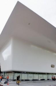
AMSTERDAM — An enormous white bathtub made out of bullet-proof material is to catapult Amsterdam’s world-famous Stedelijk modern art museum back into the 21st century after an absence of almost 10 years.
The museum that over 70 years ago set the trend for the now ubiquitous white gallery walls reopened last week adorned with its 100-metre bathtub-shaped extension that architect Mels Crouwel describes as “shiny, flashy… and white”.
The Stedelijk’s collection of more than 90,000 art and design objects, from Bauhaus to Warhol, is one of the most important in the world, but times have changed since its 20th-century heyday when it had few competitors.
Dozens of modern art museums have sprung up around the world, with franchises such as the Guggenheim becoming globally marketable brands for wealthy cities seeking a higher-profile and tourist cash.
The Stedelijk, founded in 1874 and whose name simply means “City Museum”, must now compete with the likes of London’s vast Tate Modern, opened in 2000 and already the most popular modern art museum in the world with over four million visitors a year.
But the Dutch museum has an edge thanks to its pioneering place in history, and now, of course, its headline-grabbing extension.
With its sloping sides and white legs, the extension’s seamless 3,000 square meter (32,000 square foot) surface is the largest composite building in the world, a deliberately light addition to the heavy neo-Renaissance style of the original 1895 building.
“It’s a composite of resin reinforced with very hi-tech fibers normally used in the boat or aerospace industry,” Crouwel told Agence France-Presse.
“Shiny, flashy… and white”
Edwin Dommershuijzen of Teijin Aramid which makes the fibres — a Dutch invention five times stronger than steel — said that using anything else would not have worked because of expansion and contraction with temperature changes.
“If you want to make such a huge part out of one piece of aluminium or steel, no way,” as they would expand and/or crack, he said.
“The nice thing about these materials, carbon fibre and para-aramid fibre, is they both get shorter when the temperature rises, while the resin they’re contained in gets longer when the temperature rises,” said Dommershuijzen.
“It compensates and then in the end nothing happens,” he said.
While the coating is “more or less exactly the same” as that used in flak-jackets and helmets, the museum’s new extension is not quite bullet-proof. That would require several more layers.
The Stedelijk’s ornate 1895 building rubs shoulders with the now better-known Van Gogh Museum and Rijksmuseum, home to Rembrandt’s most famous work “The Night Watch”, on Amsterdam’s Museumplein (Museum Plaza).
The area is a main draw for Amsterdam’s 12 million annual visitors, and all three museums are undergoing or are to undergo extensive renovations, with the Rijksmuseum and the Van Gogh Museum both to reopen next April.
Nevertheless, work on the Stedelijk and the Rijksmuseum has taken years longer and cost many more millions than planned.
Willem Sandberg, a graphic designer who curated the Stedelijk from 1937 to 1941 before becoming its director until 1963, sealed its avant garde status by painting the interior walls white and with a series of daring exhibitions.
The venue became quintessentially Dutch, moving away from the stuffiness of museums at the time to create what Sandberg called a place “where you dare talk, kiss, laugh out loud, be yourself, a focus of the life that’s lived today.”
In a sign of the museum’s ambitions to internationalise itself, former Los Angeles Museum of Modern Art senior curator Ann Goldstein was named the Stedelijk’s first US and first woman director in 2009.
Proud history of controversy
Presenting the renovation work, she hailed a “unique museum that gets under people’s skin, that enters into peoples’ lives”, vowing to continue the museum’s tradition of engaging visitors by “turning confusion into curiosity.”
The museum is proud of the controversy it has caused over the years and remains as critical as it is criticized.
This can be seen in the choice of John Knight’s “Autotypes, A Work In Situ”, housed in the “bathtub” and consisting of dining plates with blueprints of new additions to museums around the world on them, including the bathtub itself.
The Stedelijk says the work reveals “the uniformity of museum architecture… the changing role of the museum, which includes serving as a marketing tool for city branding within the ever-expanding spectacle of mass tourism.”
The museum has even had a dig at rising anti-immigrant politics in the usually tolerant Netherlands, with its first temporary exhibition called “Beyond Imagination”.
The museum’s blog said the show “mirrors the diversity and international character of the highly experimental Dutch art scene, a unique ecosystem at risk due to the current political climate.”
While the building’s architectural contrasts are obvious from the outside, once visitors are inside the exhibition space the interiors are all the same style and visitors do not know if they are in the old or the new.
“There are people who really hate it, they think it’s impossible to put such a white thing next to such a beautiful old building,” said architect Crouwel, whose father Wim Crouwel was the museum’s most famous graphic designer.
“But I think it’s good, you can see in which time which is built and you should always build for the future and not for the past.”