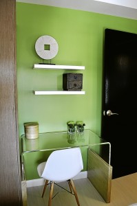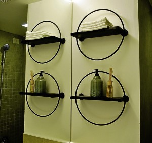
That’s how Gelo del Mundo edged out fellow interior designer Childy Elamparo to win top prize in the annual Metrobank Art & Design Excellence (MADE) competition.
They also appreciated the fact that Del Mundo, a graduate of the Philippine School of Interior Design, understood the transitory nature of condo living, as seen in his winning entry “Urban Asian.”
With sustainable lifestyle as overall theme, MADE, which also recognizes outstanding works in architecture and the visual arts, started accepting entries early this year.
Del Mundo and Elamparo bested 19 interior designers. By moving to the next level, both got the chance to turn their winning concepts into reality.
Del Mundo and Elamparo received P200,000 and P150,000, respectively, from Chito Sobrepeña, president of Metrobank Foundation.
The contest’s judges were architects Juan Carlo Calma and Arlen de Guzman, interior designers Jiro Estaniel, Michael Pizarro and Dr. Raquel Florendo, and urban planner and broadcaster Daphne Oseña-Paez, host of the lifestyle show “Urban Zone.”
Elamparo, a University of the Philippines graduate, who took graduate studies in Italy, was inspired by her Filipino roots to produce a chic ensemble composed mostly of stylized and Filipiniana-inspired pieces and elements dubbed as “Urbanized Filipino Bukid Living.”
Both contestants chose an imaginary young couple as their clients. They were each given a budget of P624,000 and less than two months to work on a pair of bare units at Oriental Place in Makati. Federal Land, developer of Oriental Place, is an affiliate company of Metrobank.
“I’ve felt and seen his maturity when it came to allocating a budget,” said Pizarro of Del Mundo. “Not only did he choose well, he took into consideration that he could be working on a transitory space.”
Unique furniture
Rather than spend a substantial amount of money on permanent structures, Del Mundo chose to allocate the bulk of his budget to unique furniture and accent pieces the couple could bring should they decide to move to a bigger space in the future.
“I designed only a few pieces and had them made because I believe in the wisdom of using existing furniture pieces from different designers,” he said. “There are plenty of talented furniture designers out there. I also went beyond the usual sources of furniture pieces in my search for something new.”
Apart from having the walls painted celadon, which seemed closer to “citrusy” apple green, said one judge, and cerulean, he used whatever money was left to retile and install a series of shelves in the couple’s bathroom. He also redid ceilings and the maid’s quarters, which doubles as the unit’s laundry area.
In contrast, Elamparo barely touched her unit’s bathroom and maid’s quarters, leading a judge to assume that she must have run out of budget after spending a considerable portion of it on a number of permanent structures, particularly a ceiling and wall treatment in the living room, which she insisted imparted an illusion of space.
The two had to account for every centavo spent. There was no rule against spending their own money, but they chose to stick to the budget.
Del Mundo’s move to do away with parquet flooring that came with the unit and to replace it with pale laminated wooden floor didn’t impress some judges. One also criticized his decision to put a glass-top table beside a floor-to-ceiling mirror as “unsafe.”
Elamparo won points for her decision to retain her unit’s parquet flooring. But to suit her concept, she had the existing flooring bleached.
She chose to design most of her furniture, including a wood-frame sofa and small bangko that functions as bench and coffee table.
Scale and proportion, a number of judges emphasized, weren’t her strongest suit.
While Elamparo’s work appeared more nuanced, albeit busier, Del Mundo’s entry had a tongue-in-cheek quality, as seen in eye-catching accent pieces such as a life-size bicycle in the living room made of bleached rattan, and a side table with legs resembling what looked like worn-out toothbrush bristles.
Practical move
Paez also cited his “great” understanding of living in small spaces. Again, she commended his decision to spend more on furniture instead of permanent structures as a “practical” move.
“He has a nice combination of colors,” said Paez of Del Mundo’s cerulean and apple green walls. “I also love the multifunctional quality of his furniture.”
Lighting is one area, however, where Elamparo had an edge over Del Mundo. Her predominantly neutral palette and soft lighting, especially in the master bedroom, is designed, she said, to induce rest and relaxation.
“While I was studying in Florence, I realized that Filipinos have much to give in terms of international design,” she said. “When I joined this contest, I was thinking of showcasing the Filipino design in a different way. I wanted to showcase, in a modern sense, a feel of provincial life in the big city.”
The Metrobank Annual Painting Contest was launched 27 years ago, but it was only in 2005 that organizers started recognizing outstanding works in interior design and architecture. From then on, it came to be known as MADE.
“It now involves practical aspects of the art as part of everyday living,” said Sobrepeña. “We call it visual arts at work. The theme has always been sustainable lifestyle, as Metrobank has an advocacy of encouraging people to use materials common in their area. We’re also promoting recycling and reuse of materials that are safe for the environment.”

