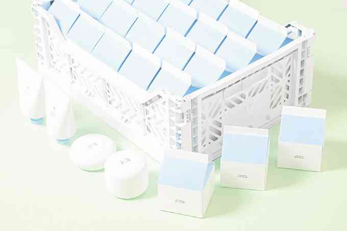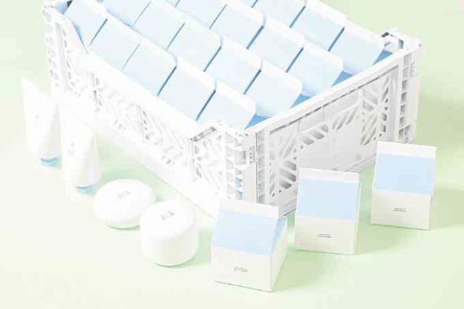
I’d like to think I’m a responsible shopper, complete with a mental checklist of what I want in my products and all. But when I found myself in Korea almost paying P1,600 for the petite 3CE White Milk Cream—a possibly basic lightening product packaged in a pristine milk carton sans a list of ingredients—I knew I was kidding myself.
Asian beauty fans know this struggle too well: The art of packaging is hard to resist. Part of the fun in doing the multi-step routine is seeing the products you’ve accumulated. Beauty, after all, is also about the experience. Brands that can afford to set up a physical store have the power of enticing a market through their interiors.
“In beauty, the experience at the point of sale remains the most important. It is where the sale is won or lost, where interaction with the brand comes to life, and where the seeds of loyalty are planted,” writes Pascal Armoudom and Hana Ben-Shabat in the paper “Beauty: Only as Deep as the Customer Experience.”
But what happens if the brand doesn’t have this luxury offline? Beauty e-commerce has been enjoying a boom locally since last year. The number of online sellers I see all have unique products and prices that can compete with more well-known offline stores.
Online presence, according to a study on beauty packaging done by The Benchmarking Co., does influence choice. About 79 percent of women in the survey decided to use a new product after seeing it on social media.
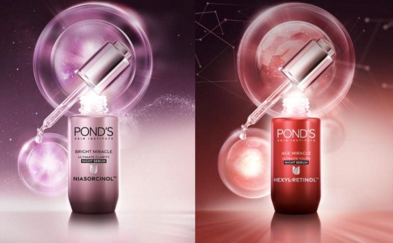
Like our friends’ travel photos that pop into our feed, a product’s design catches the eye more than its origin. Visuals are crucial to seducing the market.
The Global Cosmetic Industry says, “85 percent of consumers attribute color as a primary reason for their purchasing behavior. Color in a brand’s packaging and products help clarify and maintain the message of the branding, creating a key visual element in brand storytelling.”
Take the 3CE White Milk Cream. It comes in a blinding white shade that’s almost too pure; even liquid dairy isn’t that pretty. That packaging echoes its promise of perfectly clear skin, the one we used to have before puberty. That time, of course, was an age of juvenile innocence, hence the milk carton image.
It also helps that 3CE is a brand known for being stylishly quirky.
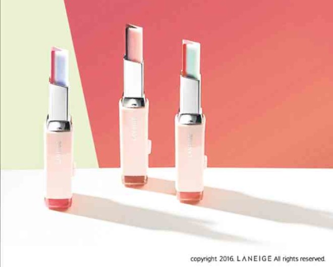
I’m also a fan of other brands’ packaging. Laneige’s Two Tone Lip Bar essentially solves the problem of gradient lips while looking like an artist’s tool. Tony Moly’s Inked Cushion Liner rides on the cushion fever, but really, it brilliantly embodies the idea of precision through quill-like packaging.
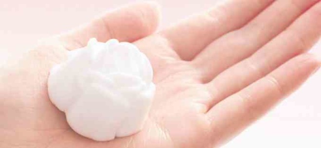
Happy Skin comes off sophisticated and playful with its puns and pastels. And, when done right, pumping the Kanebo Evita Beauty Whip Soap would produce a rose-shaped foam.
This is not to say the looks is everything in packaging. The best ones are both stylish and functional. If you end up using a pretty, beneficial product and don’t, at any point, complain or fuss about how you use it, you’ve got a winner right there. —CONTRIBUTED
