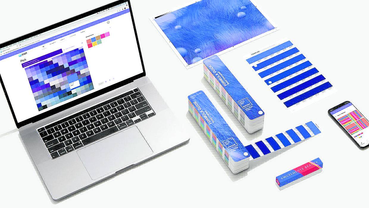
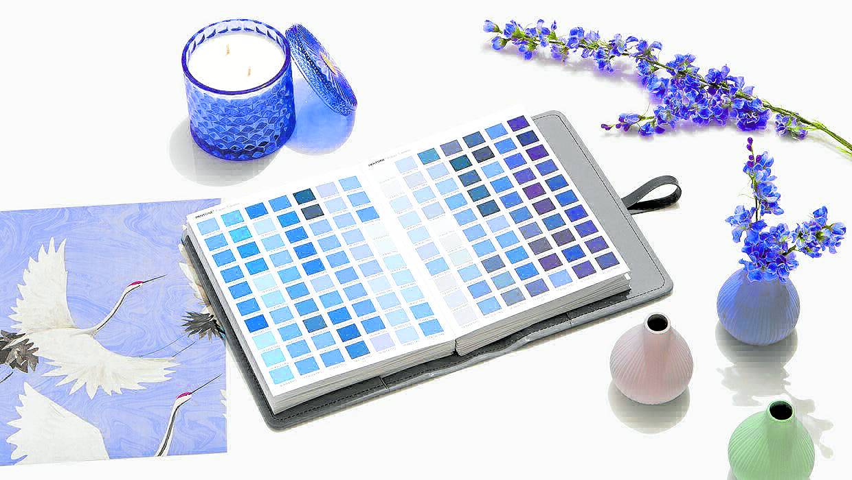
Very Peri blends dynamic periwinkle blue and exciting red-
violet undertones. Above, its application in home decor
—Pantone.com photos
As the world emerges from nearly two years of isolation and uncertainty, the Pantone Color Institute created a new color for 2022—Very Peri (Pantone 17-3938)—to capture the global zeitgeist of the moment. It’s the first time the New Jersey, USA-based company has created an entirely new color in the history of the Pantone Color of the Year, which started in 2000.
Very Peri blends the dynamic periwinkle blue with the exciting red-violet hues. It’s bright and optimistic. And it also reminds a whole Army of another global phenomenon—“borahae” (“I purple you”) or the color synonymous to the global phenomenon that is BTS.
“It’s okay, Pantone, you can just say ‘borahae,’” wrote one Twitter user.
Is 2022 the year of BTS? Or is this BTS’ world and we’re all living in it?
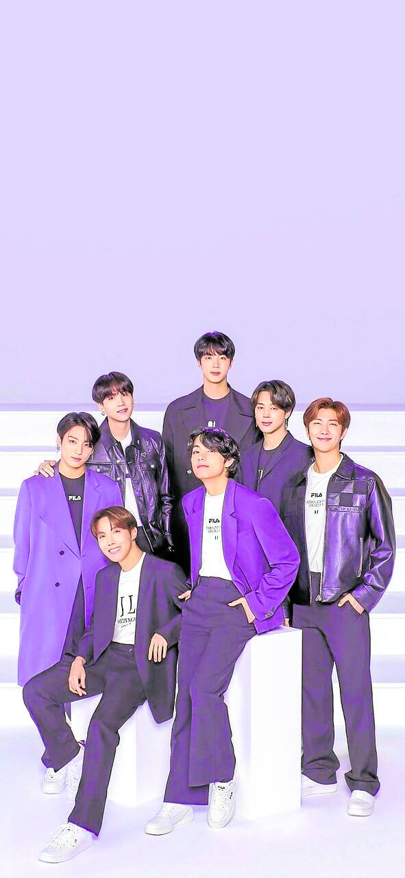
Considering how the Korean septet has captured the hearts of fans all over, it’s not a stretch to imagine that, quite possibly, the unofficial color of their fandom had influenced the trend analysts at Pantone.
According to the color authority, Very Peri shows off a “spritely and joyous attitude and dynamic presence that encourages personal inventiveness and creativity.”
Reflection of global culture
“The Pantone Color of the Year reflects what is taking place in our global culture, expressing what people are looking for that color can hope to answer,” said Laurie Pressman, vice president of the Pantone Color Institute.
Since the year 2000, the prognosticators at Pantone have carefully selected a color (or colors) that will dominate the year. They look into entertainment and pop culture, fashion, even travel destinations, emerging trends in technology and lifestyles and socioeconomic conditions. Gaming was also one big influence on the color authority’s decision for 2022.
But instead of delving into its archives, the Pantone Color Institute created for the first time a new color to capture what will be a transformative factor in modern life.
“Our notions and standards are changing, and our physical and digital lives have merged in new ways. Digital design helps us to stretch the limits of reality, opening the door to a dynamic virtual world where we can explore and create new color possibilities,” Pantone added.
Very Peri is just an example of how the dominant colors in the digital space manifests into the physical world.
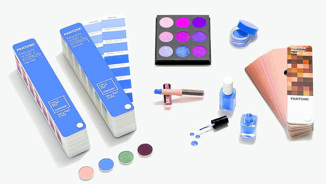
Ionica Abraham Lim, a teacher from De La Salle-College of St. Benilde, said that Very Peri can be used in fashion pieces, accessories, furniture, home interiors and even on beauty products for eyes, nails and hair.
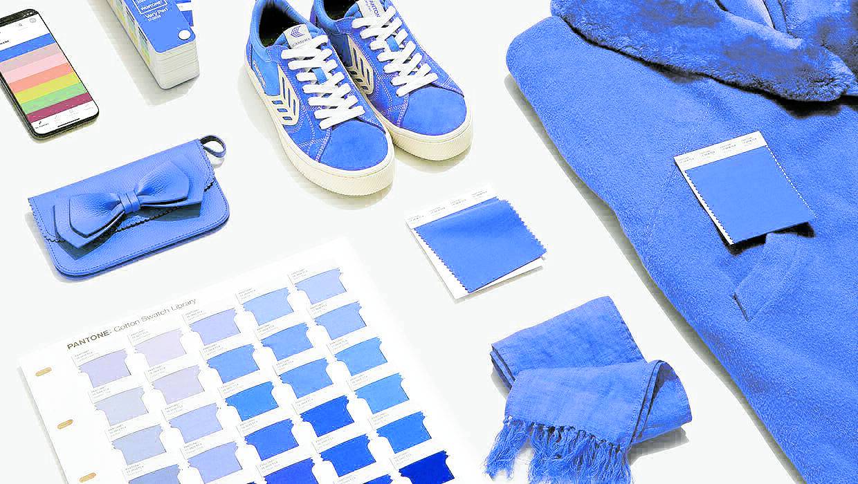
The dominant shade of 2022 is also eye-catching and gives a sense of credibility, making it ideal for graphic design and packaging.
Very Peri’s optimistic mood also matches the excitement and hope in next year’s fashion trends.
“We are redesigning the future based on the changes that we are experiencing this pandemic,” Lim said. “Very Peri creates new ideas and opportunities for trends, and it illuminates how fashion is evolving into a more inventive industry.”