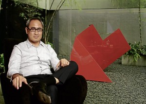
In Philippine design and architecture, the name “Calma” is synonymous with a powerful aesthetic impact on the environment. Think Lorenzo “Lor” Calma’s sculptural planes, whose flatness is interrupted by cuts and folds, or Ed Calma’s stark-white College of Saint Benilde School of Design and Arts building with its irregular form and all-glass backside set against an old, grayish district in Manila.
Friends observe that architects Calma and his son Ed are opposites.
Lor is all bonhomie, while Ed is reserved. In interior design, Lor injects a lot of color; Ed favors a restrained palette with only an occasional zap of color. Ed’s dress sense is sharp, while Lor is casual. In communication, Lor is tactile while Ed is aural.
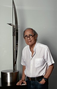
Lor studied architecture at the Mapua Institute of Technology but ended up doing more furniture, interior design and sculpture. He is a founding partner of the Philippine School of Interior Design and has won awards in this field.
Through the years, he has been pursuing his passion for sculpture, which is characterized by its bold geometry and concepts.
Ed studied at Pratt Institute and Columbia University School of Architecture. Between courses, he worked for Carlos Zapata and Peter Pran who encouraged their designers to literally think out of the box. At Pratt, Ed’s mentors taught him to draw inspiration from unconventional sources outside of architecture and to redefine the uses of space.
Beauty of local materials
From the ’50s to the ’70s, architects made use of existing materials—marble, concrete and wood—due to the import ban. While other architects showed the natural texture of adobe, Lor was known for whitewashing hollow blocks. He also wanted to project the beauty of local materials such as kamagong, mother-of-pearl and capiz.
Ed’s projects use glass and metal and luxurious finishes of travertine, onyx, wenge and makasar.
“In his generation, architects were inventing a lot of things with limited materials. Things were custom-made. Now you can order anything from abroad and assemble here,” said Ed.
Lor said that in his time, he had less clients for architecture. “I was stubborn. When you brought a magazine and said, ‘I like the foyer of Lindy Locsin,’ I would answer, ‘I can’t do it.’ But any architect would do that.”
When Lor built the house of Aurelio Periquet Jr., he used raw concrete, with capiz, to create shimmer. The look caught on.
Today, many of Lor’s buildings have lost the original design after renovations. The only buildings that represent his style are his homes in Forbes Park and Alabang. Some collectors have kept his furniture.
Nonetheless, Lor’s vision is being continued by his son. Their designs share the DNA of rejecting the traditional vernacular for modernism. Their architecture utilizes cantilevers that slice the space to evoke the feeling of suspension, and the interplay of planes and volumes to create multidimensional patterns.
“We stick to what we believe in. That’s the common thread between us. He (Lor) started modernism. I’m just continuing that,” said Ed.
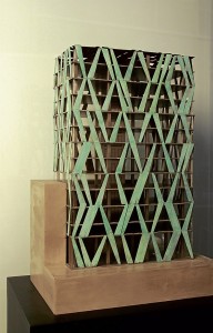
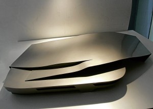
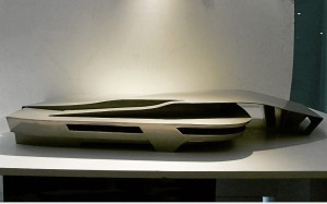
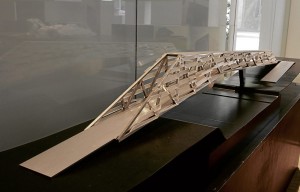
Today, the father and son will open “Calma—Lor and Ed—an Exhibit of New Works” to celebrate the eighth anniversary of LRI Design Plaza.
“Unlike other exhibits that focus on the final products, we’re going to show how we design, from the inspiration to the actual building,” said Ed.
The exhibit will show the diversity of their design, which includes furniture, lighting, interior design, sculpture and jewelry.
The exhibit will be on view from May 23-June 9. LRI Design Plaza is at 210 Nicanor Garcia St., Bel-Air II, Makati City.
Minimalism and cleanliness
What is your landmark work?
Lor: People admire my minimalism and cleanliness. I started with furniture when we were working with Cancio-Calma. We were the licensed manufacturers for Walter Knoll furniture. When I built houses, though small, I always used foreign design because it’s clean, even if the material was mostly wood. Because of Knoll’s influence, the design of my furniture was clean.
Ed: I did my sister’s house (author John Powell described it as a “brilliant modernist solution” to the compact site) and my uncle’s brick house in San Lorenzo, which is still modern, using a soft material. Now it’s the Mind Museum. There’s no façade. It’s three-dimensional.
You can’t see one façade. It’s an amorphic form that can be viewed from everywhere. It’s designed with a magnet around it, so everyone can go through the form, which brings you to the covered plaza area. The curves on the side bring people there. Its location is aligned with Serendra and Bonifacio High Street so there’s a continuous pathway. The Mind Museum caps that axis.
Lor: That is the beginning of something more expressionistic and futuristic. People have accepted the style.
How are your homes well-ventilated?
Lor: I wanted a glass house in Forbes Park but it would be hot. There wasn’t any double-insulation glass then. I put slits under for natural ventilation. I planted a lot of trees so there are like curtain walls. You have to invent something to create coolness.
Ed: We’re taking from the old tradition of cooling. Today, we add those technologies like LED lighting and thermal absorption air conditioners to save on electricity.
If there is a project which, to you, embodies your design philosophy, what would it be?
Ed: The Mind Museum follows all the way through. They never questioned how I did it. Let the form of the object evolve, whatever it is, depending on the site and the forces around it. We used the cell as a metaphor for generating that building. You let the shell be shaped by the environment around it.
Lor: I’ve been working on wood. My lounge chair, which has a flowing form, was exhibited in Singapore. The gentle curves follow the contours of the body when you lie down on it. It’s heavy because it’s made of kamagong. The lines are very clean. The form follows function. There’s no exaggeration of the form.
A beautiful object
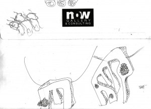
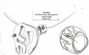
Lor: My jewelry—neckpieces, arm bands, etc.—because they are like sculpture. They are made of sterling silver. It’s a deviation from my sculpture. Instead of large pieces, they’ve been scaled down into decorative pieces for the ladies.
Ed: The iPhone is elegant. It’s just a smooth slab with no buttons. It’s simple but everything is touched by technology. It’s a breakthrough. You can watch movies, download music. With the iPad, I’ve changed the way I design. I sketch on the tablet. Beauty isn’t just physical attractiveness. It also means changing the way people live.
What do you think of the Metro Manila landscape?
Lor: Ayala is doing well. They are working on a main road by changing the old landscape with uniform planting para hindi magulo. From Ayala and Paseo de Roxas, the planting is extended up to Roxas Boulevard. But Ayala is the only company that spends money on landscaping.
Ed: They (Ayala Land Inc.) are not just developers of their own projects. They’re improving the environment so they add value to their own development. But the problem with the cities is that even if they say it’s modern, it’s still archaic. Even if Bonifacio Global City is new, it’s still an old model. They never copy the good sample of a city which is walkable with pedestrian paths and bicycle lanes. BGC has no mass transportation. People have to rely on taxis and shuttle buses to go to where they live and work. In Japan, people go from their houses to the store in a bicycle. They use the subway as mass transport. Those are basic requirements in the city.
Ed: With Filinvest, the community is self-contained. Working on an existing city like Makati is a challenge. You have to negotiate with other developers.
If you were to redesign Metro Manila, what three things would you do?
Lor: 1. Greening. 2. Preserve all the old houses 3. I was talking to then-Mayor Atienza. I liked Avenida Rizal because it still had that atmosphere from the past. I told him you could recreate that environment. Many houses there are wooden. Those who live there are people of various occupations like making santos and jewelry. I said, why not put them all in a complex where everybody owns it?
Ed: I want to reduce the buses along Edsa to one or two lines, given to the highest bidders, and relocate the other buses to other roads. Redesign a network of bus routes. Each route would be assigned to a bus company so they can schedule stops and pickups. The loading and unloading of passengers should be synchronized. That’s the only master transport system. You don’t need big infrastructure. But that can be done if government makes policies. How people travel around the city is important.
Lor: When the LRT was built, many trees were cut down. Why don’t they replant the trees in exchange for the cutting down?
Ed: Infrastructure has to be designed better. MRT is just an eyesore. It wasn’t designed properly.
What is your dream project?
Lor: To build a church floating on water.
Ed: Designing a multilevel city with separate levels for vehicles, pedestrians and a park.
What is your favorite wardrobe staple?
Lor: Well, I’m informal because I used to work in a furniture factory. You can’t go around in a barong or nice pants. In those days, I used to wear nice pants but they would get snagged by the furniture. So I wear mostly jeans. For dressier occasions, I like this tuxedo I bought in Florence.
Ed: In New York, I always wore a jacket over slacks and shirts. Here, it’s shirt, slacks and leather shoes. (Comme de Garçones or Junya Watanabe are some of his brands.)
What are your top three passions?
Ed: Architecture. When I visit cities, I look at design ideas of other people. Designer furniture. Clothing. I don’t have a favorite brand but I like something classic with a twist.
Lor: I like collecting art books; paintings and sculpture; designer flatware and unusual glassware and watches.
What is Calma synonymous with?
Ed: A talent or a skill on how we design. It’s elevating it into an art form.
Lor: We started the clean lines and modernism. Until now that’s still our line. We go modern but not beyond. Here, even if clients spend money, they will still control the style. You can’t go beyond what they want. Ours is a discipline. We just do what’s right to be appreciated by modern-oriented clients.


