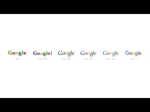
You know that Google’s dead serious about its redesign when just a month after the announced overhaul of its corporate structure to Alphabet, a new logo comes out. The new Google logo is almost still the same—same wordmark, same colors—but now done in a sans-serif typeface. This makes it younger and more playful.
There is a stark resemblance between the new Google logo with Alphabet’s. This change solidifies the two companies’ design language falling into place with one another. The redesign debuted today on Google’s homepage. There is an animation of a hand wiping off the old logo then rewriting the new version.

This is the biggest change the logo has undergone in 16 years, since moving a letter around. The huge leap is now being cascaded throughout the devices, services and every corner Google’s logo has touched.
The biggest question is, why the change? The Verge discussed Google’s stance on “how much technology has changed how we interact with its products and with the Internet at large.” And though no solid reason has been given for the redesign, it is a matter-of-fact that this “better reflects the reality that Google is no longer [just] a site you visit on PCs, Chromebooks, smartphones, and anywhere you can find a web browser.”
In the video Google released about its evolution, this teeny tiny bit of change is just “the tip of the iceberg” and “it probably won’t be the last.”
Photo courtesy of Google


