AFTER years as a top executive in a multinational company, Paquito “Pen” Roque now enjoys the fruits of his hard work—and fatherhood to toddler Pio.
He rewarded himself with a condominium that reflected his style and substance, while being a cozy home for a growing son.
He collaborated with Michael Pizarro, considered one of the country’s fast-rising young interior designers, to give this 117-sqm unit a look which he calls “modern Italian.” Roque was inspired by a trip to Italy where he saw how the houses mixed textures and blended the old with the new to create character.
Laid-back
To get beautiful decorating results, Pizarro quizzed his client to determine the latter’s “interior design personality,” as Pizarro put it. “Pen is laid-back. Based on the quiz results, his personal choices tend to be more functional.”
Aptly, Pizarro’s choice of furnishings and décor treatment capture Pen’s relaxed sensibilities: note the dining table from Quirino fashioned from an 80-year-old, four-inch-thick solid dao; wooden, rectilinear stools from Cappellini; and the beechwood finishes in the master bedroom.
“These encapsulate the character of the resident—simple but sophisticated,” says Pizarro.
Roque also reveals his love for all things Italian in his furniture preferences, key pieces of which are made of leather.
“When you think of Italian modern furniture, you think of craftsmanship and artisanship. In Italy, I learned that artisanship means a piece of furniture is built by one person from beginning to end, as opposed to furniture made in an assembly line. So we focused on elegantly made furniture which, by itself, could be a conversation piece,” says Pizarro.
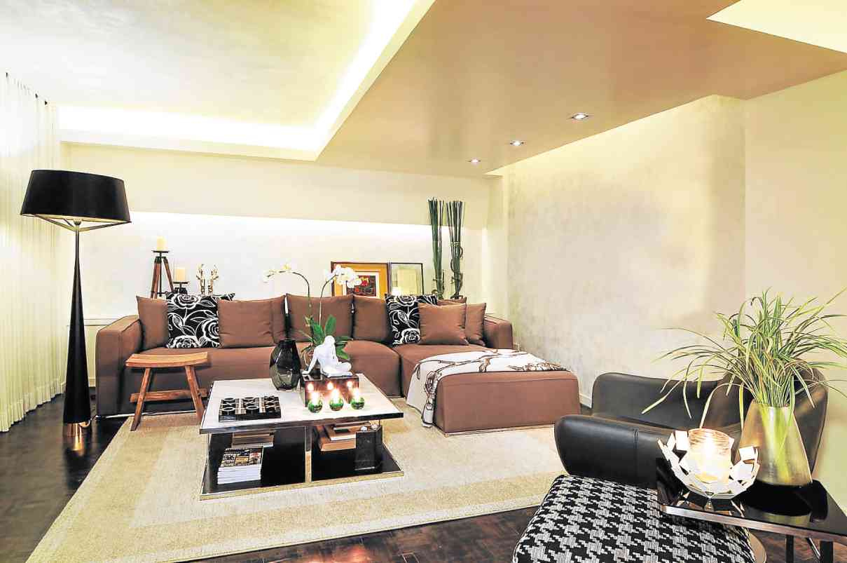
Italian interior design style is all about space. Lighting and ceiling treatments contribute to the spatial experience. As such, Roque’s condo features a sculptural ceiling, which combines cove lighting for ambiance and a drop or false ceiling for a modern look.
“Units built in the ’70s and ’80s have low ceilings, but they are wider in area. That is the plus factor. When people enter this unit, I don’t want them to see the low ceiling right away,” explains Pizarro.
Meanwhile, indirect lighting through floor lamps, pin lights, recessed lights and sparklers or candles creates ambiance as well as a sense of movement.

White scheme
Employing a white scheme is another Italian décor influence. This interior designer gave Roque’s condo a whitish stucco and plaster finish as well as classical painting techniques that lent texture and depth.
Pizarro originally chose shimmery white, a major trend in homes. But his client nixed it. “There was pearlized powder in the glaze, but the shimmery look wasn’t Pen. We had to customize the paint to meet his requirement.”
A neutral scheme, he adds, requires texture to avoid looking boring. “For equal visual weight, we used materials that won’t upstage each other.”
Textured walls are complemented by wood veneer which, says Pizarro, is made of fine shavings of wood adhered together onto a core material to create panels. The wood veneer finishes, especially in the dining room, make the space look warm and inviting.
“My visitors always want to hang out here in the dining area even if I put snacks in the living room,” observes Roque.
The parquet flooring, typical in an Italian-style home, was stained a brownish-black for dramatic effect.
“There’s a story behind everything. In the end, there are spots of black like the throw pillows in the living room, the black floor lamp set against the white curtain, the black armchair, the black-and-white houndstooth ottoman, the black mirror frame in the dining room, the black frame of the Romulo Olazo painting. It all sprang from the black streaks in the wood.
“It’s like gourmet cooking,” sums up Pizarro. “You have all these ingredients stewed for some time, bursting with layers of flavor.”
Reprinted from Cocoon magazine available in leading bookstores and newsstands nationwide. Call 8978808 local 604; visit www.facebook.com/cocoonmagazineph


