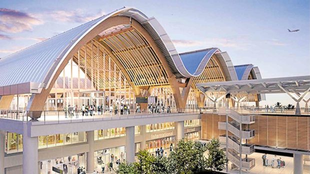
Like David against the Goliaths, the 65,500-sq m Mactan-Cebu International Airport (MCIA) Terminal 2 won top prize in the Completed Buildings-Transport Category at the World Architecture Festival in Amsterdam. It was up against Turkey’s Istanbul Airport—the world’s largest at 76 million sq m—and Jewel Changi in Singapore, a tropical lifestyle complex, which is double the size of MCIA T2.
On the winning project, the judges, world-famous architects and industry practitioners, noted: “This is a simple and elegant new airport that uses many locally sourced materials. It is integrated into the local area through the development of a local hub and landscape plan. The internal spaces are light and uncluttered and the design is capable for future extension. It is clearly popular with the local community and this established memorable travel experiences.”
MCIA T2’s charm lies in the combination of modern construction techniques and how architecture interpreted Cebu’s identity—the weaves of its crafts, the beach experience, the waves surrounding the island and the use of glulam or engineered wood to convey the tropical ambience.
Megawide Construction Corp. and GMR Group of India led the construction, working with Integrated Design Associates (IDA), the Hong Kong-based firm led by Winston Shu, that specializes in sustainable designs and international airports. One of its projects, the Rajiv Gandhi International Airport in Hyderabad, India, has been on the list of the Top 5 World’s Best Airports for many years.
Sense of place
The builders likewise consulted with Budji +Royal and Cebuano industrial designer Kenneth Cobonpue. Design specialist Budji Layug, architect Royal Pineda and Cobonpue were responsible for the renovation of Naia 1.
“A well-designed airport shows a sense of place,” says Cobonpue.
“You’ll be surprised to see a very Filipino yet modern airport in Cebu. It feels as if you are in a different world. You arrive with great anticipation in a space designed for a Philippine city,” says Layug.
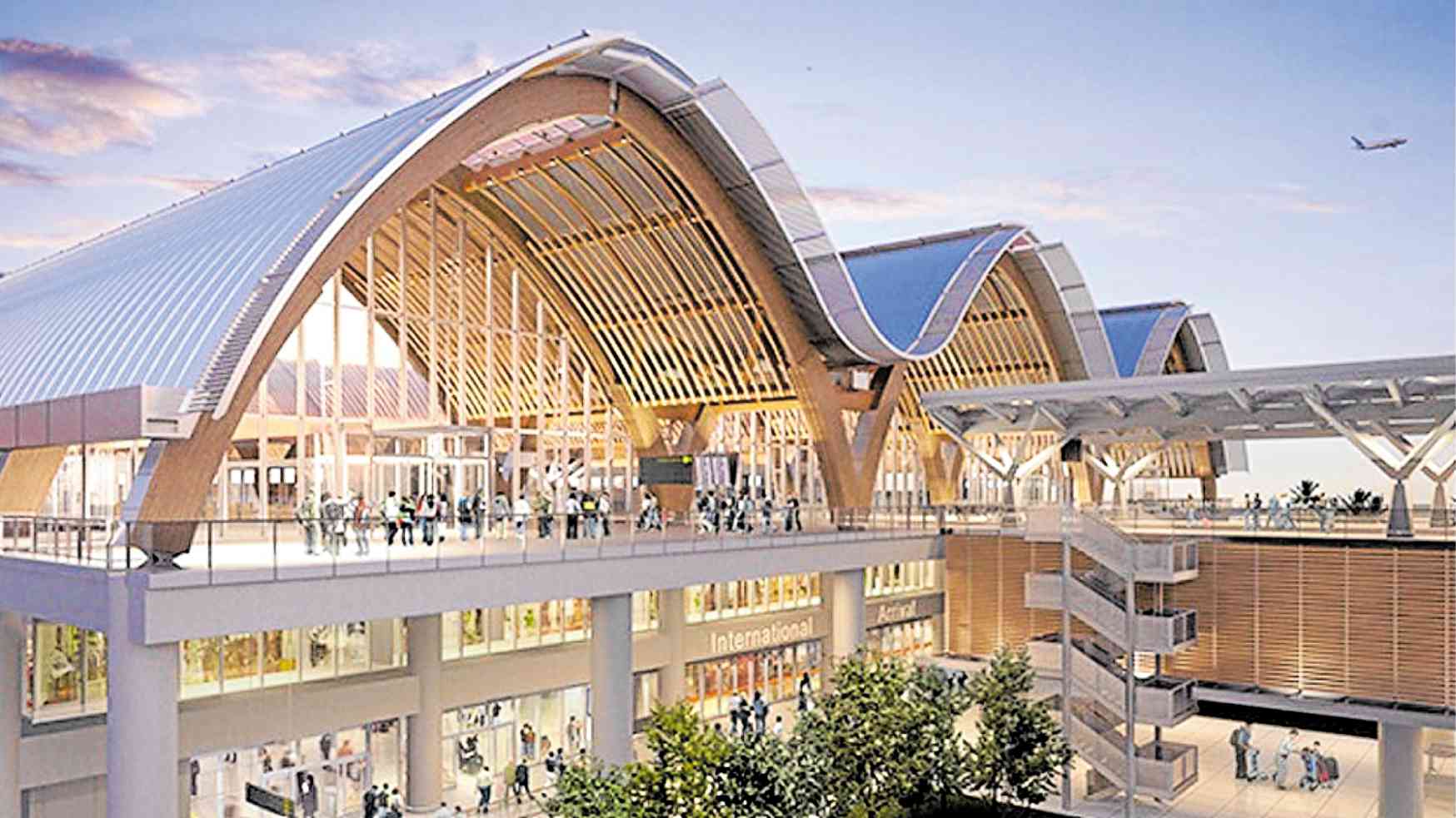
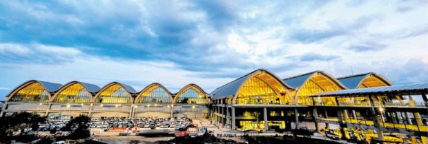
The original silhouette was shaped like a sail. After research, the project team decided that the concept of waves that surround the islands of Cebu was more relevant. Hence, the undulating roofline, made of glue-laminated timber or glulam, makes a grand, welcoming first impression.
From the drop-off area, passengers traverse a walkway with a clear canopy made of a special plastic that brings in natural light yet diffuses the heat. The canopy allows the passengers to view the dramatically arched facade.
Under the waves
Before the entrance to the departure area, an in-between space for well-wishers is defined by a curvaceous overhang and sloping walls with exposed trusses. The arched entrance and curvilinear ceiling lend the feeling of being under the waves.
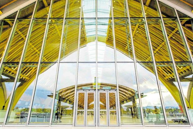
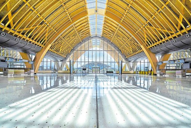
The departure hall is shaped like an inverted boat hull. The soaring timber arches connected with smaller ribs become the main design element and structural support. The skeletal design lessens the columns and opens up the space.
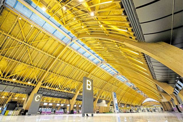
The crisscrossing patterns underneath the ceilings are references to Cebu’s weaving tradition. The area brings in the outdoors through the skylight and walls of glass with grid patterns. The pillarless hall offers unobstructed views.
The layering and lattice work of the glulam on the ceiling and rafters pay tribute to Cebu’s weaving tradition expressed in a contemporary manner. Tiny slots filter the sun and manage the heat.
The flooring is terrazzo, a material commonly used in airports. What makes it Filipino is the composite of broken shells and mother-of-pearl often used in Cebuano handicrafts. Then again, the sunlight casts a warm shimmer on the flooring, lending the impression of being on the beach.
These organic materials play against modern elements such as exposed powder-coated aircon ducts.
The departure gates and arrival area likewise bring in the maaliwas nature of Philippine architecture.
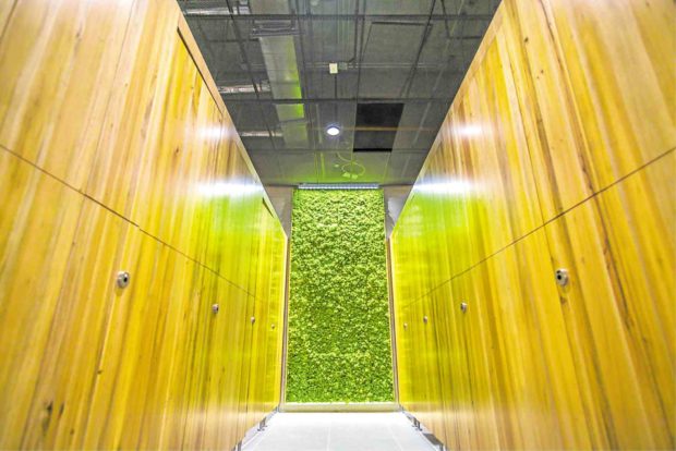
In the restrooms, IDA introduced biophilic design—an architectural approach of connecting people to nature. Live mosses line the walls to absorb ozone gases and dust.
Ultimately, the project won accolades not only because of the indigenous elements used in a contemporary expression but also for the honesty of approach.
While other projects clad steel with wood, glulam provides structural and architectural integrity. The surfaces, ceiling treatments and utilities such as the powder-coated metal aluminum are exposed. There is room for horizontal expansion. More bays can be added to augment passenger capacity.
Filipinos can indeed be proud of this world-class infrastructure in its land. MCIA T2 is a fine example of how architecture and design define a nation. People don’t need to live in the First World to experience good facilities.
