By Rob Cham
The idea behind this was inspired by how a New York Times article on the Drug War in the Philippines recently won a pulitzer.
I read through it again and that kind of started up these ideas of just how this is what keeps happening here. It’s scary. And I wanted to bring it up for this week’s column.
I don’t really want to say much more about this because I feel like I want people to focus more on the image than what I have to say about what it’s supposed to be about. Figured I’d just talk about some behind the scenes stuff for this week.
Image One
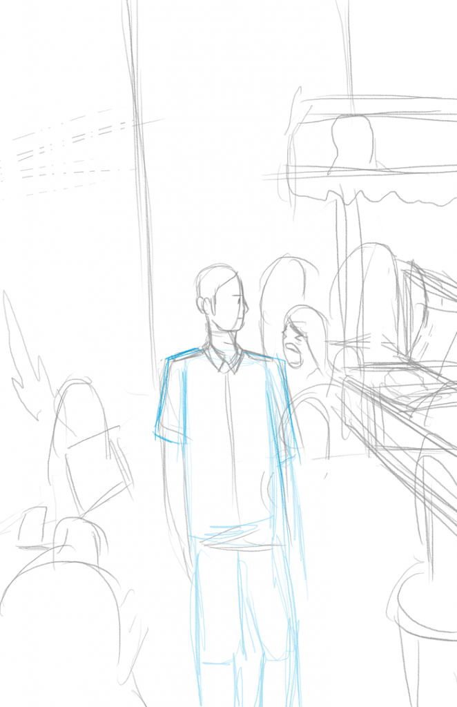
I pitched the idea of it all happening on the same street. Night time showing how an murder was just committed, and day time where people here usually have wakes on the streets where they live.
Image Two
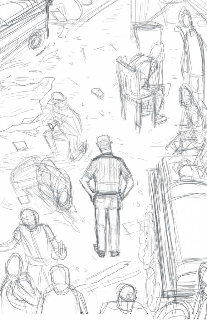
I pencilled this, fleshing out the thumbnail, changing the perspective so it would show a lot of the elements a lot clearer, I had intended that the colors would be what divides the image because having a line down the middle would not be that great, and it would be sort of a cleaner image without the line. I had the policeman in the middle, that he is our constant character in the scenes, and the person whose perspective we’re seeing in all of this: at night he has to show up at the crime scene to document, investigate, and clear the corpses, and during the day where he would have to walk by the aftermath of families grieving and people going about their day like nothing happened.
Image Three
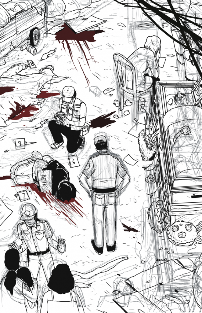
I change a lot of things while inking, I try a lot of things out which is why the pencils differ so much from where I end up. I just thought of getting rid of having too many things to focus on, having the crowd there, the vendor, people smoking on the street. So I narrowed it down to just having the grieving mother of the recently deceased in the frame.
Image Four
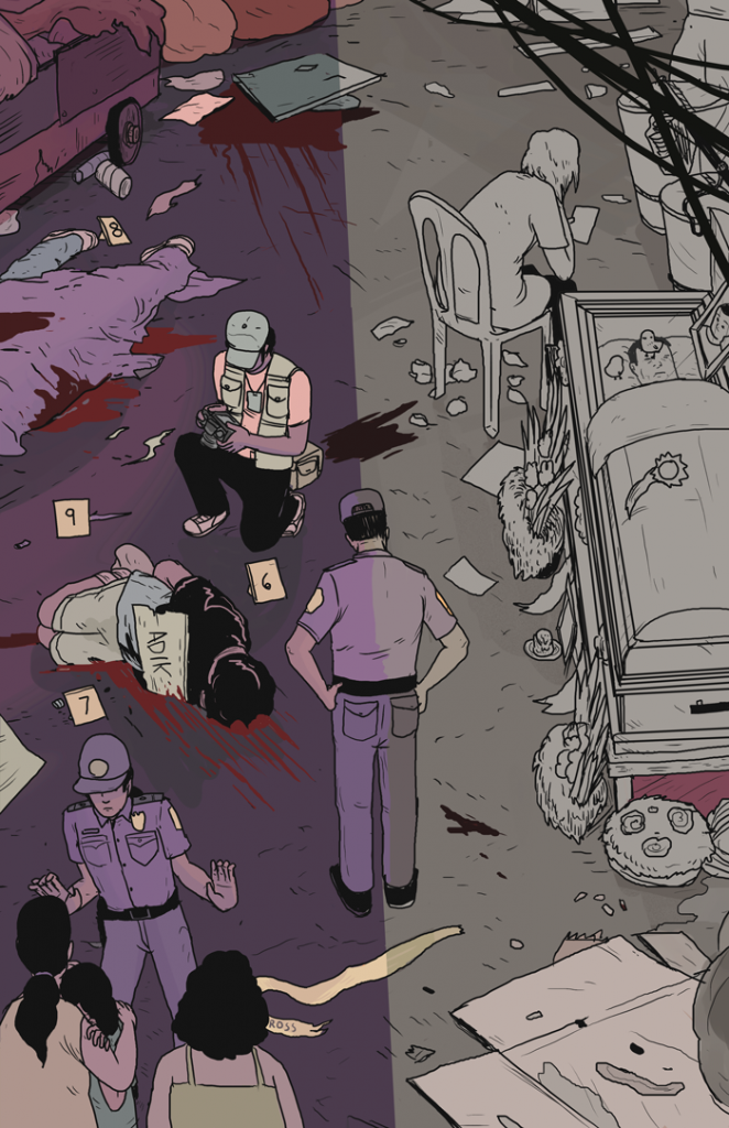
When I started to color this, I had to split the image in two, my orginal idea where it was more of straight down the middle was bothering me and I tried this slanted shadow look so it looks a bit more natural, that maybe at first glance it seems like one image and as you look at it more you see what I was going for.
See you next week.
-rob
Rob Cham is an illustrator, comic book creator, friend. You can check out his work on his website, robcham.me, and find him @robcham.

