Reprinted from Cocoon Magazine
Personal details, from favorite artworks to customized color combination, and decorative devices add the homeowner’s touch to the living room
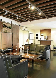
When architect Dan Lichauco renovated the family house, he left the floor joints and beams exposed in the living room. The architectural detail gives the room more height, and the distressed patina shows off clean lines and slick leather furniture. There’s a lot of hidden storage to keep the clutter at bay.
2. Creating balance
Balance is as much about feeling as it is about proportion. “There’s nothing symmetrical in this living room, but everything is balanced. I call it ‘false symmetry.’ Weight plays an important role,” says Lichauco. The living room is a vertical space divided into three parts. The sofas and coffee table are at the center, flanked by an armchair and sculpture. There’s a lot of visual movement going on. The array of candleholders on the table is balanced by the severe angularity of tables and chairs.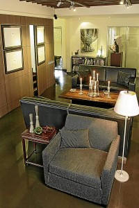
3. Chiaroscuro
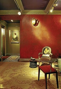
Chiaroscuro is the use of light and shade to create the illusion of depth. This is the design theme of Chito Vijandre and Ricky Toledo’s living room. The space is at its best at night, when the objets d’art sparkle under mood lighting and shadows are cast on the walls for drama. A gilded bronze Buddha hand from Sukhothai is embedded against the den’s wall with a Pompeian paint finish. The color serves as background for the Napoleon III armchair upholstered in tapestry. The rich period piece contrasts with the African side table and the boldness of Philippe Starck Royalton Sedia Chair in cherry wood and aluminum. Mia Herbosa’s oil painting of “Nina” (1999) lends a sense of mystery.
4. Color chic
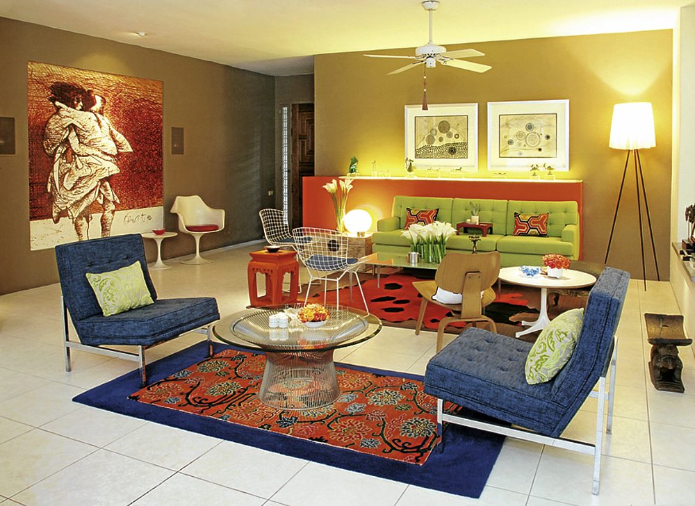
 “I’m through with beige and brown! It’s like living in a bowl of oatmeal porridge,” says design consultant Enrico Punzalan. Taking his cue from the age of the house (built in the ’60s) and his acquisition of mid-century furniture, he favored acid colors evocative of the ’60s. Punzalan recommends using a tricolor scheme that is composed of a base color and two accent colors whose hues are evenly spaced out in the color wheel. In the living room, the Tiger Lily Orange blends with Log Cabin Brown and Continental Cream. The orange picks up the warm hues from BenCab’s “Sabel,” which is blown up into a tarpaulin. For contrast, he chose a complementary color, blue that is opposite orange in the color wheel, as an accent in the furnishing.
He enjoys mid-century furniture by Florence Knoll, Harry Bertoia, Charles Eames, George Nelson, Warren Platner and Eero Saarinen for their classic appeal, and the way they blend seamlessly with contemporary architecture and furnishing.