In all their years at the Philippine School of Interior Design (PSID), this year’s graduating interior-design students had never seen such furniture and fixtures as a tilting tub, vibrating bed, grab bar, handrails, visual alarm system and signs written in braille. Nor have they come across the concept of mental mapping in any of their subjects. That was until several months ago.
For the first time in its 45-year history of annual graduation exhibits, PSID is addressing the special needs of the differently abled.
Dubbed “Dibuhong Umaakay,” the ongoing month-long exhibit at SM North Edsa in Quezon City, which doubles as the graduating students’ thesis, features 23 assisted living spaces divided into four sections: Dinig (heard); Tindig (stand); Tanaw (outlook); and Galaw (movement).
Each section covers various areas of the house such as the living room, dining room, kitchen, bedroom and lanai.
Like in years past, students were divided into groups composed of two to five members. Since lots were drawn, they had no way of choosing in advance what section of the exhibit and part of the house to work on.
Unlike studio sets, spaces are made of real wood, steel and concrete. Furniture and fixtures, some of which were designed and custom-built to address particular disabilities, are life-size and functional.
Jie Pambid, PSID director for external affairs and this year’s exhibit adviser, thought of the theme not only to challenge students, but also to inspire them to go beyond mere aesthetics by producing more socially relevant living spaces.
“We also wanted to create public awareness that interior design is for everybody, whether you’re disabled or not,” said Pambid. “If you think about it, the National Building Code now requires ramps for people on wheelchairs. A growing number of elevators already have braille signs.”
The exercise is also designed to introduce future interior designers to the possibilities of catering to “differently abled” clients. After all, said Pambid, everyone will grow old or suffer health- and age-related ailments.
“Apart from producing living spaces that are practical and useful, the challenge to make them beautiful by applying some of the things they learned in school is still there,” he added.
Buckled down to work
There were initial apprehensions among students in the beginning, but since they had no choice but to abide by the exhibit’s theme, they buckled down to work as soon as they got their assignments. To their surprise, they actually enjoyed and learned a lot from the experience.
Since PSID is working this year with the National Council with Disability Affairs, most of the students did their research interviewing disabled and elderly persons and their teachers, doctors and caregivers.
Most of them worked based on the needs of an imaginary client, while some drew from inputs provided by actual persons with disabilities.
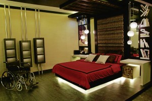
One group, for instance, drew inspiration from wheelchair-bound polio victim and “Pinoy Big Brother” finalist Naprey Almario to produce “Abot Kamay,” a bedroom showcase based on his needs.
Another relied on inputs provided by architect Jaime Silva, who went blind when he was already an adult and practicing architect.

One group, “Beyond Sight,” understood the importance of mental mapping among the blind after interviewing a couple with a 13-year-old blind daughter. Members applied the concept to their living-room showcase.
“Since blind people, apart from their sharp sense of hearing, rely on their memory to move around the house, it is not advisable to constantly move furniture pieces,” said a group member.
The only movable piece featured in the small living room was a swivel chair with no wheels. “It can be rotated in different directions without being moved,” the group member added.
Tactile strips stuck on the floor and a short flight of stairs double as pathways that signal the child either to pause (circular patches) or continue (rectangular patches). By helping her familiarize herself with her surroundings, she learns to become partially independent inside the house.
A number of spaces in the Tanaw section also took into consideration the importance of light and color. To sighted people, bright lights may mean nothing, but not to a partially blind person who may find it too glaring.

In lieu of bright daylights, most of the groups either used soft yellow or indirect lighting to lessen the glare.
According to research, blue and white are also the colors most visible to a person who is 70 percent blind because of such ailments as diabetes. Thus, most of the spaces resorted to this color scheme.
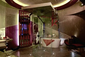
One group, “IndustrialEYEzed,” produced a bathroom that combines industrial chic with Maranao design flourishes for their totally blind client.
Again, relying on the blind person’s ability to mind map, the group resorted to an embossed floor plan with tiles that could lead its user to the sink, toilet bowl or shower stall without assistance.
Members interviewed Silva, the blind architect, who gave them the idea to include a voice-activated application in the bathroom’s sound system to help the blind client move about.
Unbreakable bottles containing shampoo, body wash and conditioner also come with braille signs.
For the deaf, the challenges are different. Since they’re hearing impaired, it’s important to enable them to be aware of their surroundings through visual cues, faint echoes and vibrations.
Strategically placed
Not a few groups, for instance, resorted to strategically placed mirrors and light-activated doorbells, alarms and telephones. Since hearing-impaired people can still sense vibrations, groups eschewed wall-to-wall carpeting and concrete floors in favor of wooden floors.
Members of “If Walls Could Speak” even included a specially designed vibrating bed in their bedroom that an imaginary client could connect with his alarm clock or doorbell.
Groups who did living rooms also resorted to circular sitting arrangements to allow their hearing-impaired clients to see and communicate with other people.
They also made sure that their clients, who “talk” with their hands, wouldn’t hit anything once they started gesticulating.
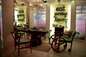
Practical concerns also guided the two-person team behind “Limitless,” a living room-cum-den, which includes a foyer, for a wheelchair-bound client.
They had to construct, for instance, a wider main door to easily allow the wheelchair to roll in. To save space, they opted for a sliding door with two peepholes, one for a normal person and a lower one for a person on wheelchair.
“We had to design special shelves and place switches within reach of our client,” said Aline Delfino Bautista. “We also designed a number of custom-built furniture pieces, including a sofa with an armrest that doubles as a service table.”
Any form of area rug that might get tangled under the wheelchair is a no-no. Instead, the duo incorporated a circular pattern on the wooden floor to keep it from looking too plain.
“We also made sure that the wheelchair could do a 360-degree turn anywhere within the entire room,” said Jason de la Peña. “It was a challenge considering that we were given a mere 20 sq m-space to work on.”
Finally, groups behind Galaw, the section devoted to the elderly had to incorporate bits and pieces of what their schoolmates did in the other sections depending on the ailments of their imaginary clients.
Since the elderly have to deal with a host of concerns, from partial blindness to diminished ability to hear, walk, bend and even remember, the groups’ challenges were no less difficult.
They made use of anything, from a tilting tub and nonskid floor tiles in the bathroom, to a so-called memory board and colorful, mood-boosting Malaga tiles in the kitchen. Most of them also took into consideration open shelving and adequate lighting to help clients accomplish everyday indoor tasks.
Apart from judicious use of space, one underlying element seems to be present in most of the spaces for the elderly: to maximize outdoor views through skylights, picture windows and accessible exits.
During their research with elderly people and their caregivers at Golden Acres, they found out that spaces, which allow the outdoors in as well as those with the right combination of colors and elements could instantly boost a senior citizen’s mood, as he or she makes the most of a well-deserved retirement.


