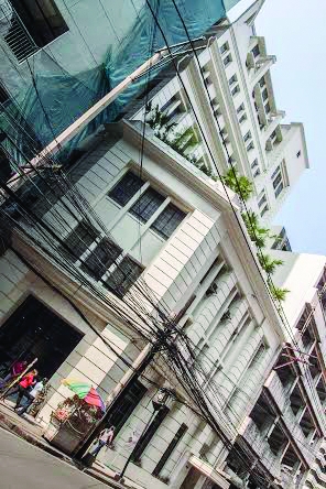
IN A BUSY portion of Juan Luna Street in Binondo, Manila, stands the former SJ Wilson Building. It was built in 1937 and named after the American expatriate Samuel J. Wilson, who was behind the printing business Carmelo and Bauermann before the World War II.
The structure, with its period boxy and geometric façade, looms like a behemoth in what was once called “Chinatown’s Wall Street.”
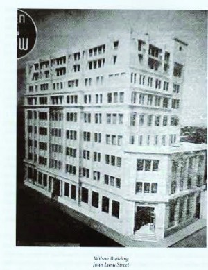
Here on the southern stretch of Juan Luna’s tight sweep once stood the mighty headquarters of prewar Manila’s foremost financial institutions, such as Chinabank, Bank of the Philippine Islands, PBCOM and the now defunct Equitable Bank, as well as multinationals such as HSBC and Citibank.
In its heyday, SJ Wilson Building also housed the Standard and Chartered Bank, Manila Stock Exchange, even the Japanese Consulate General. After the 1960s, the shift of financial trade from inner-city Binondo to suburban Makati saw the decline of commercial activities along Juan Luna, which led to buildings falling into disuse and even demolition.
In 2011, the building came under the ownership of the Binondo-based hardware company Co Ban Kiat Inc. (CBCI). After almost 65 years of operations in its Quintin Paredes Street address—yet another specimen of late 1940s Art Deco —the CBCI, under third-generation scion Johnny Cobankiat, has injected new life into SJ Wilson Building as the company’s new headquarters.
Celebrated rebirth
The rebirth is being celebrated by heritage-conservation advocates and concerned members of the Chinatown community. But like many old structures in the neighborhood, this building had a close call and almost didn’t make it.
The new owner initially had no inkling of the building’s architectural and heritage value. Neither did his colleagues in the real-estate industry and immediate family members see any value in it; they saw demolition as the most convenient way to redevelop the property.
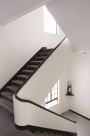
Fortunately, conscientious minds prevailed and the owner was convinced by in-house architect Deogracias B. Degala to take the path of conservation. Thus began the two years of trial-and-error that included a full diagnosis of the building’s structural integrity as well as the refurbishment of the façade, interiors and ceiling roof. The owner and architect were guided by the principle of keeping as much of the original details as possible.
The façade was painted with an off-white/light-beige (known as China white) tone in keeping with texture that followed the patina of the old building. No details were removed, and ornaments, such as the cornices, mouldings and the striped pilasters were restored.
Delightful interiors
Viewed from the street, Co Ban Kiat Building is a massive bulk, its heavy façade softened with tall, rectangular, encased windows protected by their original wrought-iron grillwork. Looking up, one sees stylized buttresses on the eighth floor and mansard-like concrete roof.
At the the southern portion of the building’s façade is the main entrance along obscure Nimfa Street. One enters the doorway flanked by a pair of Ionic columns and topped with an escutcheon. This opens up the ground floor and main office of the company.
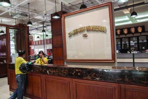
Here the design firm Atalyer, led by chief integrating officer León Araneta, has created what is probably one of the most delightful commercial interiors in all Chinatown.
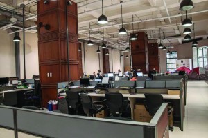
The high and airy ceiling evoke a Commonwealth-era downtown-Manila spirit, a time of beginnings for the Cobankiat family.
Brown veneer wood cladding softens the white walls and massive support columns. To demarcate the spaces within, wood partitions with fence-like railings act as partitions and give a nostalgic twist reminiscent of old banks from that era.
Details from the original company address on Quintin Paredes Street (ironically torn down) such as the old glass panels, originally a form of street-level advertising, with the embellished gold-gilt company name, now find a new spot in welcoming customers at the main entrance.
Architectural symphony
One’s eyes are immediately drawn to the center of the hall where there hangs the Chinese characters “zhit tiak ti giap,” a visual link to the company’s ethnic Chinese origins, honoring the current owner’s great-grandfather, the founder of the company. Traditional black signboards with gold-leaf lettering such as this were widely used among old Tsinoy businesses in Binondo to indicate the business name and its purpose.
On the fourth floor via the original hand-cranked elevator, the cafeteria combines modern edgy lines with nostalgic black-and-white photos of Manila. More of the building’s history is subtly integrated with the miniature wooden signboards of past tenants adorning the support columns. Outside is a lovely open deck with a front view of downtown Manila’s architectural symphony.
Striking feature
A most striking feature of this building is found on the eighth floor where the area is envisioned to be a museum of sorts. Here we still find remnants of the building’s past activities, such as a gold-smelting facility and the exposed, largely deformed, web-like roof trusses. This uneven framed outline came after a major fire in 1969 which resulted in the twisting of the cast-iron support. It, too, has been conserved as a vestige of the structure’s history.
The adaptive reusing of SJ Wilson Building is a positive development in the city of Manila after the so-called September 2014 Massacre, which saw three major landmarks (Michel Apartments, Army & Navy Club and Admiral Hotel) being cannibalized and demolished by private developers.
Already, two period buildings nearby have been conserved and refurbished: the Juan Luna eServices (1922); and the Philippine Bank of Commerce (1940s).
Co Ban Kiat Building adds new luster to the bygone character of Binondo’s Juan Luna Street. It serves as another inspiring example of heritage conservation in a city that seems to have turned a blind eye to its architectural past.


