Built on an uneven downhill slope, the house has a contemporary silhouette with large, open-plan social spaces for entertaining visitors.
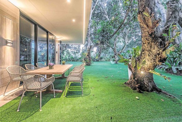
The interiors feel like elegant outdoor rooms ringed by old mango trees with gnarled trunks that add an organic feature to the modern structure.
The house was designed to make the best of an unobstructed view: a grassy field under open skies.
Architect John Pangilinan of JRP Design Inc. worked with this environment to give his client a dynamic living experience directly engaged with the local setting.
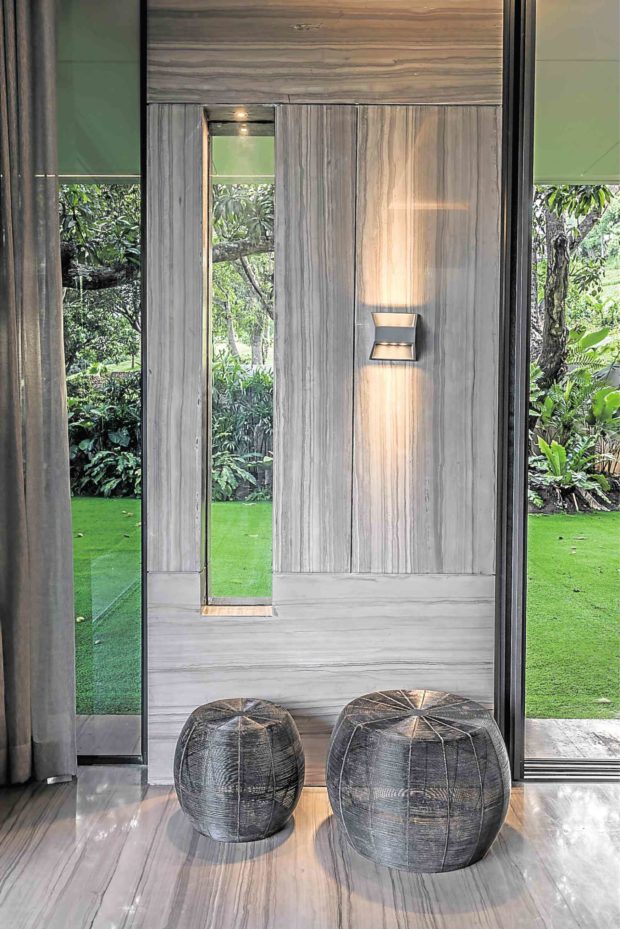
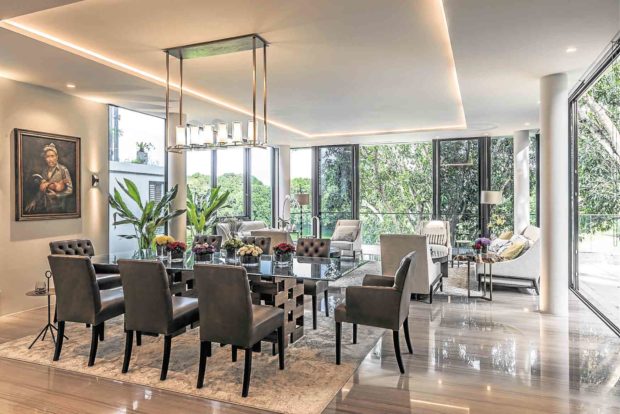
Opting for minimalist interiors so as not to upstage nature, Pangilinan used floor-to-ceiling glass doors and a neutral palette all throughout the house. This resulted in airy spaces that effectively fulfilled their required function for socialization and interaction beautifully.
‘Terraces’ design
A major concern about designing a house on a slope was getting the elevations right.
“One of the challenges was ensuring that we get the right elevation for each level of the house. The lot dropped by 7 meters from front to rear,” Pangilinan says. “Furthermore, we had to balance the areas where retaining the earth would be required, as to not compromise the space requirements. We applied the ‘terraces’ design approach wherein the structure of the house complements the site topography, thus looking ‘stair-like.’
“This approach also allowed us to capitalize on natural lighting and ventilation, allowing the house to ‘breathe’ and not seem enclosed even if you are two levels below.”
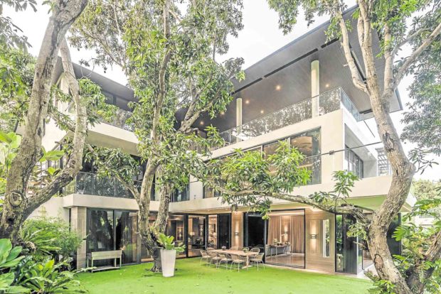
It is built on three floors, the street level being the first, the second level, and the basement which leads out to the lawn. Each level sitting at a slightly different angle and elevation offers unexpected layers of experience, so much so that nothing distracts from the natural features of the terrain.
The basement provides laid-back comfort and privacy even when other meetings or functions are going on in the upper two levels.
Interior ornamentation is kept low, and because the outdoors come into play at different hours of the day, the natural outdoor connection becomes complete.
Impeccable light-filled monochromatic interiors become the perfect canvas for working with line, shape and volume.
The owners wanted different spaces for entertaining family, friends, and business associates, so each level had to have its own entrance.
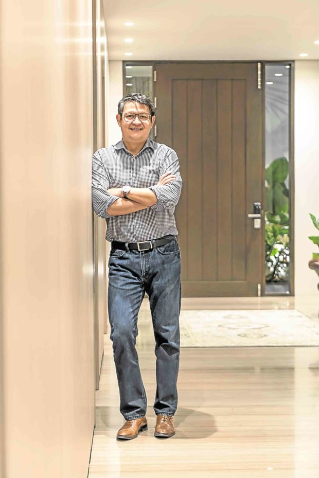
Private living spaces were ingeniously integrated and hidden so the main function of the home as spaces to meet and entertain was achieved through effective space planning and soft furnishing.
Different levels, characters
Though there are three different spaces on three different levels, each has its own character: classic and elegant, relaxed and contemporary, and casual and homey.
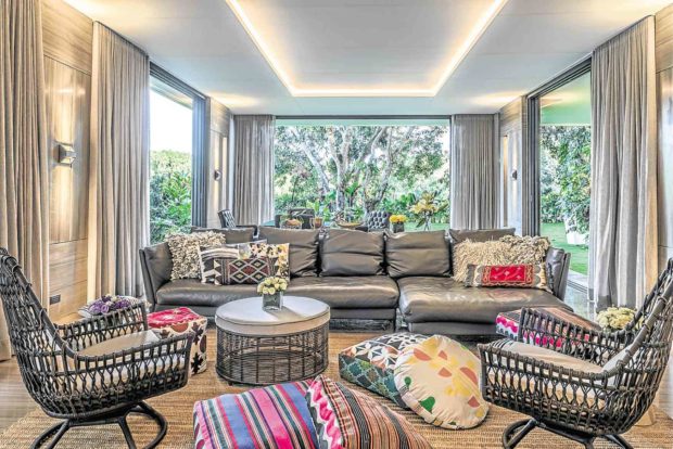
These three spaces form the heart of the house.
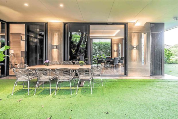
Pangilinan adds: “The basement area is like a secret hideaway, a cozy space that can be opened all the way to the garden and embrace the green expanse—appreciate the huge mango trees that wrap the house, up to the highest levels, with a view of the open field in sight. It can be a place to gather but can also be a place to disconnect and unwind. I was honestly a bit surprised with how this space turned out.”
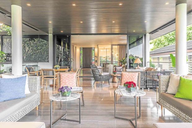
To enhance the restful ambience, lighting is discreetly placed so that brightness is refracted from strategically placed fittings.
In the daytime, sunlight streams from the outdoors and fills the interiors. The Kenneth and Mock window wall system showcases floor-to-ceiling glass doors that can be drawn open with a second layer of protective screening to keep glare and bugs out.
“Essentially it will be for the overall comfort of the end user, but more than that, residential architecture should always consider the environment and the general landscape to define the character and silhouette of a house,” says Pangilinan. “It is not just about trends, or anything ‘Instagrammable,’ but a house that brings a certain amount of pride and joy to its owners. Engagement then becomes complete.” —CONTRIBUTED
