 In the mind of a gifted designer, a space can be distinctive and evocative even with the use of basic materials, simple shapes, an open floor plan and an integration with nature and humanity rather than technology.
Once again, design consultant Budji Layug and architect Royal Pineda interpret this design sensibility, this time in a commercial space in Tel Aviv, Israel.
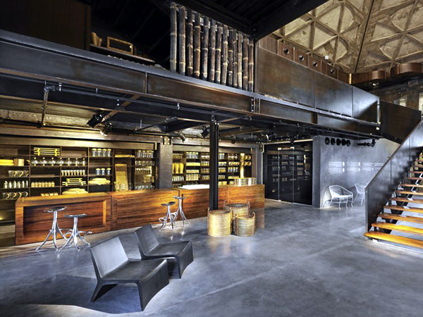
A midcentury wheat granary was upcycled into a high-end concept store called Mamgorha whose products reflect the green movement.
It all began when Israeli entrepreneur Ronit Grinberg, whose company Kane-Kash espouses sustainable living, began sourcing eco-friendly products from Asia. When she came to the Budji Living showroom in Makati, she was impressed with the overall experience so that she tapped them for her project.
Design brief
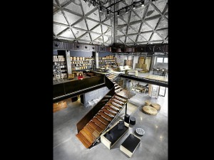 The design brief was to create a space that would project the company values of “design, preservation, authenticity, simplicity and integrity.”
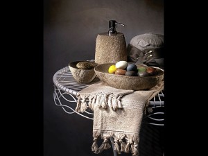
The store, Mamgorha, would carry baskets and accessories, custom-made furniture, a sales area, raw materials for the home, and a flexible open plan for exhibits and special events.
The target market is composed of the design community and discriminating patrons.
Grinberg acquired an old wheat granary which consists of a series of pyramidal, concrete storage silos with an overhead track. In the old days, a train would bring the sacks of grain to the adjacent tower. The sacks would be transported through overhead tracks, then dropped down the ceiling vents and into the silos.
At the onset, Layug and Pineda believed that the most attractive element of the granary was the structure itself. The absence of decorative detail and the exposed structural parts lent character.
 “There was no change in the façade. You will still see the tracks on the roof and the patina of the cement,” says Layug.
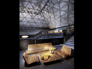
Pineda adds, “We also preserved the interiors. There are space-framed beams that strengthened the pitched roof, which is a slab. We reveled in the architecture, the texture of the structure and its colors, all of which became the major accent.”
“There’s the beautiful structural grid on the ceiling which is the main part of the design,” says Layug. “A raw design can still come out sophisticated.”
Decorative detail
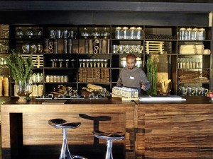
Shelves and cabinets were installed and became part of the decorative detail. Their surfaces were enhanced in metallic finishes to let the products pop out. Ventilation openings on the pitched roof serve as the skylights.
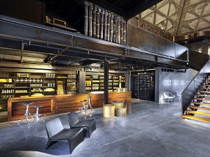 The design duo says Kane-Kash acquired the granary, whose purpose was to transform something raw into something consumable. Mamgorha is a hub that provides sustainable products for the market. It augurs well that the philosophy of Budji + Royal is to adopt what is organic and sustainable.
Layug points out that the owner didn’t want endangered wood. To add warmth to the concrete and glass materials, the design team favored bamboo, a renewable material. The bamboo has been processed and compressed to look like solid wood or hardwood.
The 380 sqm footprint of space is divided into four levels. The ground floor hosts an exhibition area for home products, an open-bar, kitchen, and café.
The levels are linked by a staircase made of bamboo and glass railings. The burnished colors of the shelves play against the cool, deep tones of the cement walls. The metallic finishes are highlighted by theatrical lighting.
The second floor hosts the home products.
The third level is devoted to furniture. A bridgeway connects to the top level, where sample materials such as bamboo are displayed; there is also a library and a negotiation space.
No dead-end
 “It was important to imagine the movement of people. We avoided making a dead-end. The idea was to create a more fluid traffic so that visitors could explore the space and discover the surprises. One level overlaps another so they can see the pieces on a different perspective. As you walk up to the next level you will see the product from another angle. That’s the guest experience. On the third level, there’s a bridgeway that creates a feeling of floating. We want people to experience the elevation and the granary in its entirety,” says Pineda.
More than a showroom, the architecture makes a statement about its historical past and the present use of space. Pineda says the cavernous scale of the place and the dramatic lighting, a contrast of lights against the deep void, create drama.
“It’s like being in the church where Jesus was,” says Pineda. “With the high ceiling (15 by 50 meters) there’s the feeling of smallness. After the ascent, there is another route that will bring you back to the ground floor. Your walk is a complete experience that doesn’t repeat itself. As you complete the course, it’s a complete showcase of the entire design.”

