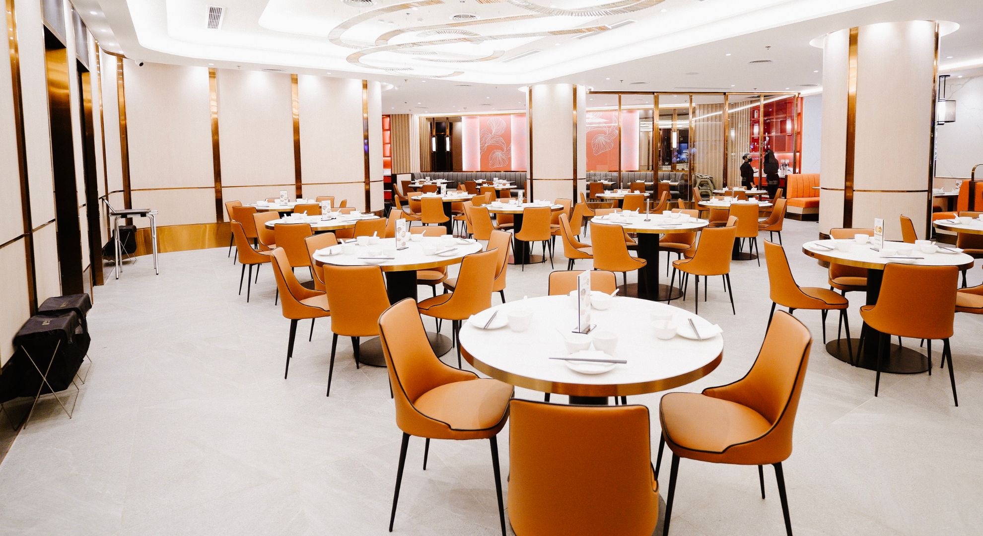
A well-designed color palette crafts a restaurant ambiance that speaks to your brand
The dining experience is a holistic one that starts the moment a customer enters your establishment. This includes everything about the restaurant’s ambiance—from the interiors to the music, welcoming nature of your staff, down to the very food and drink consumed.
Given its sensory nature, even the very color palette speaks volumes about the business. In fact, it can set the tone of what ambiance you want to exude.
To know more about designing your space, we ask Lara Barrios—the architect behind many restaurants, both local and abroad.
Branding as the foundation of a restaurant’s color palette
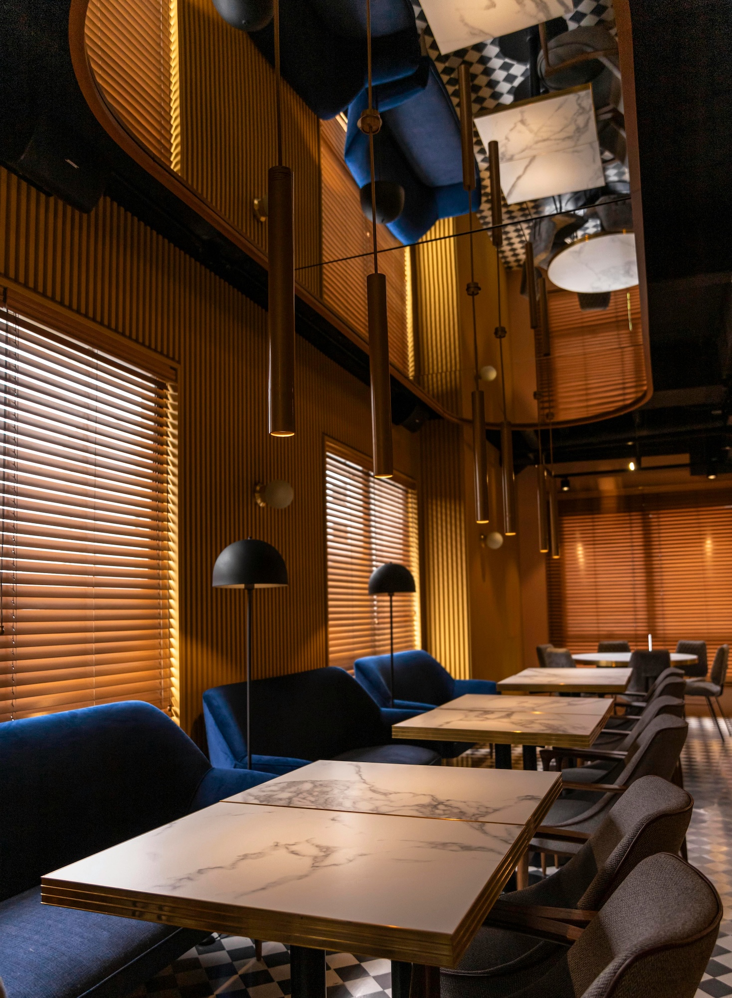
Colors play a pivotal role in branding. From the choices that build the color palette you have or envision, people can already get a feel about your business.
“We generally like to consider the branding of the company for the colors,” Barrios explains. “It depends on the ambiance that we want to have, and if it is a cafe, fast casual, fine dining, etc.”
“Depending on the project, we can either go with their brand colors being the main color, or just [use] hints or accents of the brand colors,” says Lara Barrios.
“We usually try to incorporate some colors of their branding in the overall design,” she continues. “Depending on the project, we can either go with their brand colors being the main color, or just [use] hints or accents of the brand colors.”
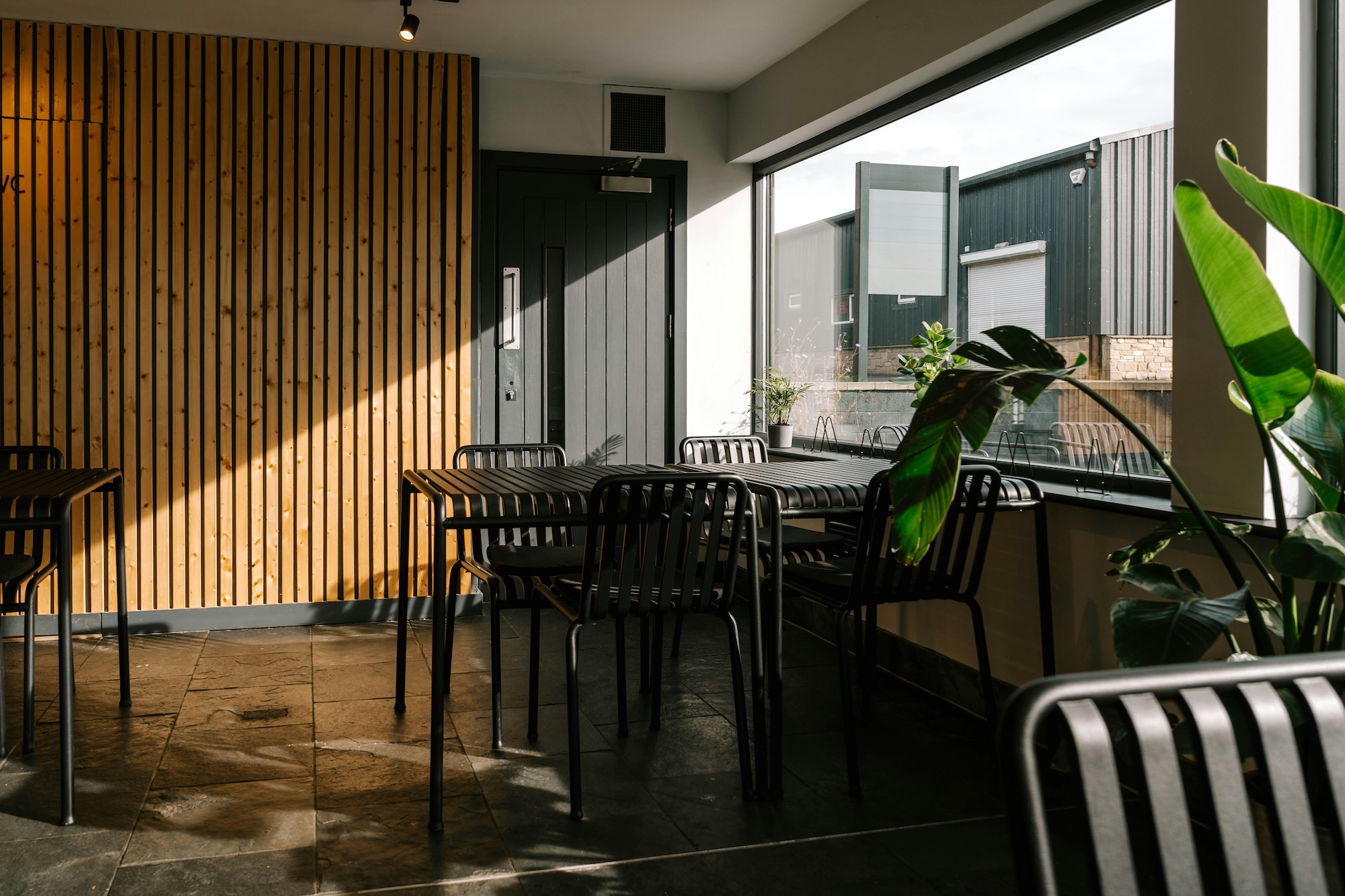
Even the nature of the business plays a big role. This is why cafes generally use brown and neutral tones, while healthy vegetarian restaurants feature lots of greens in their design.
Is color psychology a necessity?
Beyond branding, color psychology—according to the architect—remains relevant. However, she adds that “it is not the only factor we consider.”
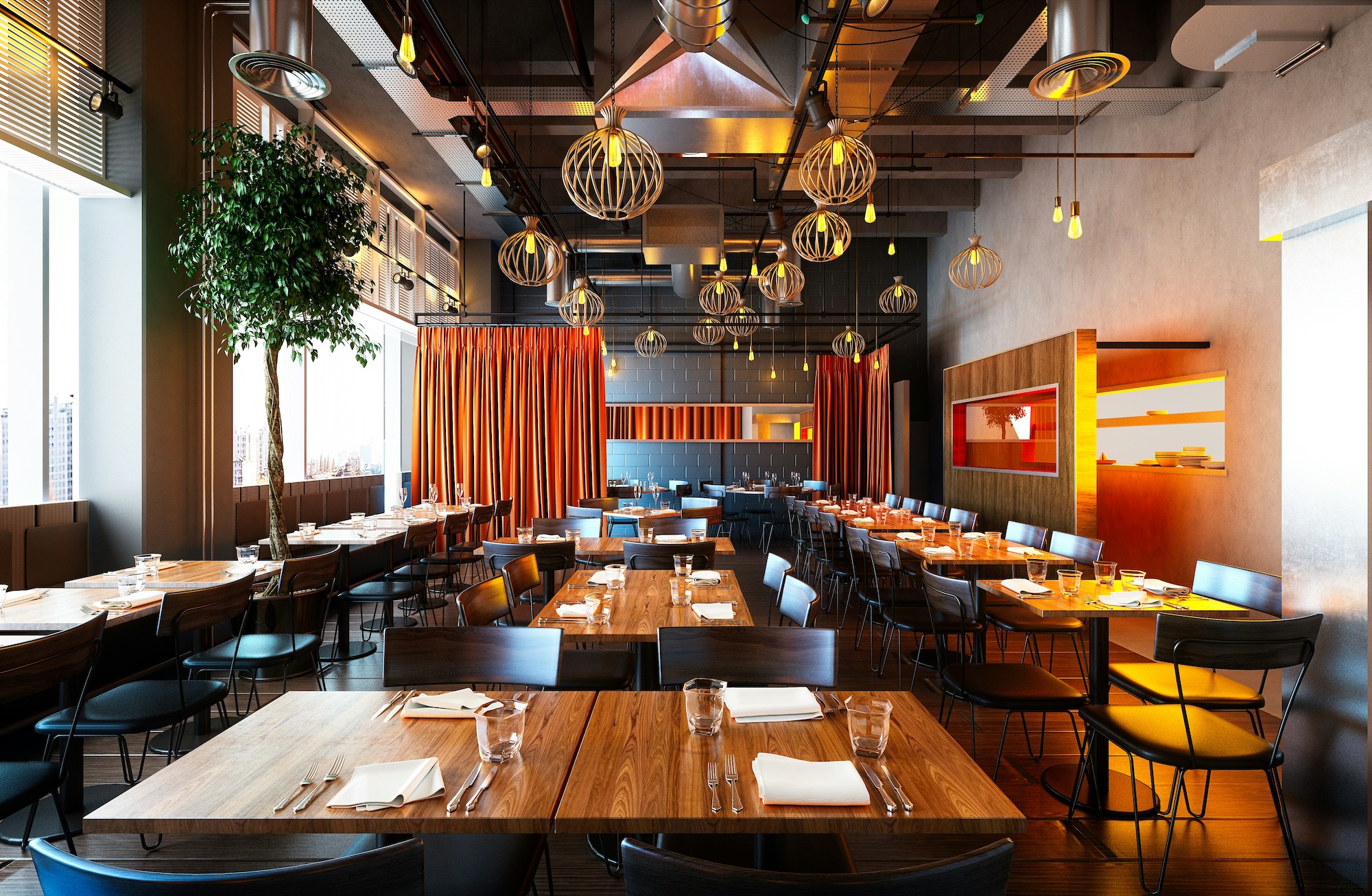
“Red and orange are generally used to stimulate appetite,” Barrios says, noting that some fast food restaurants use those colors for that purpose. “But now, using earth tones—like green through plants, and brown from wood accents—help make a place cozier and nicer to spend time in.”
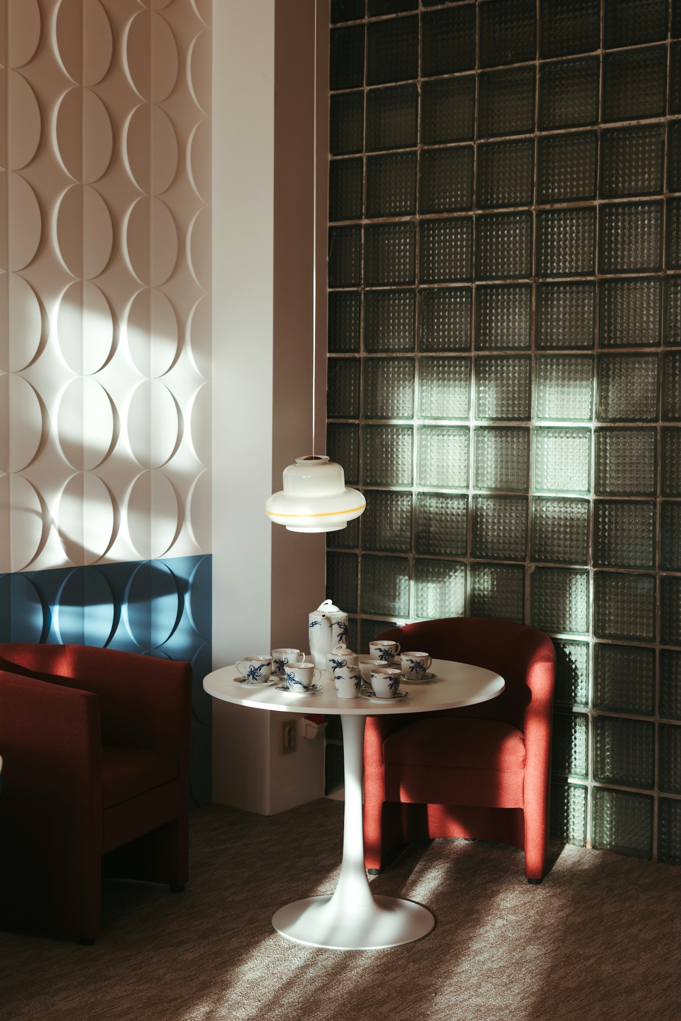
“Darker hues create mood, and have a certain elegance for private dining spaces,” she continues. “A lot of fine dining spaces tend to use darker colors to evoke elegance or an air of mystery.”
This, however, is not a rule that is set in stone given that “there are some fine dining spaces that are bright and cheery in yellows and sage greens.”
More than the feeling the color evokes, the message it sends is just as important in color psychology.
“Calming colors tend to make customers stay longer. Brighter colors usually work in fast food for appetite stimulation and help move people along.”
Tying everything together
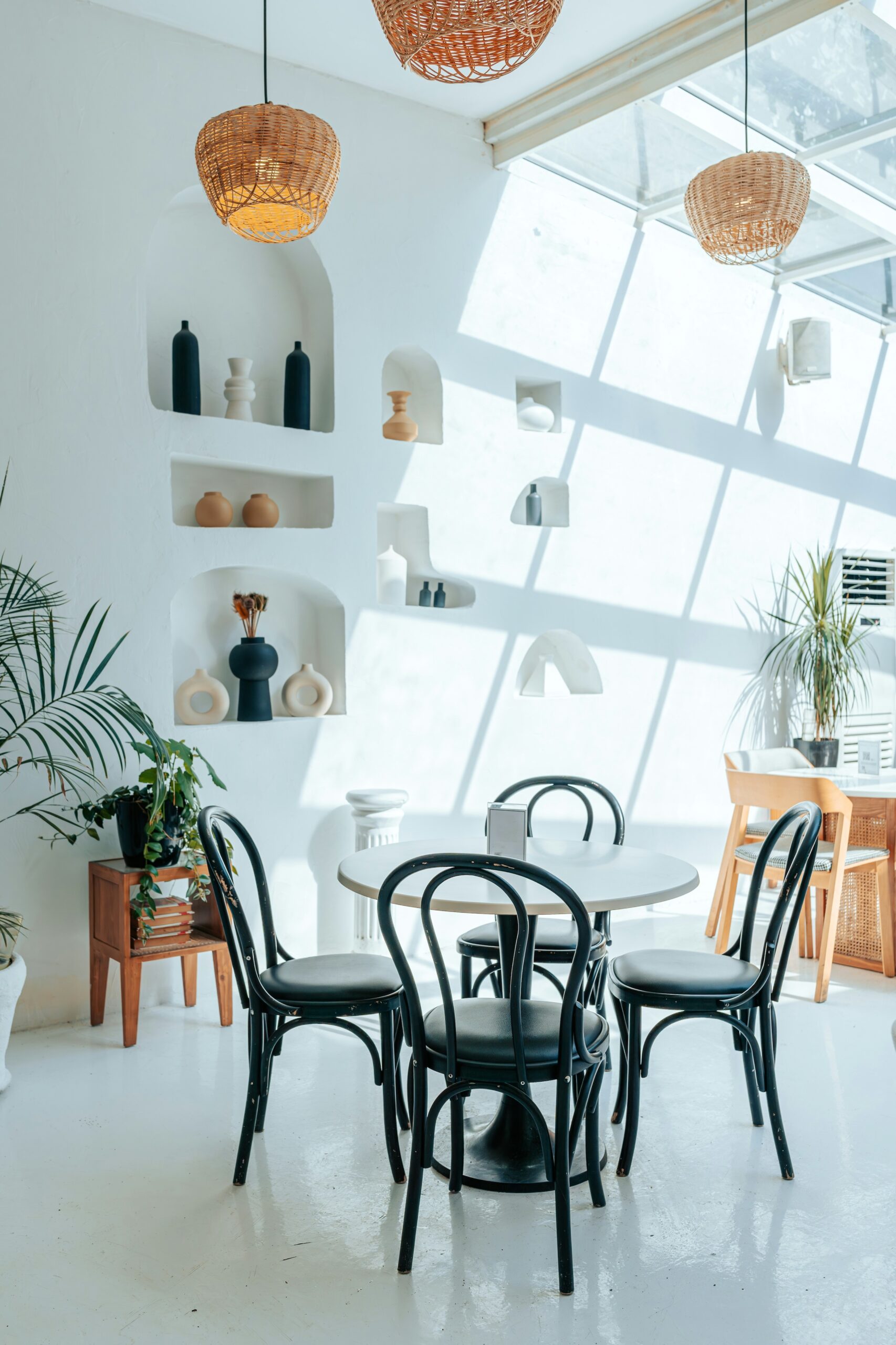
No matter what motif or color palette is chosen, the restaurant’s interiors must go hand-in-hand with the food and drink served.
This is why Barrios believes in getting insight from key players in the business. “I usually like to involve the chef in choosing the color palette as much as possible since they’re also highly creative and the goal is to showcase their food,” she explains.
But are there mistakes and non-negotiables when it comes to choosing color? For Barrios, nothing is really set in stone given that “in terms of color, I believe it’s really a preference of the owners.”
“The space has to work—operationally—especially the kitchen. If the operations don’t work well, it will be difficult to run the restaurant,” Lara Barrios opines. Doing so means that “all materials should work together to get the desired ambiance.”
“The space has to work—operationally—especially the kitchen. If the operations don’t work well, it will be difficult to run the restaurant,” she opines. Doing so means that “all materials should work together to get the desired ambiance.”
What you need to know
Branding, color psychology, and practicality. All these factors considered, timelessness is just as important. After all, amid ever-changing trends, your restaurant’s design needs to remain relevant.
“I think being aware of the current trends and knowing what has stood the test of time helps in balancing design choices,” Barrios says. “Commercial spaces usually reinvent themselves every few years, so one can, if willing, be more adventurous.”
This, however, shouldn’t hold anyone back. After all, there is always room for trial and error and each decision will serve as a lesson for the future.
When in doubt, the architect advises, “Don’t be afraid of color. When trying it out, it’s best to paint a bigger area, at least 1x1m to get a better idea of the effect of the chosen color.”
“Always choose the color in the intended lighting—whether warm white or daylight—as it affects how it looks,” she ends. “At the end of the day, if it’s just paint, you can always paint over it.”

