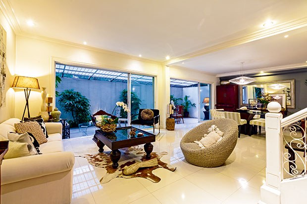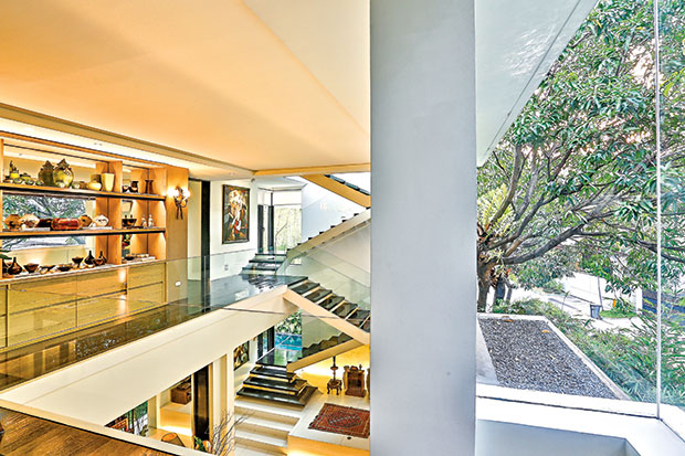
After working as a top executive in a multinational company, Paquito “Pen” Roque can now enjoy the fruits of his effort. Aside from travel, he rewarded himself with a condominium that reflected his style and substance.
He collaborated with Michael Pizarro, considered as one of the country’s fast-rising young interior designers, to give this 117-sq m unit a look which he calls “modern Italian.” Roque was inspired by a recent trip to Italy where he saw how the houses mixed textures and blended the old with the new to create character.
To get beautiful decorating results, Pizarro even did tests on his client to determine the latter’s “interior design personality,” as Pizarro put it. “Pen is laid-back. His personal choices (in the quiz) tended to be more functional.”
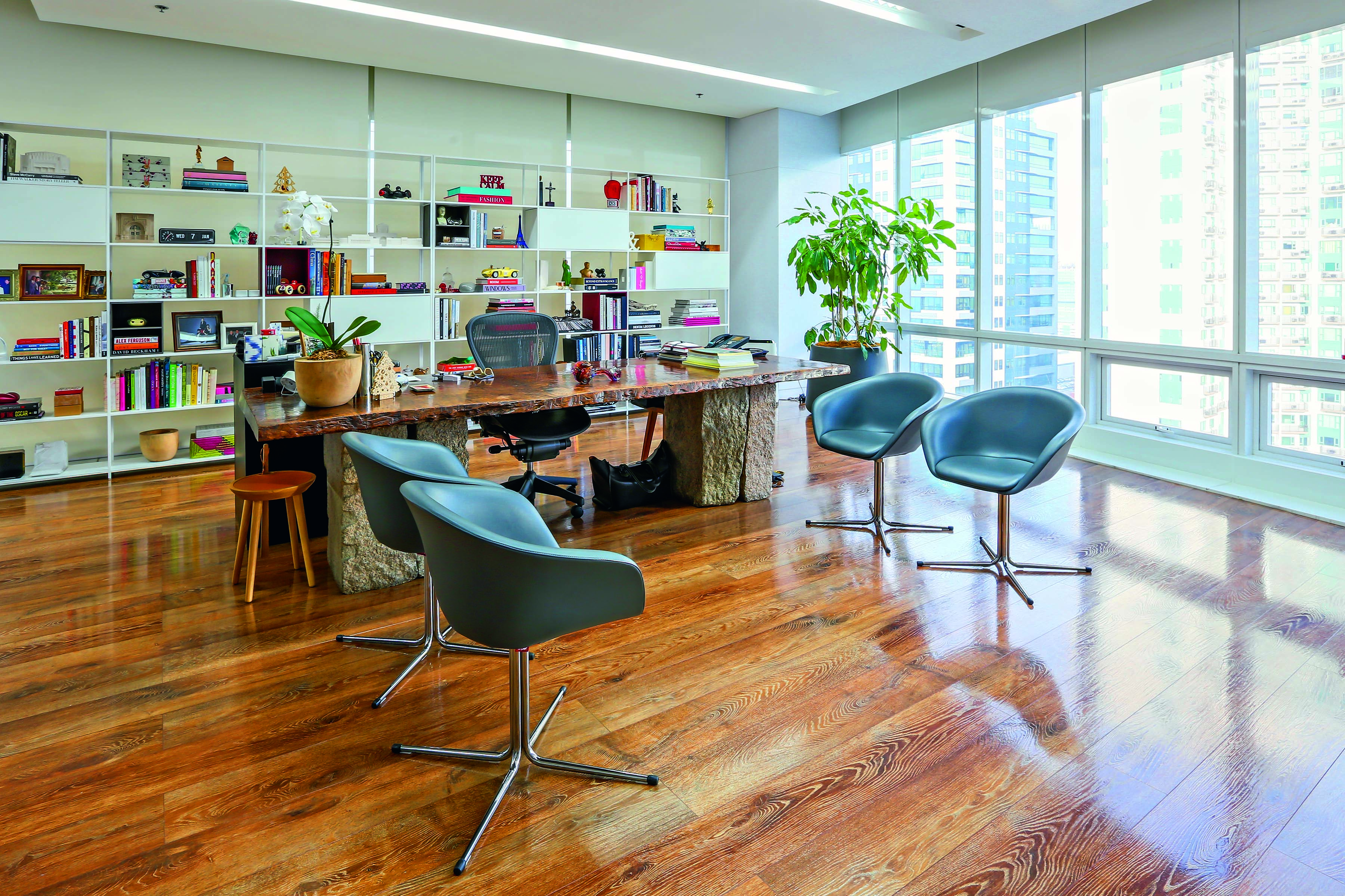
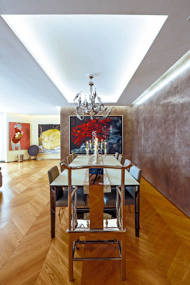
According to Pizarro, a nod to this laid-back personality is the choice of furnishings and décor treatment: the dining table made of an 80-year-old, four-inch thick solid dao from Quirino; the wooden, rectilinear stools from Cappellini; and the beech wood finishes in the master bedroom.
“These encapsulate the character of the residence—simple but sophisticated,” says Pizarro.

When Roque buys stuff for the home, he looks for their possible meaning in his life. One of his earliest acquisitions was the Lladro sculpture depicting the bonding of a father and son. Not only did it spark tenderness but it symbolically reflected his desire for parenthood.
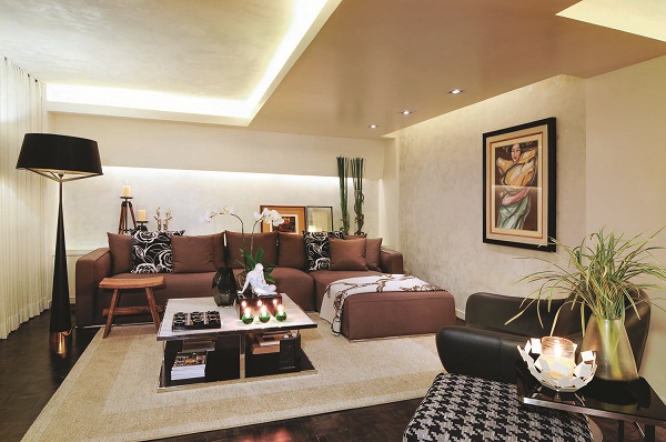
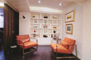
Pizarro also notes the sophisticated, contemporary taste of Roque, shaped no doubt by his marketing career. This is evident in the selection of furnishings, from the steel-frame Italian armchairs, the acrylic lighting fixtures, the graphicote kitchen walls, to the nuanced layering of elements.
Italian interior design style is the experience of space. Lighting and ceiling treatment contribute to the spatial experience. One of the most striking elements in Roque’s condo is the asymmetrical ceiling treatment.
“I wanted to drop the ceiling, but Pen wanted the cove all the way to the edge,” says Pizarro. As a compromise, he created a sculptural ceiling which combines the cove lighting for ambiance and the drop or false ceiling for a modern look.
“Units built in the ‘70s and ‘80s have low ceilings, but they are wider in area. That is the plus factor. When people enter this unit, I don’t want them to see the low ceiling right away.”
In the social areas, Pizarro creates a seamless visual continuity, from the ceiling to the walls, to give a feeling of intimacy.
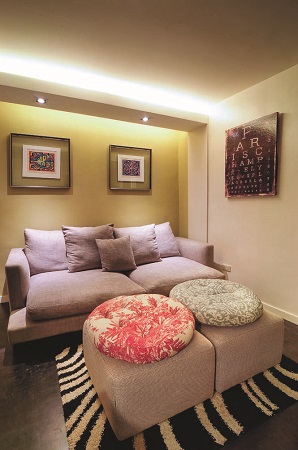
Indirect lighting produces quality lighting, without the heat and the glare. This is achieved through floor lamps, pin lights, recessed lights and sparklers or candles for mood. Lighting not only sets the ambiance, but it also creates a sense of movement as it lets you visually zoom in and out of space.
“When you come in, you are welcomed by a warm glow of light in the living room. Then the eye travels towards the wall washed by a pin light beaming on the painting,” says Pizarro.
“Each area is framed by the ceiling and within that frame are lights coming down.”
Pizarro maintains that there should be no difference between the structure and the décor. “At the end of the project, I don’t want to show solutions. I want to create a whole living space.”
Another Italian décor influence is the white scheme. Pizarro explains that after the wallpaper trend at the end of the 20th century, interiors reverted to textured paint finishes. He gave Roque’s condo the whitish stucco and plaster finish and classical painting techniques that lent texture and depth.
Pizarro originally chose shimmery white, a major trend in homes. But his client nixed it. “There was pearlized powder in the glaze, but the shimmery look wasn’t Pen. We had to customize the paint to meet his requirement.”
A neutral scheme, he adds, requires texturing so that the interior design won’t look boring. “For equal visual weight, we used materials that won’t upstage each other.”

The textured walls are complemented by wood veneer which, says Pizarro, is made of fine shavings of wood adhered together onto a core material to create panels. The wood veneer finishes, especially in the dining room, make the space look warm and inviting.
“The visitors always want to hang out here in the dining area even if I put snacks in the living room,” observes the homeowner.
Roque shows his love for things Italian with his choice of furniture, the key pieces of which are leather.
“When you think of Italian modern furniture, you think of craftsmanship and artisanship. In Italy, I learned that artisanship is one person to one furniture, from beginning to end, as opposed to an assembly line. So we focused on elegantly made furniture which, by itself, could be a conversation piece,” says Pizarro.
The final décor process entails unifying the elements. Picking up from the brown and black grains in the veneer panels, Pizarro used them as accent colors. “The random patterns on the wall are mimicked by the scattering of blacks and browns,” says Pizarro. The parquet flooring, typical in an Italian-style home, was stained in brownish-black for dramatic effect.
“There’s a story behind everything. In the end, there are spots of black like the throw pillows in the living room, the black floor lamp set against the white curtain, the black armchair, the black-and-white houndstooth ottoman, the black mirror frame in the dining room, the black frame of the Olazo painting. It all sprang from the black streaks in the wood. When you go simple, you zero in on the small details that are sometimes taken for granted. Most designers focus on decorating rather than using materials as a springboard. What glued the spaces was the fine selection of materials—engineered wood, painted surfaces, upholstery and metal. It’s like gourmet cooking; you have all these ingredients stewed for some time bursting with layers of flavor.”
Cocoon magazine is available in leading bookstores and newsstands nationwide. For inquiries, please call 8978808 loc 604. Facebook.com/cocoonmagazineph


