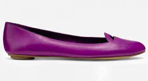
Pantone Inc., the world’s authority on color and provider of color systems, annually comes up with a staple color that influences tastemakers in fashion, music, film, design, travel and pop culture.
Most people may think that this whole Color of the Year issue is just for luck, or a capitalist-driven fad to encourage consumers to buy nonessential items, or merely something for kibitzers to talk about on slow days. But it is actually a significant cultural aspect whose symbolism must match current global issues, economic weather and collective feeling.
For example, Emerald—2013’s Color of the Year representing renewal, prosperity and growth—was an apt representation of the hopeful upswing that followed the quite looming energy of 2012, a year of bomb attacks, forest fires and earthquakes, and the year that everyone said would signal the world’s end.
Radiant Orchid
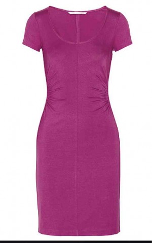
Color of the Year for 2014 is Radiant Orchid, symbolizing imagination, creativity and spirituality —three things Pantone claims are increasingly valued in today’s society. As Pantone puts it, “An enchanting harmony of fuchsia, purple and pink undertones, Radiant Orchid inspires confidence and emanates great joy, love and health. It is a captivating purple, one that draws you in with its beguiling charm.”
It’s also a color that is briefly glimpsed in the wee hours of sunrise.
Visual stimulus
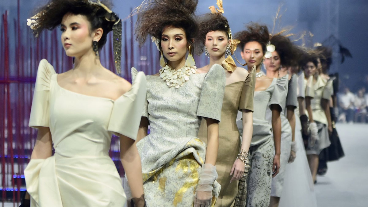
One of fashion’s basic techniques, the use of colors in an ensemble, is an effective visual stimulus. Color and its variations strike the optic senses, with an almost primal instinct that took generations to develop.
Cleopatra is an example of someone who used color to beguile, and some historic sources claim that her manipulation of the sensual Julius Caesar began the day she rolled out of a carpet embellished in vibrant Egyptian makeup and jewels.
Interestingly, purple means royalty in the West, because of the expensive purple Tyrian dyes from Lebanon.
In China and other parts of Eastern Asia, royalty is exhibited in yellow—a shade extracted from the rare herb, saffron.
Radiant Orchid energizes, and makes whoever wears it feel healthy and revitalized. Just try swiping on MAC Heroine in the morning.
Purple is a blend of cool and warm undertones, and is flattering to different hair, eye and skin colors. To avoid looking like your grandmother, wear it either only on the eyes, or only the lips. Keep the rest of the face neutral.
Too intense in a room
Radiant Orchid can look too intense in a room, so keep it muted. If you like keeping up with interior design trends, stick to small statement accessories like vases, throws and nice pillowcases. Pantone says one can complement this with olive and deep greens, turquoise, and even light yellows.
For the more subtle decorator, use the color to liven up neutrals like grey, beige and taupe.


