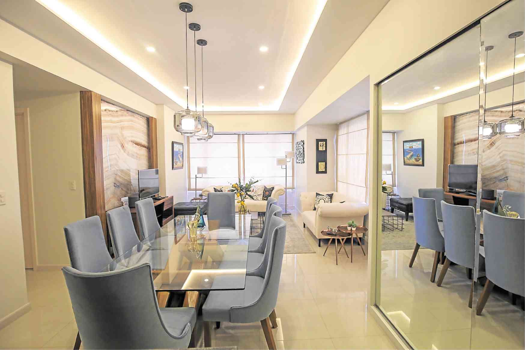
Finding a balance between clever use of limited space and creating a visually stunning interior is the first order for any interior designer doing condos. That it should be remarkably functional comes next.
Interior designer Margo Felix was tasked to do just this, the best part was she was given a free hand to meet all these requirements in this three-bedroom condo.
“What I liked most about this project was that my clients had complete trust in me,” Felix says. “A couple, both doctors who live abroad and come home to Manila several times a year to visit family, left me with a newly turned-over unit. They gave me carte blanche to do what I had in mind for them. They had complete confidence in me, which is what made this project a joy to work on.
“They came back to a beautifully curated home. Their happy faces, once they finally saw it finished, left me feeling fulfilled and, needless to say, overjoyed.”
Neutral colors are used everywhere, with color accents on soft furnishings such as throw pillows, area rugs and accessories.
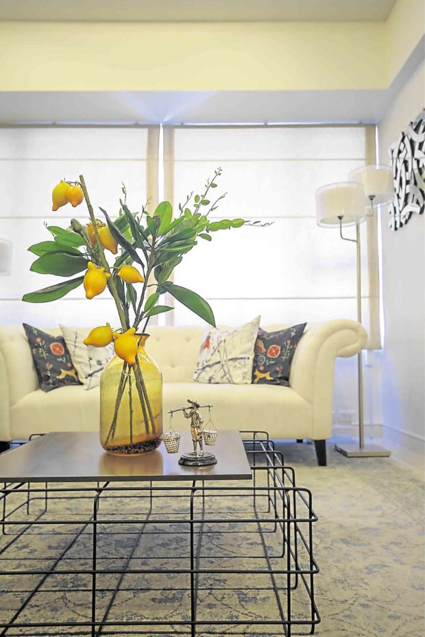
Since they are not structural elements, hence impermanent, soft furnishings can easily be changed from time to time, depending on one’s mood or if one tires of them.

The three-bedroom condo has been transformed into a spacious home through the judicious use of space—every square inch of it—taking the inhabitants’ preferences and interests into consideration.
Spaces were separated or delineated through lighting. The kitchen space is lit differently from the living area, while the bedrooms have indirect lighting to suit different moods.
Felix put personal touches on the condo by adding some of the residents’ favorite conversation pieces here and there.
Not just aesthetics
Felix explains: “For me, a good design for a condo is not just the aesthetics. You actually have to create a home that addresses all your client’s needs. All things must be considered— their need for privacy, whether they like to entertain family and friends, if they like to cook, or love relaxing indoors.
“Spaces must be planned accordingly, prioritizing what they love doing most. This ensures a good flow and maximizes every inch of space. You can’t afford to have unused spaces, but you must also create an illusion of largeness.
“The primary design concern of condo unit owners is always space. There’s just never enough room! To address this problem, I buy furniture pieces that can double as something else. For example, dining chairs that are not used every day can be moved to the living room or study area to be used as accent chairs. This actually creates more space in the dining room and gives cohesion to the overall look.
“Another tip: For those with breakfast bars, have shallow shelving or cabinetry under the counter to store items that are not used daily.”
Felix shares five practical ways to make a condo unit look bigger, be space-efficient, cozier and livable:
1) Resist buying furniture before you actually see the condo space. Don’t rely on the floor plan the real estate broker gives you. This is because most of the time there are beams and columns that create awkward spaces. So go to the unit with a tape measure and note everything down.
2) Invest in good quality hard furnishing pieces that you’ll use daily, such as a bed, mattress, dining table and sofa. They must be of good quality, and something you love!
3) Define spaces using an area rug, but be sure it’s the correct size. This adds coziness, separates areas, opens up walkways and directs the flow of foot traffic.
4) Avoid clutter. Don’t be afraid to buy accessories such as candleholders, frames, figurines and vases in the bigger size and skip the small items altogether. This way you need only very few pieces to create drama.
5) Bring plants and flowers into the design. They add a creative layer that’s just as important as the other accessories in the room. Consider it your finishing touch.—CONTRIBUTED

