The Sunnies co-founder and creative director delves into how her childhood inspiration colors her sophisticated space
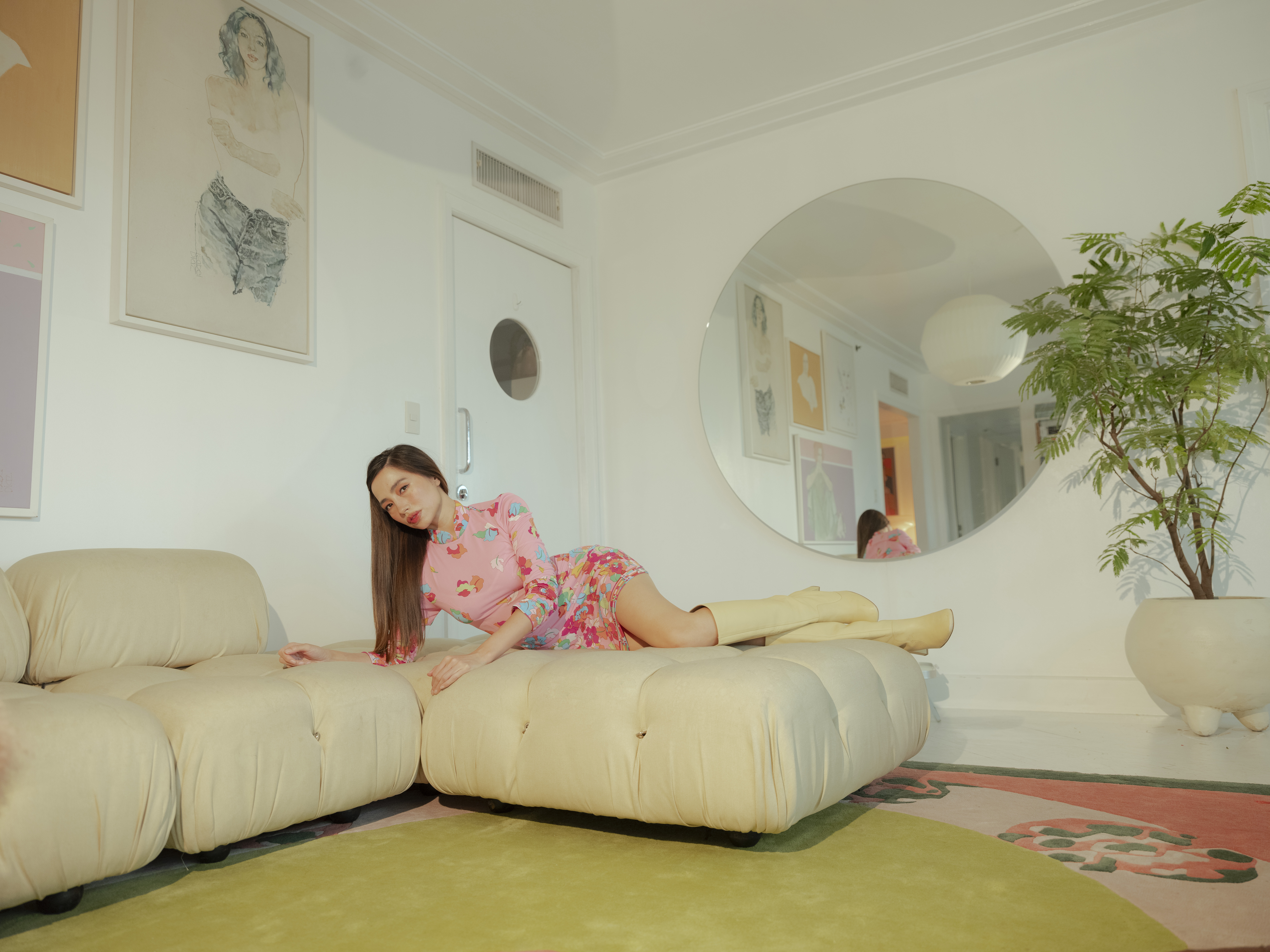
If you’re of a certain age or a fan of vintage television, you would remember Hanna-Barbera cartoons, the animation company with characters from “Josie and the Pussycats” to “The Yogi Bear Show.” As a fan of these retro cartoons, Sunnies creative director and co-founder Martine Ho especially took a liking to “The Jetsons” and “The Flintstones.”
As she designed her homes, she drew inspiration from this source of TV, incorporating the juxtaposition of the respective cartoons’ futuristic and ancient aesthetics into her Manila and Melbourne residences.
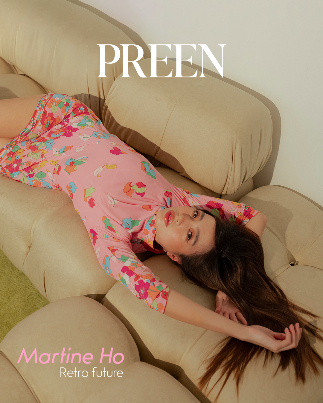
So while her Melbourne house channels “The Flintstones,” with organic elements like wood and stone, her Manila apartment embraces the retro-futuristic style of “The Jetsons,” aligned with the popularity of the space age aesthetic in the 1960s. “I just love how the style of the ’60s was so open and free. Everything was tactile and you could touch it. Everything’s furry!”
Entering Ho’s home feels like putting on a record of Leonard Nimoy’s “Music To Watch Space Girls By” (Yup, Dr. Spock released two musical albums). In her Manila space, she points to her prized collection of hard-to-get maps from the psychedelic era adorning the walls as well as her vintage yet space-age glass, metal, and plastic lamps in geometric shapes. While Ho is known for her forward-thinking creativity, she credits much of her design choices to childlike joy, nurturing her inner child through literal homemaking.
“My inner child is so active. Things that made me happy as a child are things that I cherish and bring me a lot of joy,” she shares.
Creative roots through connection
Born in Manila, Ho lived across multiple cities as a young girl, including Hong Kong and New Delhi, India, but spent most of her life growing up in Orange County, California. So it’s no wonder she effortlessly embodies that laid-back Cali-cool-girl character.
In college, she studied journalism, media design, and photography, which makes sense, as she’s able to blend her quick-tongued talent in writing with the images and designs she chooses for herself and Sunnies’ creative direction.
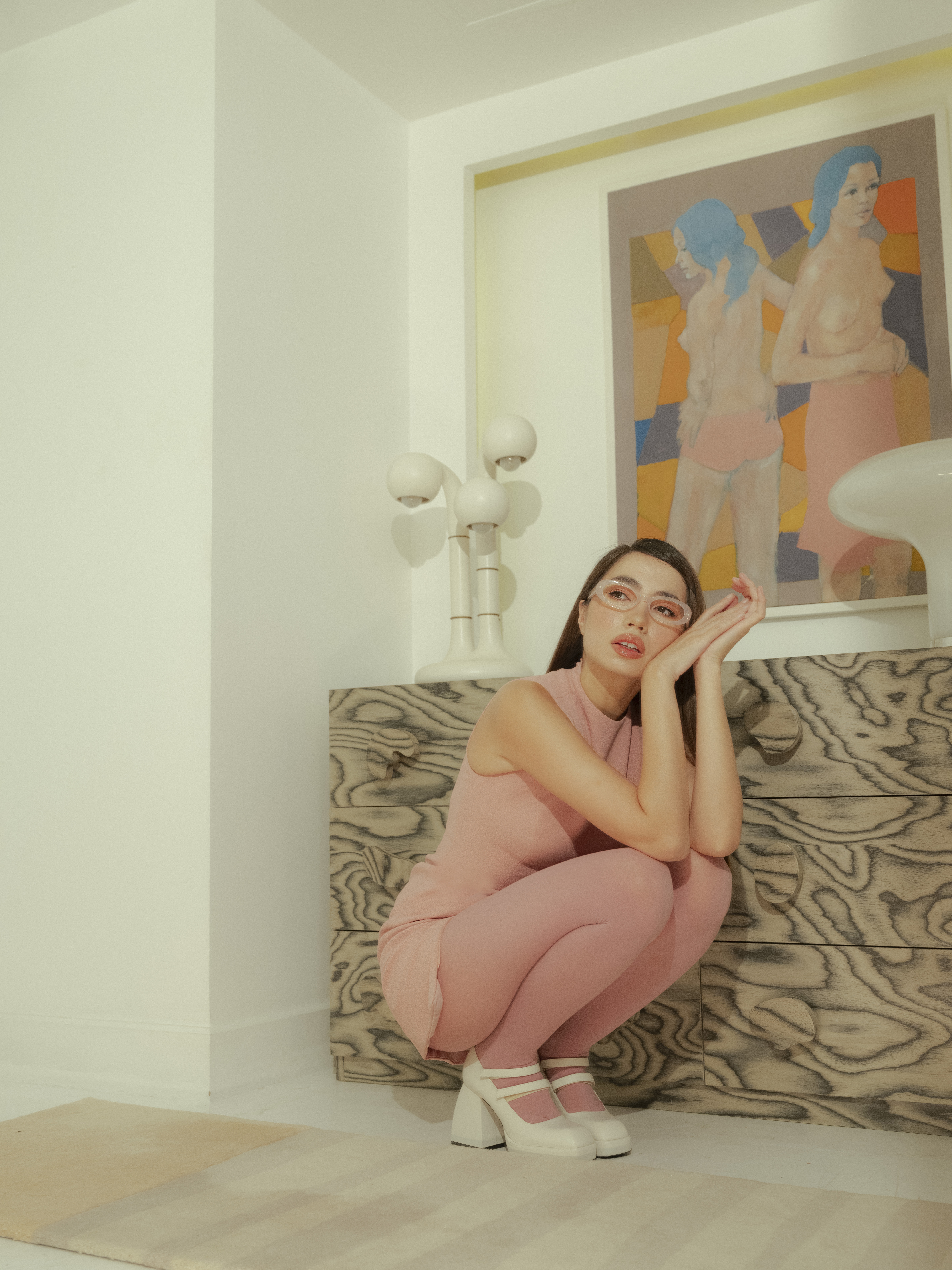
Many will remember her work in American Apparel, featuring overexposed Polaroid-esque layouts. “The way that we operated was always charmingly low budget, I would say. I would design the garments, do some product development, but I’d also do art direction. I’d shoot it, I’d also model it. When you kind of vertically integrate your operations, you can produce a lot of interesting things quickly and more cost-efficiently, which I think brought into Sunnies. A lot of things are organic, and we shoot with friends or things like that.”
At present, Ho splits her time between Manila and Melbourne, interchanging four weeks in each city throughout the year. This geographic flexibility influences her approach to space and design, building homes that serve as creative havens in both parts of the world.
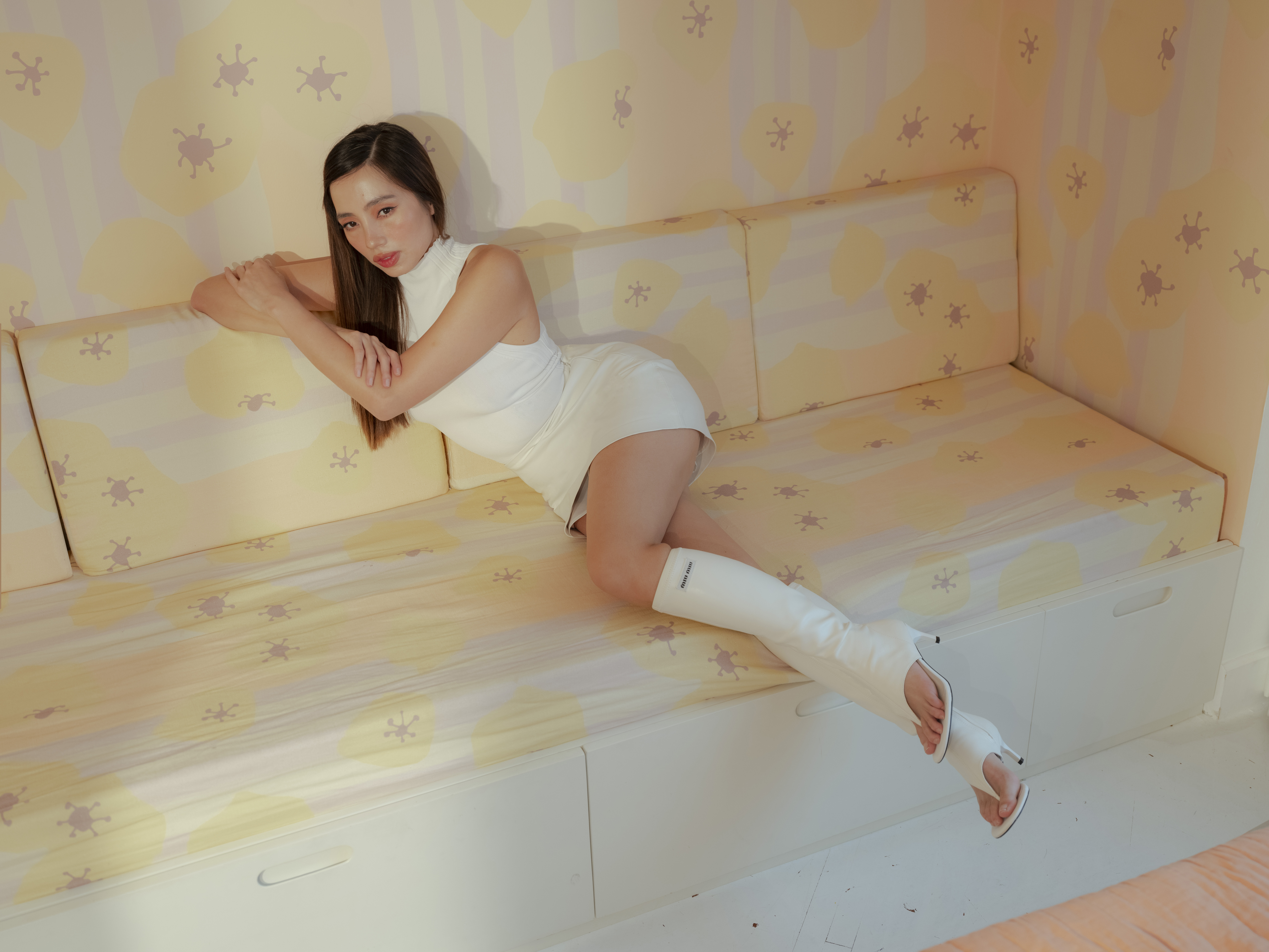
“I think they all bleed into each other. Everything I touch in Sunnies is a little part of me too that I give to the brand. And the same goes with my home,” Ho says. “These are all extensions of things I like. My vision. They all kind of intertwine.”
Movement and flow in Martine Ho’s home
Her constant movement through cities reflects in her approach to her ever-changing home design. “If my home could speak, it would say, ‘What’s my outfit for the day?’” she muses. On the regular, she switches out rugs and rearranges furniture to create fresh energy in the space. “I just enjoy seeing change. I don’t want to look at the same thing every day. I want to be visually stimulated.”
Ho has about 10 rugs stored in her Manila home, most of which she designed herself. Surrounded by her creations, she unrolls one of her designs with the pattern of a fu dog snaking around the edges, a creative way to add a touch of protective Chinese feng shui energy.
When it comes to spatial flow and arrangement, Ho credits her collaborative approach with key figures in her life. “I’m really lucky because my husband Cliff and my business partner Eric, the two Chinese husbands in my life, are particularly gifted in spatial flow,” she says with a laugh. While she focuses on picking the finishings and doing the interior styling, they advise on practical spatial arrangements that make sense for daily living.
The dining area of their Manila home stands out as Ho’s favorite space, with views that act like a dynamic backdrop for frequent family gatherings. “When there’s a thunderstorm here, I love to watch it. When the planes take off, I can see them coming and landing,” she enthuses. The space sees plenty of use, as Ho hosts dinner gatherings roughly four times a week, with family members who live in the same building frequently dropping by.
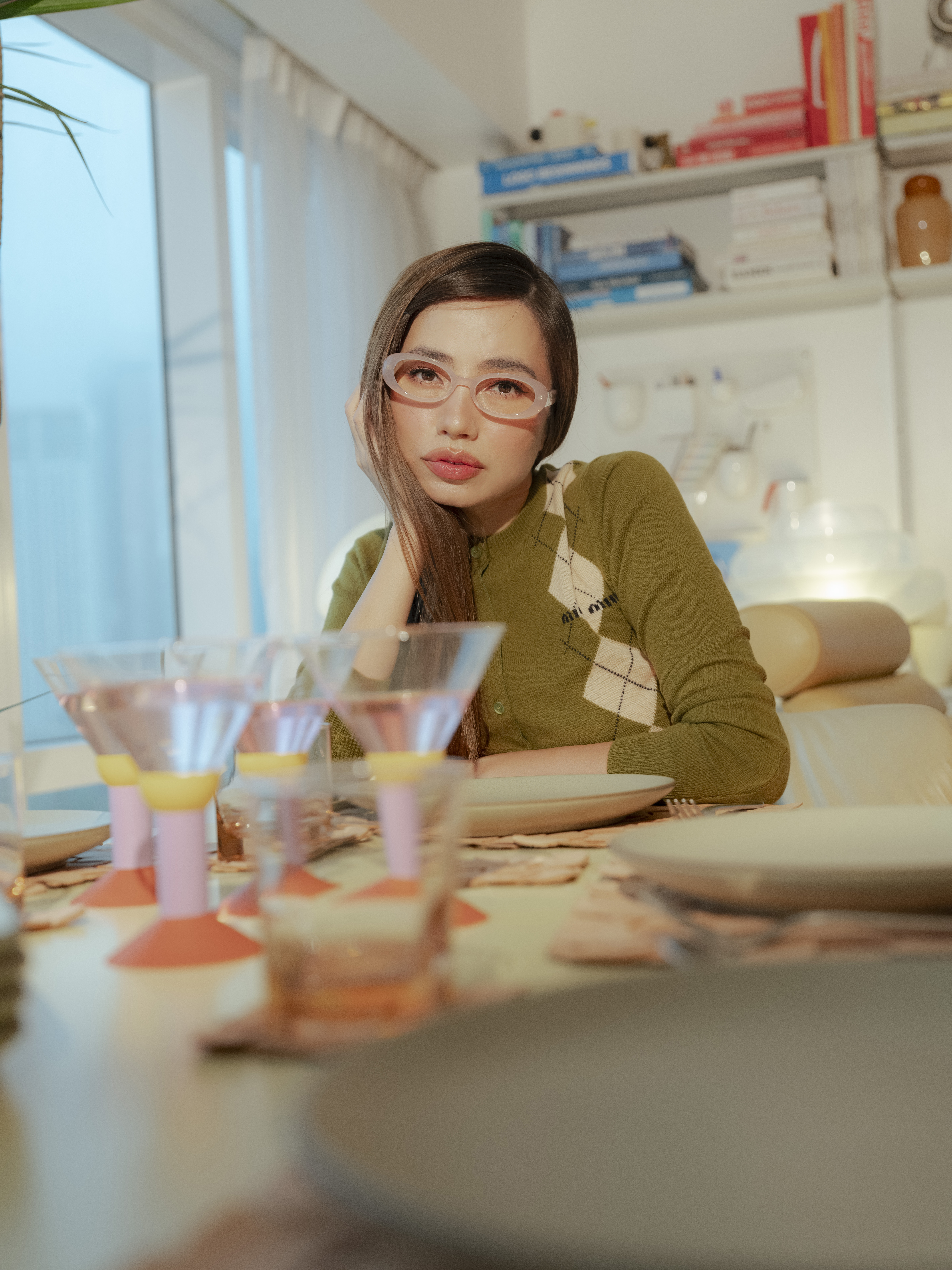
Her attention to detail extends to her curated table settings. She sets stylish yet heavy-duty plates from Heath Ceramics, a studio in Sausalito, California. Her martini vessels are not the usual sleek slivers of glass either but chunky postmodern Bodum creations from 1983 in bright purple, yellow, and red, which she picked up at the MoMA Design Store.
On the shelves, Ho’s mix of sophistication and playful irreverence shows in an eclectic library that ranges from artist Georgia O’Keeffe’s intimate letters to a bold pink tome on Yves Saint Laurent. Alongside rare Monocle travel guides to Miami, Berlin, and Istanbul sits Yuval Noah Harari’s philosophical “21 Lessons for the 21st Century.” It then comes as no surprise she’s also read “Pride and Prejudice and Zombies.”
While her Manila apartment is filled with fascinating objects, the paintings remain the most special. She gestures to paintings by her grandmother, her cousin Ali Alejandro, and her aunt Isabel Diaz, known for her vibrant floralscapes but also her alluring, ethereal portraits.
On one wall are family portraits by Diaz that span generations. “I have a portrait of my mom from the ’80s that was also in my childhood home,” Ho says. “My aunt Isabel just recently surprised me with a portrait of my daughter. Those are my most special pieces in the home because they’re personal.”
On crafting a personal aesthetic
As she walks through her apartment, Ho’s crafty sense extends to her wardrobe. She dons a playful pink cheongsam she had made from fabric that she found herself. As a Gemini, her own style oscillates in the same way as the zodiac sign’s dual nature. In one moment, she channels the sultry sophistication of a 1960s movie star; the next, she pivots to sharp, modern silhouettes—always infused with an undeniable sensuality.
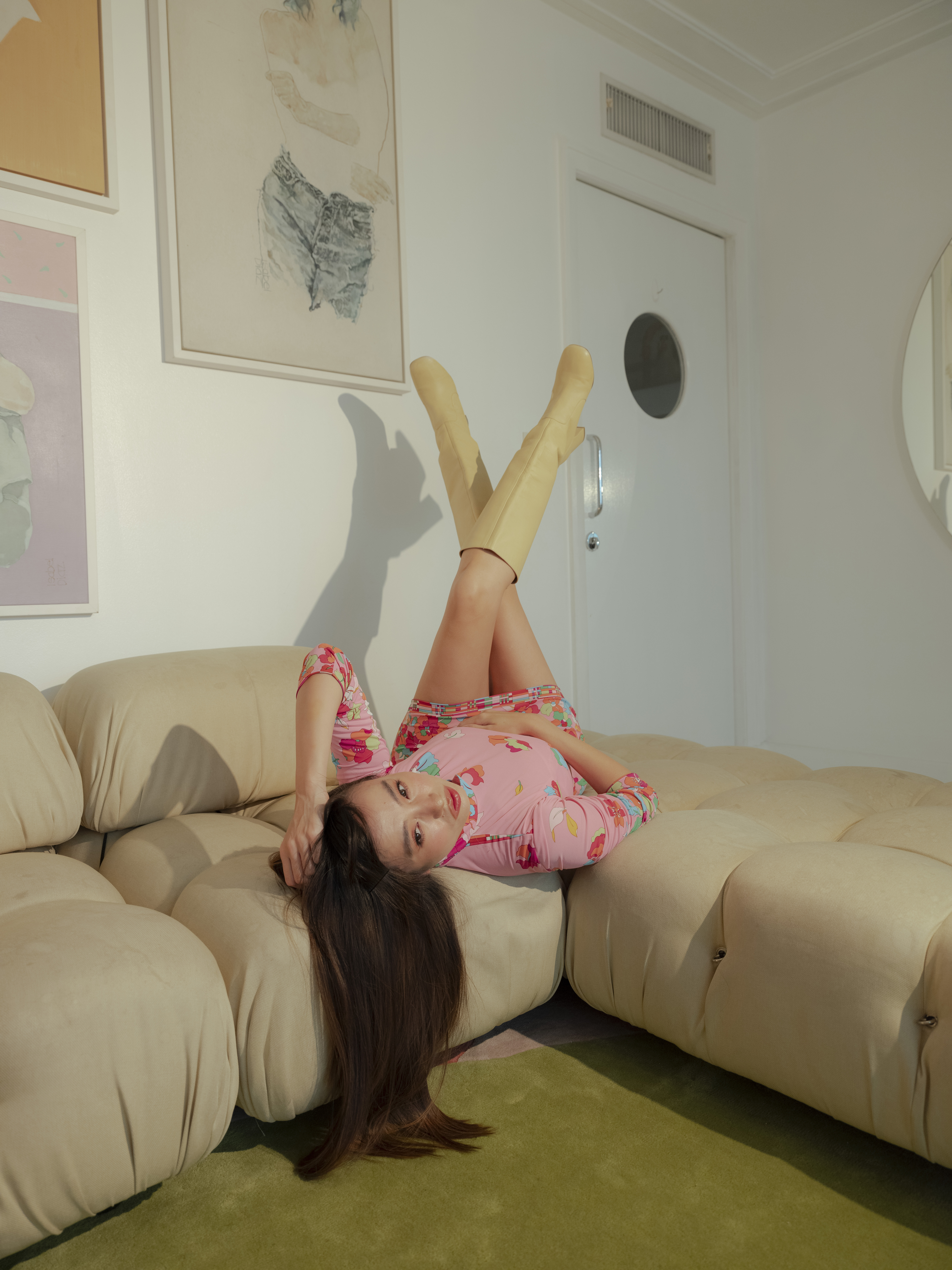
While the creative director’s photographs capture a fierce presence, in person, her demeanor is disarming with a warm, melodic voice, punctured with quips that are quick on the draw.
Much like her personality, Ho’s style—both personal and in her home—strikes a delicate balance between sharp and soft elements. Her sardonic sense of humor yet sweet charm mirrors the space, as modern pieces mix with vintage finds.
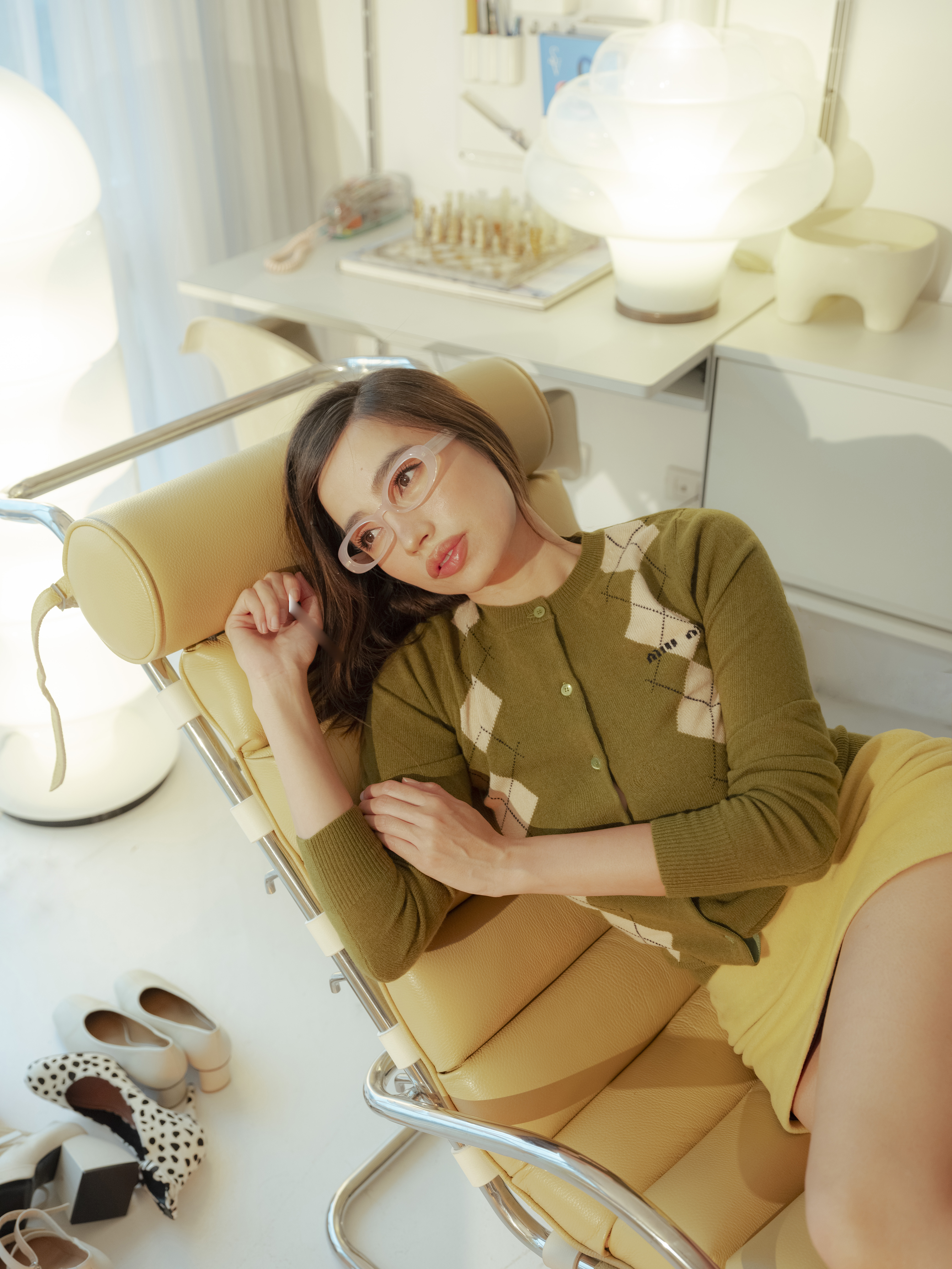
For those looking to develop their own aesthetic, Ho gives sage advice, “I think it starts from within. If you’re on the internet too much, you’ll get too influenced, and you need to retrospectively reflect on what things bring you joy. Like what color palettes have you always enjoyed? And then to not focus on the trends. Because everybody will look the same.”
Through every carefully chosen detail and personal touch, Ho’s Manila home goes beyond the creative director’s design sensibilities, showing that spaces should evolve and grow with their inhabitants, always maintaining a connection to what brings inspiration and genuine joy.
Photography by Shaira Luna
Makeup by Zid Jian Paul
Hair by Mary Jane Nuñez
Production assistance by Angela Chen
Produced by Ria Prieto

