The style defined kitchens in the early millennium: honey-hued Mediterranean design with open shelves, a sink and preparation area overlooking a garden, and a monolithic island for dining.
According to the New York Times, this popular style was drawn from the Meryl Streep rom-com “It’s Complicated,” where the kitchen played a significant role. Filipinos followed the trend, since the style made the kitchen the new “entertainment” area.
But Rafael Calero, a specialist in kitchen design, notes that Filipinos nowadays favor cleaner lines, soothing neutral colors and natural finishes.
The Shaker design, streamlined interiors with lots of whites and beiges and premium woods, is an emerging trend, he says.
The doors and cabinetry are characterized by recessed panel doors, light surfaces and basic hardware. The design is evocative of an American religious group, the Shakers, a branch of the Quakers, who emphasized austerity.
Five years ahead
“In the US, everyone used oakwood,” says Calero. “Filipinos never adapted to the oak cabinet with molding and decorative panels. They are five years ahead of Americans.”
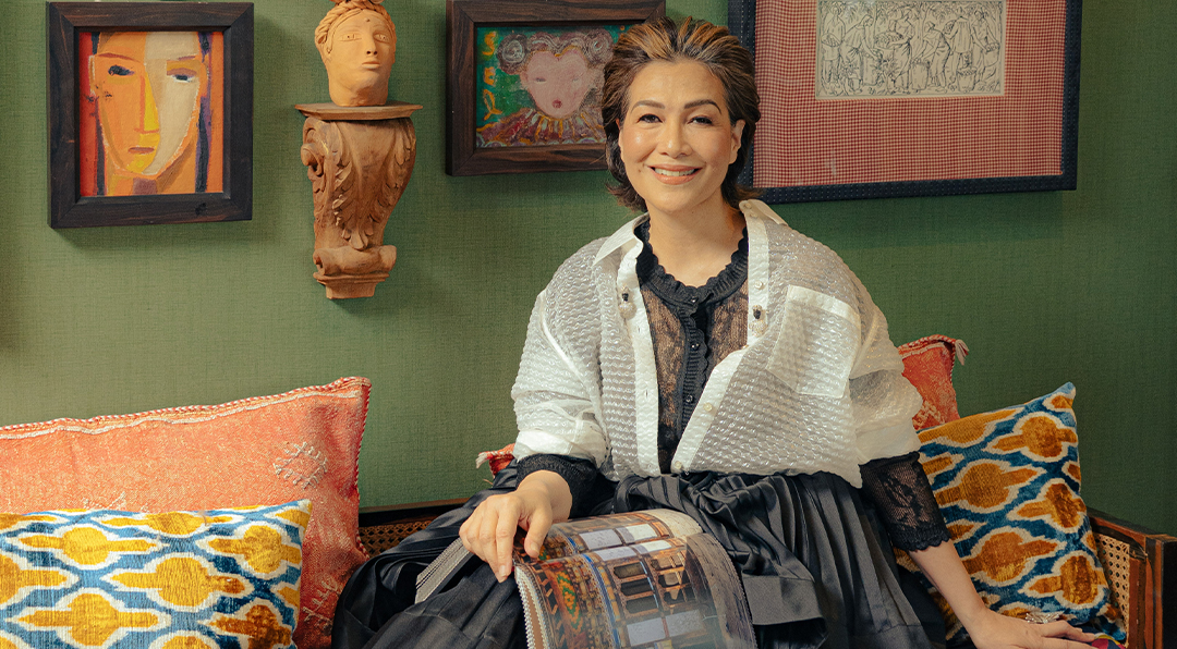
A graduate of industrial arts at the San Francisco State University, Calero had worked as a general contractor, designing and installing kitchens and remodeling bathrooms.
“I’d be carrying porcelain bathtubs and heavy fridges up the stairs,” he recalls. “I got tired of that.”
When he came home in 1997, the Philippines was having a construction boom. Owners were paying millions for kitchens and branded appliances. Kitchens were slowly evolving into the new entertainment area. Calero established the Kitchen Studio, which found a niche market of well-heeled clientele who liked his uncompromising work ethic.
Ten years ago, Calero documented the kitchens of prominent clients in his book, “25 Kitchens” (C & E Publishing). He hopes to write a second book, which contains not only newer kitchen designs but also doors and cabinetry produced in his workshop in Calatagan, Batangas.
All his kitchens are customized to reflect the owner’s personality and the architect’s vision.
“An island is a must,” he says. “Everything revolves around it. In the US, we drop our groceries on the island when we’re tired, but we put the meat in the freezer. We come back for them when we’re well-rested. The island is a prepping area and a place where friends gather. You can put bar stools around it or use it as additional storage space. You can put a hood on top of the cooking area of the island.”
Calero adds that kitchens need not use expensive finishes. One may, for example, use high-pressure laminate (HPL), a durable decorative surface material for cabinetry, and play it against exotic stone countertops.
“I like to make the kitchen warm and inviting,” Calero says.
Below are kitchen styles Filipinos have lately taken to.
Shaker
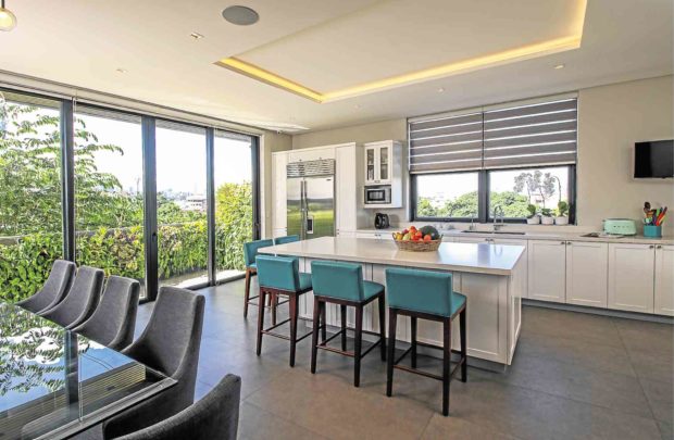
The Shaker style was adopted by architect Antonio Nazareno for a house he designed that was close to the busy C5 road. He had wanted to create an oasis of sorts, so he insulated the windows that opened to views of pocket gardens and outdoor spaces.
Having lived in Canada, the clients wanted a design that reminded them of North American living.
The Shaker style combines the timeless look with modern elements. The classically proportioned, frame-and-inset-paneled white cabinets contrast with contemporary touches such as a subway tile flooring, the low-maintenance Calcutta gray quartz countertops, and branded appliances such as a Wolf range and Sub-Zero refrigerators.
The teal upholstery sets off the white and gray color scheme.

Modern Asian
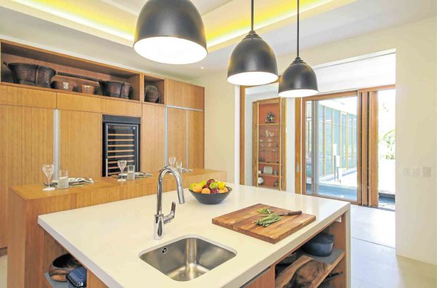
For a house by architect Noel Saratan, who’s known for Asian and Filipino design idioms, Calero introduced a kitchen with bamboo finishes and streamlined cabinetry and walls for a modern Zen feel.
Since the owners love to cook, the preparation area is huge. The double-level island consists of a quartz-topped counter and an adjacent wooden table, made for dining, entertaining and working; beneath it is hidden storage. At the cooking and storage corner, there’s even a butcher’s block beside the oven/stove.
The refrigerator is hidden from view. Pendant lights, customized by Keystone Lamps, echo the popular gunmetal look.
Calero created special ventilation for the wine chiller. “In the humidity, if the wine chiller isn’t well-ventilated, it tends to break down,” he explains. “With proper ventilation, you don’t have to worry about maintenance,” he says.
The kitchen opens to a view of the gardens and koi pond. To personalize the space, Calero built a wall system with a niche to display the owner’s collection of native baskets.
Minimalist
Minimalism tends to be cold and severely linear, since there is no ornamentation. So Calero injects woods such as the owner’s tiger dao for the dining table, pine wall cabinets and mahogany shelves.
He infuses gray as a continuation of the color scheme of the house designed by architect Bong Recio.
For a bit of nostalgia, the Terrazzo tile flooring, which resembles tiny specks of dust, suggests the interior décor of the ’70s.
Calero points out that one window extends to an herb garden from where the cook can pluck herbs within arm’s reach.
For details contact Cabinet Studio by Rafael Calero at 09173140878.


