Interior designers Ivy and Cynthia Almario are always setting benchmarks and turning heads in equal measure because they somehow manage to bring sophistication and polish into all their creative and elegant endeavors.
They recently transformed a three-bedroom condo unit and outdid themselves by getting more space than they actually thought they could.
For this unit, Ivy and Cynthia Almario brought interior design and architecture together in a single discipline.
Working with the bones and the framework of the build, they involved themselves with the design of the structure itself and ultimately rebuilt the space; in this particular case: a square box with angled diagonals.
I first heard about interior architecture from a designer friend who was trying to articulate his design concept and methodology to me in the simplest terms. He explained, “It means an involvement of the interior designer in the architectural and technical aspects of interior design.”
Changing times and lifestyles have increased the scope of work for interior designers who now are challenged with reconfiguring structural elements of “set in stone” interiors.
This new field now goes beyond merely decorating, it combines aesthetic detail and a science.

Ivy and Cynthia Almario are savvy enough to know this and have taken into account all elements: lines, shapes, scale, furniture design and safety of the limited space of a given build.
Spatial design
At the nucleus of their design for this unit is how people and space are brought together elegantly, going beyond function and needs.
The Almarios have gone beyond merely decorating and turning spaces to meet their single functions.
A young man’s bedroom has been designed and constructed in such a way that it can easily be converted into a good-sized sitting room.
The idea was to create more space by diminishing, not adding. The result is a spacious interior with a sense of control. Things hidden away in proximity to their functions: a pantry behind a wall right beside the kitchen; additional storage spaces built along hallways; a bedroom wall taken down and replaced with sliding wall panels to create a multiuse room that can be opened up or shut close; and sliding cabinet walls and mouldings that become a lovely boudoir.
From the small entry, a sense of privacy is created by adding a design feature often intentionally omitted in most condo units—a foyer.
Color palette
After the structural alterations were made, space-making elements such as lighting, furniture, soft furnishing, art pieces, along with colors, textures and style were brought in.
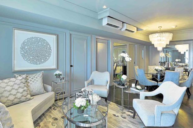
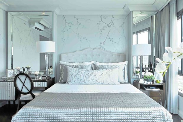
Symbolic connections made personal associations, in this case, the client’s favorite landscape of cherry blossoms in the bedroom, added to the experiential value of the unit.
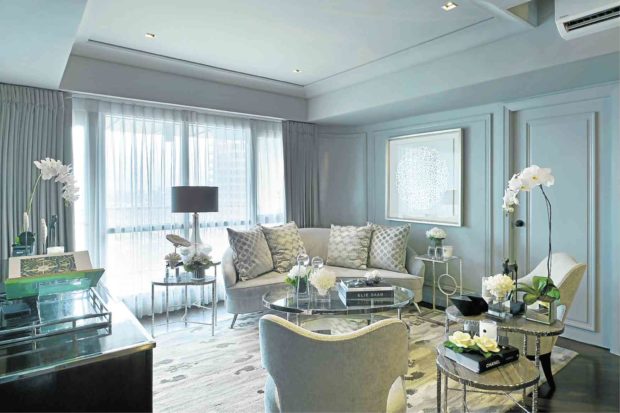
Gray is used in various subtle gradations that transition throughout the interiors so the rooms are constantly changing because of the play of reflected light hitting a lighter ceiling, wood, glass panes and upholstered furniture. It is a fascinating color choice when you want a neutral color.
“Its inspiration originated from the light gray color Christian Dior used in his dressing rooms,” Ivy adds. The monochrome palette reveals an expert layering of color from taupe to tones of enlarging cool gray.
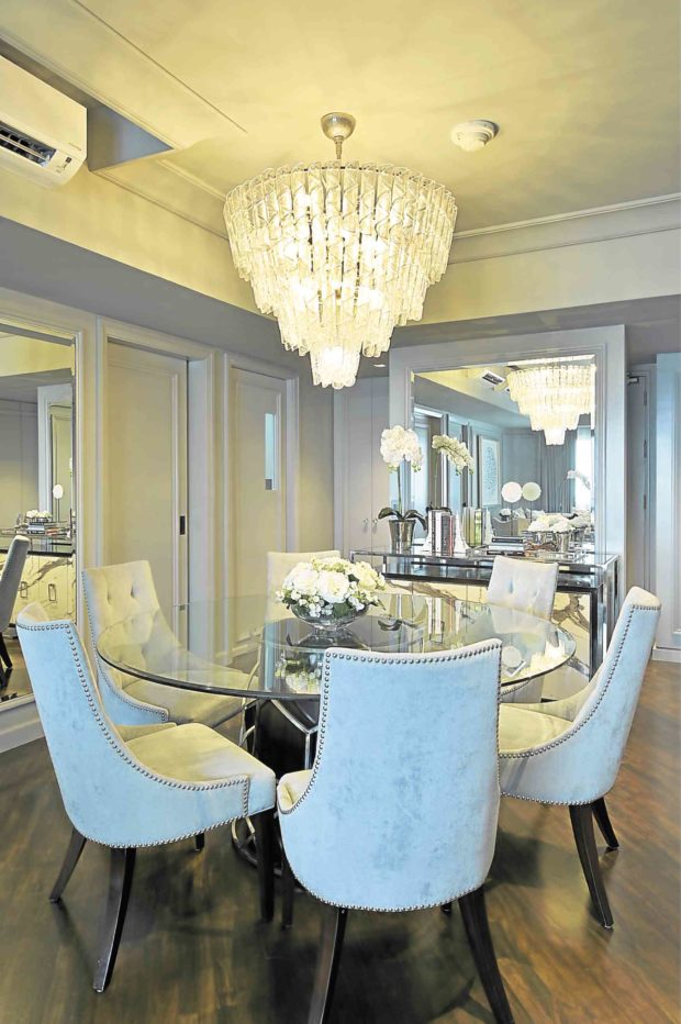
With all of these in place, the unit is still a family abode where the couple and their grown-up children enjoy their own spaces in relaxing, lived-in elegance.
Ivy says: “The palette, flow of space and the pervading sense of glamour were a result of an amazing meeting of the minds between our stylish client and us to achieve one goal: to create a home suite home for them. We both agreed on panel mouldings that would conceal additional storage, mindful that this was the challenge of condominium living. The rest of the project was quite swift thereafter. After concept and material presentation, the long wait and challenge was the interior construction that had to be done to accommodate our design concept.
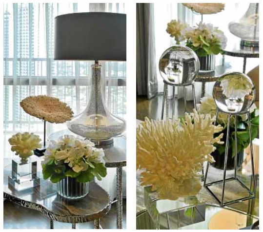
“The fully occupied building left us with no choice but to work around strict time schedules. This took a lot of time. Everyone in the team, including the owners, knew the old but true saying that goes: All good things come to those who wait.” —CONTRIBUTED


